For a plotly express solution:
You could use pd.melt() to get all your variables in the same column:
import pandas as pd
import plotly.express as px

df = pd.DataFrame({
    'Day':range(10),
    'Temperature': np.random.rand(10),
    'Wind': np.random.rand(10),
    'Humidity': np.random.rand(10),
    'Pressure': np.random.rand(10),})

df_melt = df.melt(
    id_vars='Day',
    value_vars=['Temperature', 'Wind', 'Humidity', 'Pressure'])
Your dataframe now looks like this with the variable names in a column named 'variable' and the values in a column named 'value':
    Day variable    value
0   0   Temperature 0.609
1   1   Temperature 0.410
2   2   Temperature 0.194
3   3   Temperature 0.663
4   4   Temperature 0.351
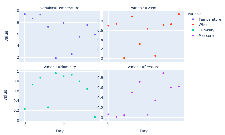
Now you can use px.scatter() with argument facet_col to get the multiple plots:
fig = px.scatter(
    df_melt,
    x='Day',
    y='value',
    facet_col='variable',
    facet_col_wrap=2,
    color='variable',
    width=800,
)
This results in the following plot:
![plotly express facet_col instead of subplots]()
Now in your example all variables have the same range of values. But if this is not the case then you might want to make sure that every plot gets its own range on the y-axis. This can be done as follows:
fig.update_yaxes(showticklabels=True, matches=None)
More info on facet plots can be found here:
https://plotly.com/python/facet-plots/


