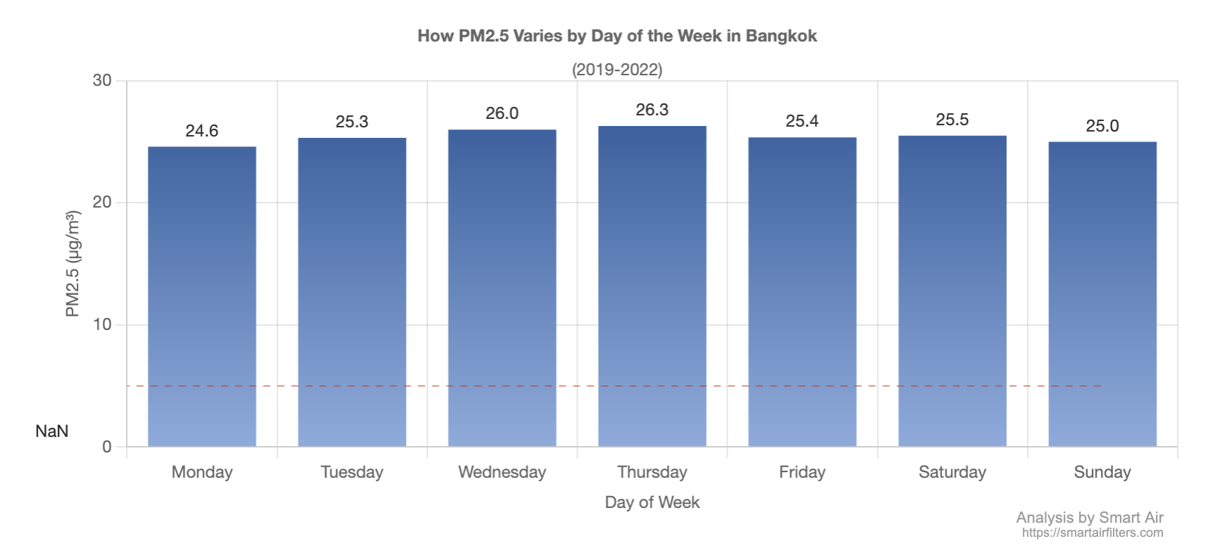
Chart.js - mixing bar and line graphs - can I get the lines to fill the full column?
Asked Answered
B

2

6

I am using Chart.js v2.5.0 to create a chart like this:

enter image description here

Note that sometimes the bar will go over the red dotted line. Sometimes the red dotted line will be at a different position (its normally at 25, but will be at other levels on some months).

My issue is that I want the red dotted lines to extend to the full width of the column. As you can see on the first column the red dotted line only goes halfway into the column. I have the same issue at the other end of the chart, the red dotted line only goes halfway into the column.

My current implementation here is to have a mixed chart, one is a bar chart and another is a line chart - with data like so:

    data = {
        labels: ['Jan 21st', 'Feb 21st', 'Mar 21st', 'Apr 21st']
        datasets: [
            {
                type: 'bar',
                label: 'A',
                data: [10, 25, 18, 37],
            },
            {
                type: 'line',
                label: 'B',
                data: [25, 25, 25, 25],
                fill: false,
                borderWidth: 1,
                borderColor: '#f00',
                borderDash: [5,4],
                lineTension: 0,
                steppedLine: true
            }
        ]
    }

Does Chart.js have an option or method for making the red dotted lines extend to the full column width?

I have had another idea, but I am not sure if this is possible: Can I use a bar graph for the red dotted line, and only show the top line of the bar graph?

Bhatt answered 24/3, 2017 at 16:58 Comment(0)
U
13

Unfortunately, there isn't a way to "configure" the chart to achieve what you want. It all has to do with how the line chart scale drawing works. With that said, you can still achieve this behavior by tricking chart.js using some "dummy" data.

Basically, you create a "dummy" first and last label. Then add a corresponding "dummy" first and last value to your bar data array (this data will never be displayed). Then add a corresponding "dummy" first and last value to your line data array, but make sure you set the value the same as the next/prev value to end up with a straight line (otherwise your line will angle at the beginning and end). Here is what I mean.

var ctx = document.getElementById("myChart");
var myChart = new Chart(ctx, {
  type: 'bar',
  data: {
    labels: ['dummy1', 'Jan 21st', 'Feb 21st', 'Mar 21st', 'Apr 21st', 'dummy2'],
    datasets: [
      {
        type: 'bar',
        label: 'A',
        // the 1st and last value are placeholders and never get displayed on the chart
        data: [0, 10, 25, 18, 37, 0],
      },
      {
        type: 'line', 
        label: 'B',
        // the 1st and last value are placeholders and never get displayed on the chart
        // to get a straight line, the 1st and last values must match the same value as
        // the next/prev respectively
        data: [25, 25, 25, 25, 25, 25],
        fill: false,
        borderWidth: 1,
        borderColor: '#f00',
        borderDash: [5,4],
        lineTension: 0,
        steppedLine: true
      }
    ]
  },
  options: {
    scales: {
      yAxes: [{
        ticks: {
          beginAtZero: true
        }
      }],  
      xAxes: [{
        // exclude the 1st and last label placeholders by specifying the min/mix ticks
        ticks: {
          min: 'Jan 21st',
          max: 'Apr 21st',
        }
      }],
    }
  }
});

Checkout this codepen example to see it in action.

Unbar answered 24/3, 2017 at 19:46 Comment(3)
Bounty on it's way to you. Thanks mateWyant
I had to use null rather than 0 for the dummy data point. When using zeros the first dummy bar still appeared to the left.Hervey
Unfortunately this method doesn't seem to work for chartJS 4.4.0, still shows the before/after.Leasia
L
0

@jordanwillis' answer is great, but some updates for Chartjs 4.4.0+ in 2023:

See the migration guide here for more info: https://www.chartjs.org/docs/latest/migration/v3-migration.html

The options > scales > xAxes > ticks > min/max should be changed to:

options: {
    scales : {
        x : {
            min: XXXX,
            max: XXXX,
        }
    }
}

Also: steppedLine should be replaced with stepped.

Finally, one thing I cannot get to work is for the chart to extend to the right. I can get it to go to the left, but just not the right: enter image description here

Leasia answered 17/11, 2023 at 9:15 Comment(0)

© 2022 - 2024 — McMap. All rights reserved.