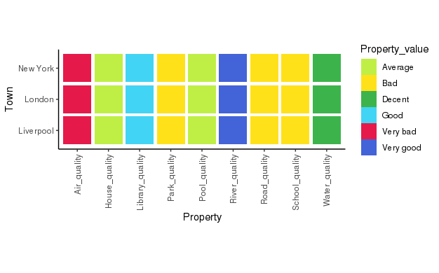
I am trying to create a 'likeliness plot' intended to quickly show an items likeliness vs other items in a table.
A quick example:
'property_data.csv' file to use:
"","Country","Town","Property","Property_value"
"1","UK","London","Road_quality","Bad"
"2","UK","London","Air_quality","Very bad"
"3","UK","London","House_quality","Average"
"4","UK","London","Library_quality","Good"
"5","UK","London","Pool_quality","Average"
"6","UK","London","Park_quality","Bad"
"7","UK","London","River_quality","Very good"
"8","UK","London","Water_quality","Decent"
"9","UK","London","School_quality","Bad"
"10","UK","Liverpool","Road_quality","Bad"
"11","UK","Liverpool","Air_quality","Very bad"
"12","UK","Liverpool","House_quality","Average"
"13","UK","Liverpool","Library_quality","Good"
"14","UK","Liverpool","Pool_quality","Average"
"15","UK","Liverpool","Park_quality","Bad"
"16","UK","Liverpool","River_quality","Very good"
"17","UK","Liverpool","Water_quality","Decent"
"18","UK","Liverpool","School_quality","Bad"
"19","USA","New York","Road_quality","Bad"
"20","USA","New York","Air_quality","Very bad"
"21","USA","New York","House_quality","Average"
"22","USA","New York","Library_quality","Good"
"23","USA","New York","Pool_quality","Average"
"24","USA","New York","Park_quality","Bad"
"25","USA","New York","River_quality","Very good"
"26","USA","New York","Water_quality","Decent"
"27","USA","New York","School_quality","Bad"
Code:
prop <- read.csv('property_data.csv')

Property_col_vector <- c("NA" = "#e6194b",
                "Very bad" = "#e6194B",
                "Bad" = "#ffe119",
                "Average" = "#bfef45",
                "Decent" = "#3cb44b",
                "Good" = "#42d4f4",
                "Very good" = "#4363d8")

plot_likeliness <- function(town_property_table){
    g <- ggplot(town_property_table, aes(Property, Town)) +
      geom_tile(aes(fill = Property_value, width=.9, height=.9)) +
      theme_classic() +
      theme(axis.text.x = element_text(angle = 90, hjust = 1, vjust=0.5),
            strip.text.y = element_text(angle = 0)) +
      scale_fill_manual(values = Property_col_vector) +
      coord_fixed()
    return(g)
}

summary_town_plot <- plot_likeliness(prop)
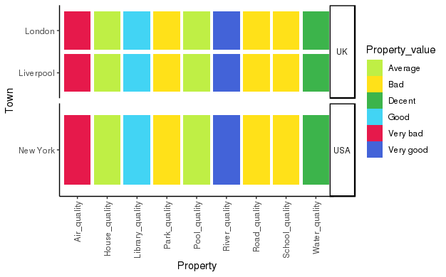
This is looking great! Now I've created a plot that looks nice because I used the coord_fixed() function, but now I want to create the same plot, facetted by Country.
To do this I created the following function:
plot_likeliness_facetted <- function(town_property_table){
  g <- ggplot(town_property_table, aes(Property, Town)) +
    geom_tile(aes(fill = Property_value, width=.9, height=.9)) +
    theme_classic() +
    theme(axis.text.x = element_text(angle = 90, hjust = 1, vjust=0.5),
          strip.text.y = element_text(angle = 0)) +
    scale_fill_manual(values = Property_col_vector) +
    facet_grid(Country ~ .,
               scale = 'free_y')
  return(g)
}

facetted_town_plot <- plot_likeliness_facetted(prop)
facetted_town_plot
However, now my tiles are stretched and if i try to use '+ coords_fixed()' I get the error:
Error: coord_fixed doesn't support free scales
How can I get the plot to facet, but maintain the aspect ratio ? Please note that I'm plotting these in a series, so hardcoding the heights of the plot with manual values is not a solution I'm after, I need something that dynamically scales with the amount of values in the table.
Many thanks for any help!
Edit: Although the same question was asked in slightly different context elsewhere, it had multiple answers with none marked as solving the question.


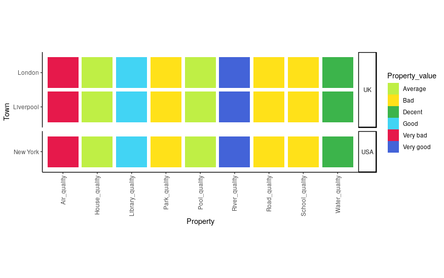
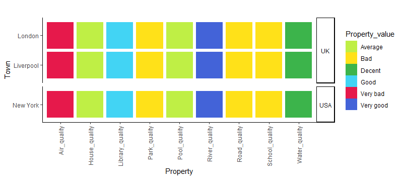
space = "free_y"tofacet_grid– Whitencoord_*do not play well withfacet_*. See github.com/tidyverse/ggplot2/issues/1492 – Whiten+ facet_grid(Country ~ ., scales="free_y", space="free_y"). Still not compatible withcoord_fixed()but it's a minor improvement in my opinion. – Montagueggsave("test.png", plot=facetted_town_plot, units="in", width=6.5, height=0.5 * length(unique(prop$Town)) + 1.2)– Montague