r heatmap - stat_density2d (ggmap) vs. addHeatmap (shiny leaflet)
Asked Answered
B

3

6

I made static heatmaps with the library(ggmap) and the stat_density2d() function. Looking to recreate this in a shiny app on a dynamic leaflet map, I found addHeatmap(). However, the resulting images are dissimilar, with the ggmap version seemingly offering the correct result.

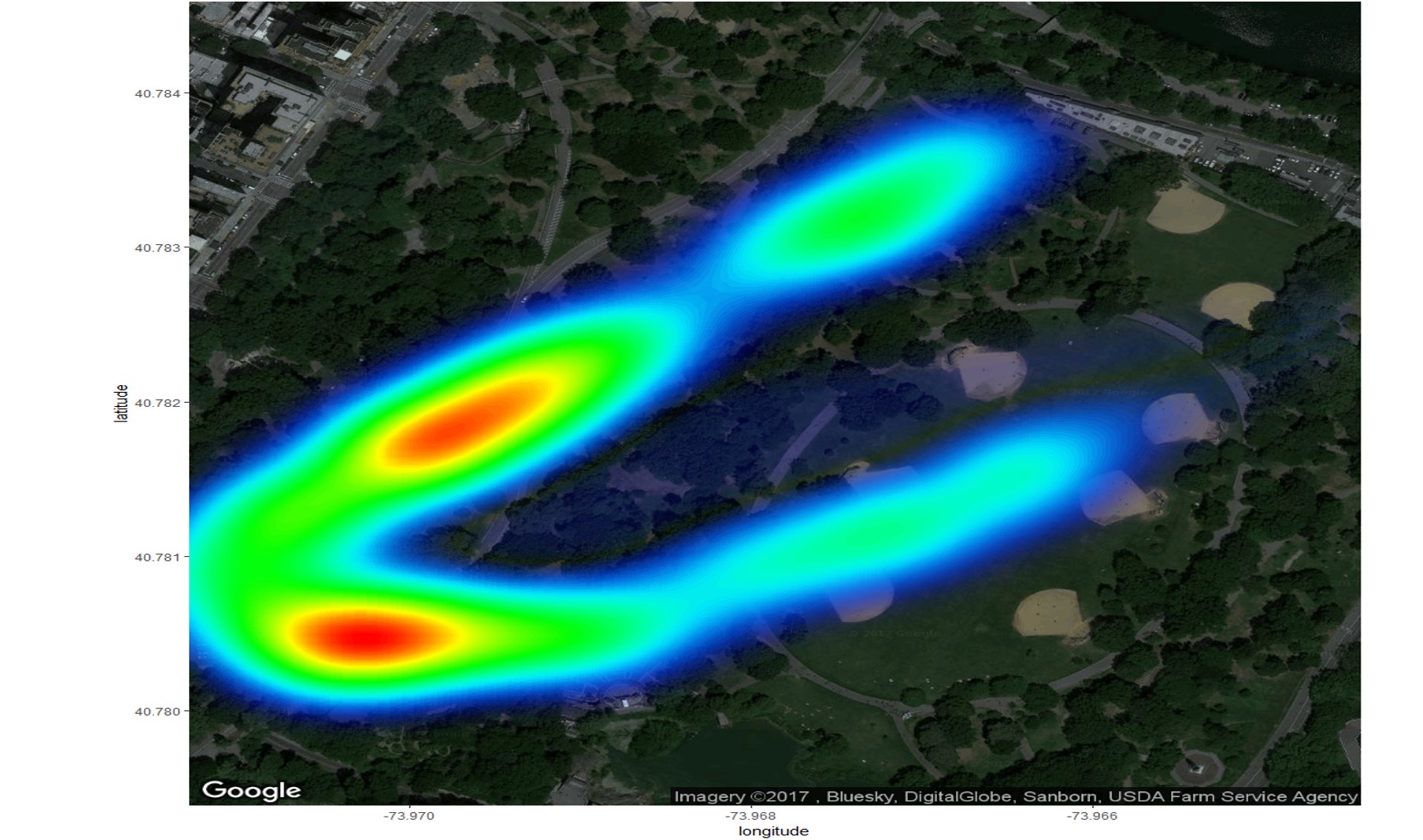
GGMAP

Heatmap on ggmap

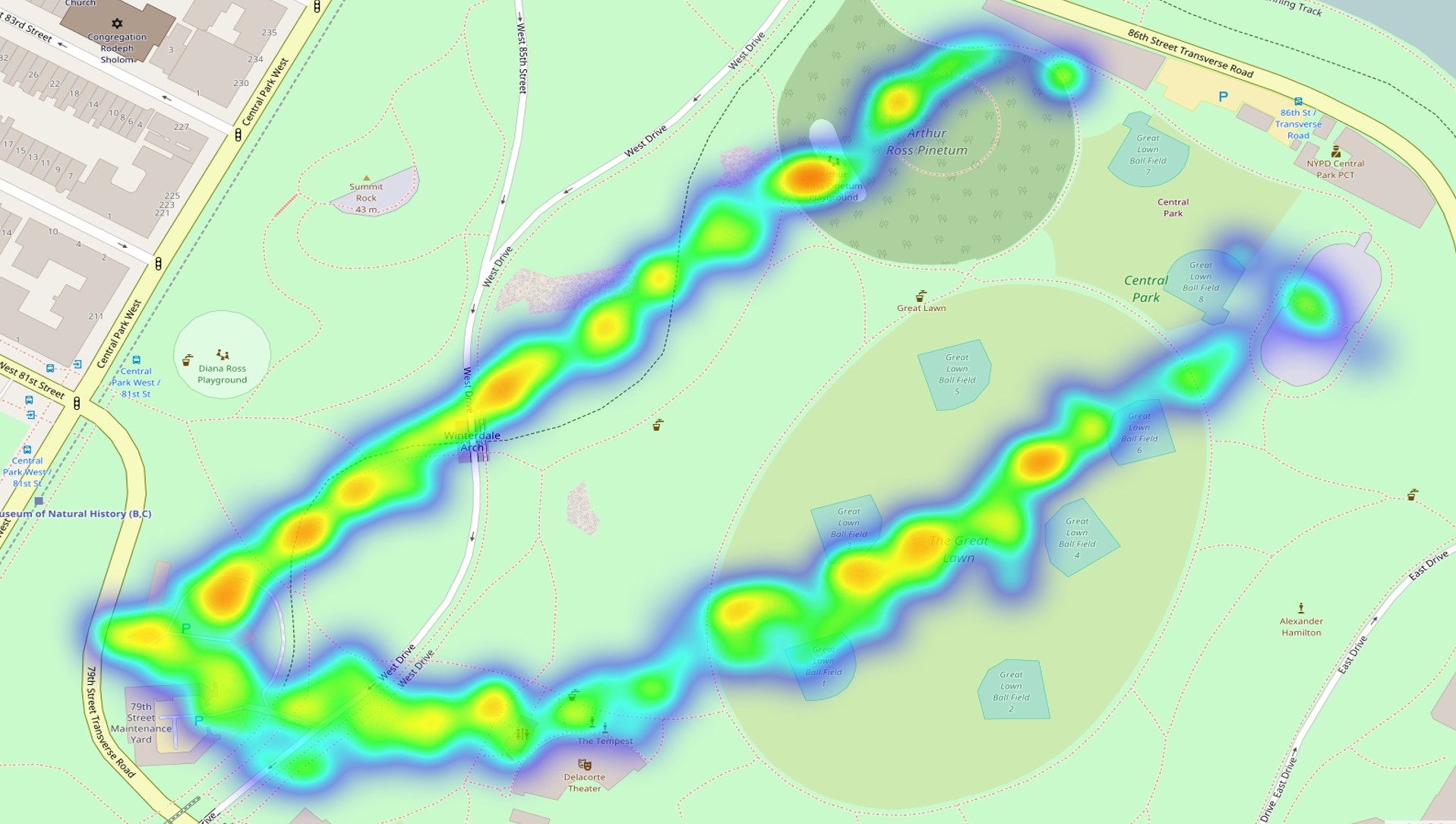
LEAFLET

Heatmap on leaflet

What is causing this difference?

To run both of the below reproducible examples, you can download some data (csv file) I put here. https://drive.google.com/drive/folders/0B8_GTHBuoKSRR1VIRmhOUTJKYU0?usp=sharing

Note that the leaflet result differs with zoom level, but never matches the ggmap result (e.g. in terms location of maximum heat).

This is the ggmap code.

library(ggmap)
data <- read.csv("DATA.csv", sep=";")
data <- subset(data, !is.na(CrdLatDeg))
xmin <- min(data$CrdLonDeg)
xmax <- max(data$CrdLonDeg)
ymin <- min(data$CrdLatDeg)
ymax <- max(data$CrdLatDeg)
lon <- c(xmin,xmax)
lat <- c(ymin,ymax)
map <- get_map(location = c(lon = mean(lon), lat = mean(lat)), zoom = 17,
               maptype = "satellite", source = "google")
ggmap(map) + 
  labs(x="longitude", y="latitude") + 
  stat_density2d(data=data, aes(x=CrdLonDeg, y=CrdLatDeg, alpha= ..level.., fill= ..level..), colour=FALSE,
                 geom="polygon", bins=100) + 
  scale_fill_gradientn(colours=c(rev(rainbow(100, start=0, end=.7)))) + scale_alpha(range=c(0,.8)) + 
  guides(alpha=FALSE,fill=FALSE)

This is the leaflet code.

library(leaflet.extras)
data <- read.csv("DATA.csv", sep=";")
data <- subset(data, !is.na(CrdLatDeg))
leaflet(data) %>%
  addTiles(group="OSM") %>%
  addHeatmap(group="heat", lng=~CrdLonDeg, lat=~CrdLatDeg, max=.6, blur = 60)
Blissful answered 25/6, 2017 at 18:31 Comment(8)
How do the images look like? It's difficult to tell the difference without looking at them.Ardel
@IvanSanchez: I provided data and code, so you should be able to produce the images yourself? I am not (yet) allowed to embed images here, so I uploaded the image results to the same link where I put the data.Blissful
Personally I know Leaflet and heatmap algorithms but don't know the first thing about R. Also running the examples means spending time running the examples. Having the data and code is a very good thing to do, but if you can, you should make it easier for others to see the problem. If you upload the images somewhere, I'll be able to edit your post and include them.Ardel
Well, like I said, they are behind that same Google Drive link. Thank you for your time.Blissful
Well, you actually did not mention that the google drive link had the images, at least when I read this :-PArdel
I added the images. Sorry for the confusion :-)Ardel
Thanks for that!Blissful
I haven't tried this, but this answer on GIS: gis.stackexchange.com/questions/168886/… uses the same function as what's used in stat_density2d() (which is MASS::bandwidth.nrd()), although it does use polygons.Selaginella
A
7

The images look different because the algorithms are different.

stat_density2d() extrapolates a probability density function from the discrete data.

Leaflet implementation of heatmaps rely on libraries like simpleheat, heatmap.js or webgl-heatmap. These heatmaps do not rely on probability density. (I'm not fully sure which of these is used by r-leaflet's addHeatmap).

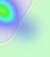
Instead, these heatmaps work by drawing a blurred circle for each point, raising the value of each pixel by an amount directly proportional to the intensity of the point (constant in your case), and inversely proportional to the distance between the point and the circle. Every data point is shown in the heatmap as a circle. You can see this by playing with your mouse cursor in the heatmap.js webpage, or by looking at this lone point in the top-right of your image:

heatmap of a lone point

Think of a heatmap like a visualization of the function

f(pixel) = ∑ ( max( 0, radius - distance(pixel, point) ) · intensity(point) )

One can tweak the radius and intensity of heatmaps, but the result will never be the same as a statistical density estimation.

Ardel answered 26/6, 2017 at 9:0 Comment(2)
Thanks! Then I guess I will use addPolygons and use the calculated density estimation.Blissful
can you please take a look at my question? #66513044 thanksSharitasharity
S
6

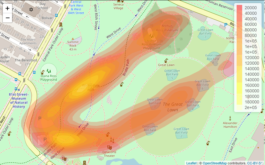
I've found this answer over at GIS, and I've attempted to create a function and applied it to this case. I haven't figured out how to finetune the colour gradient scheme as of yet, but it seems like a good first start otherwise:

library(leaflet)
library(rlang)

addHeatMap <- function(data, lon, lat, intensity, show.legend, ...) {
  df <- data.table::as.data.table(data)
  df_expanded <- dplyr::slice(df, rep(1:dplyr::n(), times = !! enquo(intensity)))

  lon_var <- dplyr::pull(df_expanded, !! enquo(lon))
  lat_var <- dplyr::pull(df_expanded, !! enquo(lat))

  lon_bw <- MASS::bandwidth.nrd(lon_var)
  lat_bw <- MASS::bandwidth.nrd(lat_var)

  lon_lat_df <- dplyr::select(df_expanded, !! enquo(lon), !! enquo(lat))

  kde <- KernSmooth::bkde2D(lon_lat_df, bandwidth = c(lon_bw, lat_bw))
  CL <- contourLines(kde$x1 , kde$x2 , kde$fhat)
  LEVS <- as.factor(sapply(CL, `[[`, "level"))
  NLEV <- nlevels(LEVS)
  pgons <- lapply(1:length(CL), function(i)
  sp::Polygons(list(sp::Polygon(cbind(CL[[i]]$x, CL[[i]]$y))), ID = i))
  spgons <- sp::SpatialPolygons(pgons)

  if (show.legend) {
    leaflet::addPolygons(data = spgons, color = heat.colors(NLEV, NULL)[LEVS], stroke = FALSE, ...) %>% 
      leaflet::addLegend(colors = heat.colors(NLEV, NULL)[LEVS], labels = LEVS)
    } else {
    leaflet::addPolygons(data = spgons, color = heat.colors(NLEV, NULL)[LEVS], stroke = FALSE, ...)
    }
}

mydata <- read.csv("DATA.csv", sep=";")
mydata <- subset(mydata, !is.na(CrdLatDeg))

leaflet() %>%
  addTiles(group = "OSM") %>%
  addHeatMap(data = mydata, lon = CrdLonDeg, lat = CrdLatDeg, intensity = FsmIdf, show.legend = TRUE)

enter image description here

Selaginella answered 3/7, 2018 at 23:56 Comment(8)
Can you check agan your funcition I'm trying to reproduce it but I don't unt¿derstand What is "Intensity" is. the object Fsmdf was no previously declared. Thanks in advanced!Saar
It's a variable in the data file that the OP provided.Selaginella
But What kind of variable is?It is an ID? What role plays in order to create the Heatmap?Saar
It's whatever the OP wanted to focus the level of "heat" intensity on that specific lat/lon point. I don't know what that variable otherwise represents.Selaginella
@Phil: your code is amazing! Do darker colors here represent larger values of the variable"fsmidf"? Is it possible to add a legend that indicates the association with color and ranges of "fsmidf"?Sharitasharity
Thanks, I've edited it to add a legend. The larger values in the variable are represented by lighter colours.Selaginella
can you please take a look at my question? #66513044 thanksSharitasharity
Hi, amazing code! Question: is it possible to scale the values so they represent, for example the average FsmIdf? At the moment, it's hard to understand the exact meaning of the legend. (The smallest value in the legend is 20k, but hte largest value in your file is it says 4000 but the values in the file is about 3k...)Sayyid
A
1

Both use a different algorithm. You need to tweak the radius and blur arguments of addHeatmap and the h argument of stat_density2d to get somewhat similar results.

Acicular answered 26/6, 2017 at 8:53 Comment(1)
Well, I've been tweaking quite a bit, but they never look alike at all. I want a leaflet option that shows the density of points. This does not seem to happen with my current use of addHeatmap, as it highlights areas with less than maximal density with the warmest colour (red), seemingly regardless of the values supplied to the arguments.Blissful

© 2022 - 2024 — McMap. All rights reserved.