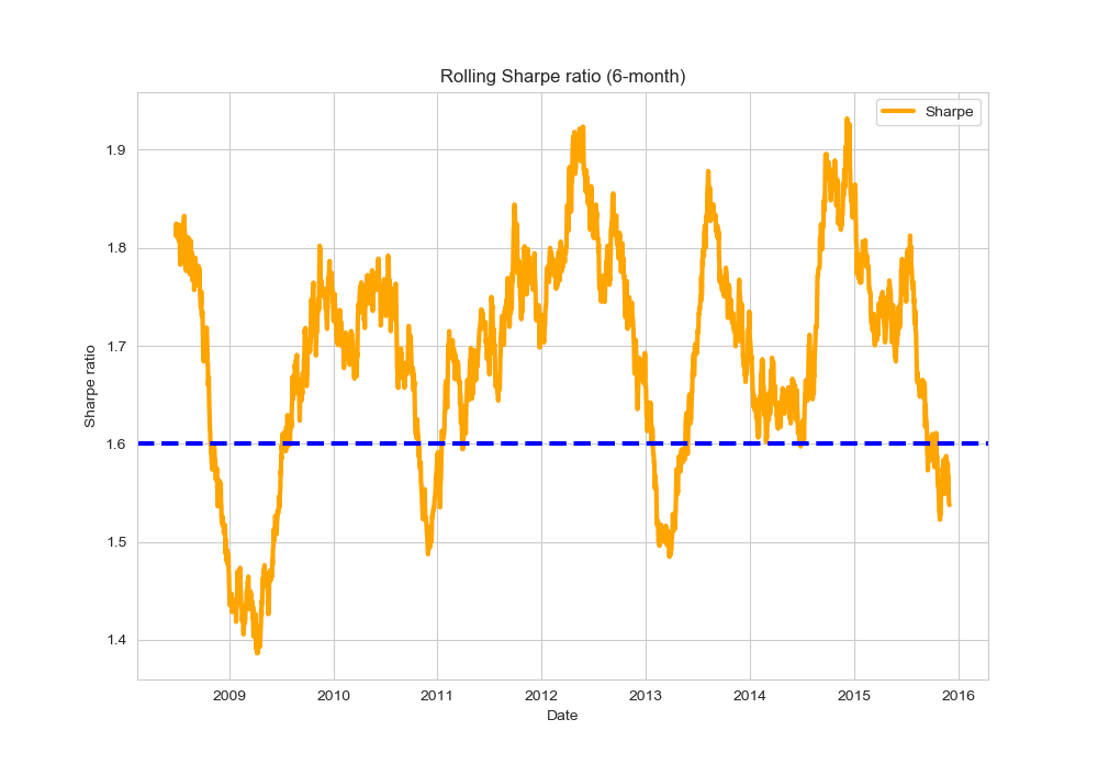
I am trying to generate a plot of the 6-month rolling Sharpe ratio using Python with Pandas/NumPy.
My input data is below:
import pandas as pd
import numpy as np
import matplotlib.pyplot as plt
import seaborn as sns
sns.set_style("whitegrid")

# Generate sample data
d = pd.date_range(start='1/1/2008', end='12/1/2015')
df = pd.DataFrame(d, columns=['Date'])
df['returns'] = np.random.rand(d.size, 1)
df = df.set_index('Date')
print(df.head(20))

             returns
Date
2008-01-01  0.232794
2008-01-02  0.957157
2008-01-03  0.079939
2008-01-04  0.772999
2008-01-05  0.708377
2008-01-06  0.579662
2008-01-07  0.998632
2008-01-08  0.432605
2008-01-09  0.499041
2008-01-10  0.693420
2008-01-11  0.330222
2008-01-12  0.109280
2008-01-13  0.776309
2008-01-14  0.079325
2008-01-15  0.559206
2008-01-16  0.748133
2008-01-17  0.747319
2008-01-18  0.936322
2008-01-19  0.211246
2008-01-20  0.755340
What I want
The type of plot I am trying to produce is this or the first plot from here (see below).

My attempt
Here is the equation I am using:
def my_rolling_sharpe(y):
    return np.sqrt(126) * (y.mean() / y.std()) # 21 days per month X 6 months = 126

# Calculate rolling Sharpe ratio
df['rs'] = calc_sharpe_ratio(df['returns'])

fig, ax = plt.subplots(figsize=(10, 3))
df['rs'].plot(style='-', lw=3, color='indianred', label='Sharpe')\
        .axhline(y = 0, color = "black", lw = 3)

plt.ylabel('Sharpe ratio')
plt.legend(loc='best')
plt.title('Rolling Sharpe ratio (6-month)')
fig.tight_layout()
plt.show()
The problem is that I am getting a horizontal line since my function is giving a single value for the Sharpe ratio. This value is the same for all the Dates. In the example plots, they appear to be showing many ratios.
Question
Is it possible to plot a 6-month rolling Sharpe ratio that changes from one day to the next?


