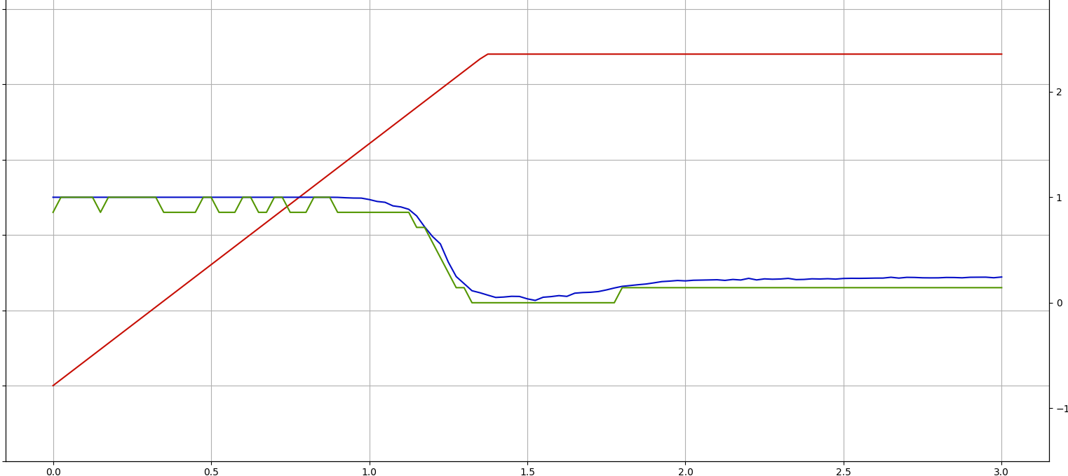
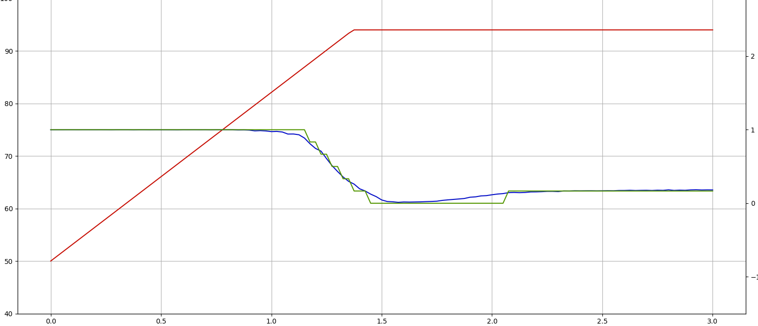
How do I discretize a continuous function avoiding noise generation (see picture)
Asked Answered
S

2

0

I have a continuous input function which I would like to discretize into lets say 5-10 discrete bins between 1 and 0. Right now I am using np.digitize and rescale the output bins to 0-1. Now the problem is that sometime datasets (blue line) yield results like this:

Ugly/noisy discretization where especially in the beginning the code creates unnecessary noise

I tried pushing up the number of discretization bins but I ended up keeping the same noise and getting just more increments. As an example where the algorithm worked with the same settings but another dataset:

Same code but more desired results

this is the code I used there NumOfDisc = number of bins

intervals = np.linspace(0,1,NumOfDisc)
discretized_Array = np.digitize(Continuous_Array, intervals)

The red ilne in the graph is not important. The continuous blue line is the on I try to discretize and the green line is the discretized result.The Graphs are created with matplotlyib.pyplot using the following code:

def CheckPlots(discretized_Array, Continuous_Array, Temperature, time, PlotName)
logging.info("Plotting...")

#Setting Axis properties and titles
fig, ax = plt.subplots(1, 1)
ax.set_title(PlotName)
ax.set_ylabel('Temperature [°C]')
ax.set_ylim(40, 110)
ax.set_xlabel('Time [s]')    
ax.grid(b=True, which="both")
ax2=ax.twinx()
ax2.set_ylabel('DC Power [%]')
ax2.set_ylim(-1.5,3.5)

#Plotting stuff
ax.plot(time, Temperature, label= "Input Temperature", color = '#c70e04')
ax2.plot(time, Continuous_Array, label= "Continuous Power", color = '#040ec7')
ax2.plot(time, discretized_Array, label= "Discrete Power", color = '#539600')

fig.legend(loc = "upper left", bbox_to_anchor=(0,1), bbox_transform=ax.transAxes)

logging.info("Done!")
logging.info("---")
return 

Any Ideas what I could do to get sensible discretizations like in the second case?

Shaftesbury answered 13/12, 2021 at 8:1 Comment(7)
Could you add a minimal reproducible problem?Acknowledgment
I am terribly sorry but I don't understand what you mean by thatShaftesbury
No problem, could you add a piece of code you can copy paste to get the graphs you show here? That way it's easier for other people to try and puts around with itAcknowledgment
I updated the question. Better now?Shaftesbury
Kindly notice that you are supposed to know what a minimal reproducible example is before posting.Merri
I read through the article you provided. Does this mean I should somehow make a csv file available that has the continuous data stored inside?Shaftesbury
To me it looks like there's nothing wrong with the method, but that your Continuous_Array fluctuates very near the border of 2 bins. Tiny dips in the Continuous_Array are exaggerated in the discretized_Array by being mapped to the bin one below.Hebrews
H
0

The following solution gives the exact result you need.

Basically, the algorithm finds an ideal line, and attempts to replicate it as well as it can with less datapoints. It starts with 2 points at the edges (straight line), then adds one in the center, then checks which side has the greatest error, and adds a point in the center of that, and so on, until it reaches the desired bin count. Simple :)

import warnings
warnings.simplefilter('ignore', np.RankWarning)


def line_error(x0, y0, x1, y1, ideal_line, integral_points=100):
    """Assume a straight line between (x0,y0)->(x1,p1). Then sample the perfect line multiple times and compute the distance."""
    straight_line = np.poly1d(np.polyfit([x0, x1], [y0, y1], 1))
    xs = np.linspace(x0, x1, num=integral_points)
    ys = straight_line(xs)

    perfect_ys = ideal_line(xs)
    
    err = np.abs(ys - perfect_ys).sum() / integral_points * (x1 - x0)  # Remove (x1 - x0) to only look at avg errors
    return err


def discretize_bisect(xs, ys, bin_count):
    """Returns xs and ys of discrete points"""
    # For a large number of datapoints, without loss of generality you can treat xs and ys as bin edges
    # If it gives bad results, you can edges in many ways, e.g. with np.polyline or np.histogram_bin_edges
    ideal_line = np.poly1d(np.polyfit(xs, ys, 50))
    
    new_xs = [xs[0], xs[-1]]
    new_ys = [ys[0], ys[-1]]
    
    while len(new_xs) < bin_count:
        
        errors = []
        for i in range(len(new_xs)-1):
            err = line_error(new_xs[i], new_ys[i], new_xs[i+1], new_ys[i+1], ideal_line)
            errors.append(err)

        max_segment_id = np.argmax(errors)
        new_x = (new_xs[max_segment_id] + new_xs[max_segment_id+1]) / 2
        new_y = ideal_line(new_x)
        new_xs.insert(max_segment_id+1, new_x)
        new_ys.insert(max_segment_id+1, new_y)

    return new_xs, new_ys


BIN_COUNT = 25

new_xs, new_ys = discretize_bisect(xs, ys, BIN_COUNT)

plot_graph(xs, ys, new_xs, new_ys, f"Discretized and Continuous comparison, N(cont) = {N_MOCK}, N(disc) = {BIN_COUNT}")
print("Bin count:", len(new_xs))

Moreover, here's my simplified plotting function I tested with.

def plot_graph(cont_time, cont_array, disc_time, disc_array, plot_name):
    """A simplified version of the provided plotting function"""
    
    # Setting Axis properties and titles
    fig, ax = plt.subplots(figsize=(20, 4))
    ax.set_title(plot_name)
    ax.set_xlabel('Time [s]')
    ax.set_ylabel('DC Power [%]')

    # Plotting stuff
    ax.plot(cont_time, cont_array, label="Continuous Power", color='#0000ff')
    ax.plot(disc_time, disc_array, label="Discrete Power",   color='#00ff00')

    fig.legend(loc="upper left", bbox_to_anchor=(0,1), bbox_transform=ax.transAxes)

Lastly, here's the Google Colab

Hellenic answered 13/12, 2021 at 16:19 Comment(1)
Thank you very much!!Shaftesbury
H
1

If what I described in the comments is the problem, there are a few options to deal with this:

  1. Do nothing: Depending on the reason you're discretizing, you might want the discrete values to reflect the continuous values accurately
  2. Change the bins: you could shift the bins or change the number of bins, such that relatively 'flat' parts of the blue line stay within one bin, thus giving a flat green line in these parts as well, which would be visually more pleasing like in your second plot.
Hebrews answered 13/12, 2021 at 14:22 Comment(5)
1. Is no an option because the values need to be discretized 2. I treid this one but for some reason incresing the number of bins did not help... Right now I'm trying a new idea where I first hardcode the two constant lines in the beginning and the end and then I try to use the np.digitize function only on the remaining dynamic part inbetween the two constant valuesShaftesbury
Sorry, maybe I didn't explain the 1st option well, but what I meant was discretize the way you did, then do nothing else and accept that the method gives you a shaky green line. I didn't mean: "do not discretize it".Hebrews
Also, I see that Morton's solution works very well, but it does not do the same as mapping the y-values of a continuous function into X bins. If Morton's solution is indeed what you wanted, great! If not I could update my answer to explain what I mean in more detail. Let me know!Hebrews
Actually you are right. Mortons solution is great and it'ts very elaborate and extensive but it does not really map the continuous input into discrete bins. I spend sime time thinking about how to further improve this and I hardcoded the constant regions in the beginning as well as in the end since these are always the same (by design of the experiment) and applied my discretization method. The result was a bit better but still not perfect.Shaftesbury
I then changed in the code how the intervals are created to intervals = np.arange(min,max,0.05) where min and max are the highest and lowest value and 0.05 is the stepsize.Shaftesbury
H
0

The following solution gives the exact result you need.

Basically, the algorithm finds an ideal line, and attempts to replicate it as well as it can with less datapoints. It starts with 2 points at the edges (straight line), then adds one in the center, then checks which side has the greatest error, and adds a point in the center of that, and so on, until it reaches the desired bin count. Simple :)

import warnings
warnings.simplefilter('ignore', np.RankWarning)


def line_error(x0, y0, x1, y1, ideal_line, integral_points=100):
    """Assume a straight line between (x0,y0)->(x1,p1). Then sample the perfect line multiple times and compute the distance."""
    straight_line = np.poly1d(np.polyfit([x0, x1], [y0, y1], 1))
    xs = np.linspace(x0, x1, num=integral_points)
    ys = straight_line(xs)

    perfect_ys = ideal_line(xs)
    
    err = np.abs(ys - perfect_ys).sum() / integral_points * (x1 - x0)  # Remove (x1 - x0) to only look at avg errors
    return err


def discretize_bisect(xs, ys, bin_count):
    """Returns xs and ys of discrete points"""
    # For a large number of datapoints, without loss of generality you can treat xs and ys as bin edges
    # If it gives bad results, you can edges in many ways, e.g. with np.polyline or np.histogram_bin_edges
    ideal_line = np.poly1d(np.polyfit(xs, ys, 50))
    
    new_xs = [xs[0], xs[-1]]
    new_ys = [ys[0], ys[-1]]
    
    while len(new_xs) < bin_count:
        
        errors = []
        for i in range(len(new_xs)-1):
            err = line_error(new_xs[i], new_ys[i], new_xs[i+1], new_ys[i+1], ideal_line)
            errors.append(err)

        max_segment_id = np.argmax(errors)
        new_x = (new_xs[max_segment_id] + new_xs[max_segment_id+1]) / 2
        new_y = ideal_line(new_x)
        new_xs.insert(max_segment_id+1, new_x)
        new_ys.insert(max_segment_id+1, new_y)

    return new_xs, new_ys


BIN_COUNT = 25

new_xs, new_ys = discretize_bisect(xs, ys, BIN_COUNT)

plot_graph(xs, ys, new_xs, new_ys, f"Discretized and Continuous comparison, N(cont) = {N_MOCK}, N(disc) = {BIN_COUNT}")
print("Bin count:", len(new_xs))

Moreover, here's my simplified plotting function I tested with.

def plot_graph(cont_time, cont_array, disc_time, disc_array, plot_name):
    """A simplified version of the provided plotting function"""
    
    # Setting Axis properties and titles
    fig, ax = plt.subplots(figsize=(20, 4))
    ax.set_title(plot_name)
    ax.set_xlabel('Time [s]')
    ax.set_ylabel('DC Power [%]')

    # Plotting stuff
    ax.plot(cont_time, cont_array, label="Continuous Power", color='#0000ff')
    ax.plot(disc_time, disc_array, label="Discrete Power",   color='#00ff00')

    fig.legend(loc="upper left", bbox_to_anchor=(0,1), bbox_transform=ax.transAxes)

Lastly, here's the Google Colab

Hellenic answered 13/12, 2021 at 16:19 Comment(1)
Thank you very much!!Shaftesbury

© 2022 - 2024 — McMap. All rights reserved.