R: Plotting panel model predictions using plm & pglm
Asked Answered
T

2

5

I've created two regression models using a linear panel model with plm, and a generalized panel model using poisson with the pglm package.

library(plm); library(pglm)
data(Unions)  # from pglm-package
punions <- pdata.frame(Unions, c("id", "year"))

fit1 <- plm(wage ~ exper + rural + married, data=punions, model="random")
fit2 <- pglm(wage ~ exper + rural + married, data=punions, model="random", family="poisson")

I now want to compare the two fits graphically by plotting the fitted values in a set of scatterplots. Preferably along these lines using ggplot2:

library(ggplot2)
ggplot(punions, aes(x=exper, y=wage)) +
    geom_point() +
    facet_wrap(rural ~ married)

I considered simply using ggplot2's stat_smooth(), but (perhaps unsurprisingly) it doesn't seem to recognize the panel format of my data. Manually extracting the predicted values with predict also does not seem to work for the pglm-model.

How do I overlay the predicted values for my two panel models in this plot?

Territorialism answered 12/8, 2015 at 0:13 Comment(2)
The examples in the middle of this doc page may be useful to you.Brnaby
What are your random effects? Individuals?Frenchify
F
8

Similar to @mtoto, I am also not familiar with either library(plm) or library(pglm). But the predict method for plm is available, it's just not exported. Edit: For models produced by plm::plm(), there is a predict method available since plm CRAN release version 2.6-2. pglm does not have a predict method.

R> methods(class= "plm")
[1] ercomp          fixef           has.intercept   model.matrix    pFtest          plmtest         plot            pmodel.response
 [9] pooltest        predict         residuals       summary         vcovBK          vcovHC          vcovSCC        
R> methods(class= "pglm")
no methods found

Of note, I do not understand why you are using a Poisson model for the wage data. It's clearly not a Poisson distribution since it takes non-integer values (below). You could try a negative binomial if you wish, though I'm not sure that's available with random effects. But you could use MASS::glm.nb for instance.

> quantile(Unions$wage, seq(0,1,.1))
         0%         10%         20%         30%         40%         50%         60%         70%         80%         90%        100% 
 0.02790139  2.87570334  3.54965422  4.14864865  4.71605855  5.31824370  6.01422463  6.87414349  7.88514525  9.59904809 57.50431282

Solution 1: use plm

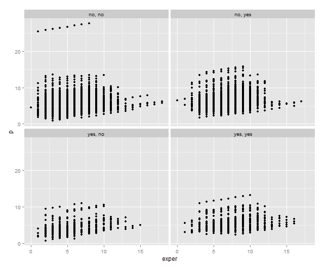
punions$p <- predict(fit1, punions)

ggplot(punions, aes(x=exper, y=p)) +
  geom_point() +
  facet_wrap(rural ~ married) 

Solution 2 - lme4

Alternatively, you can get similar fits from the lme4 package, which does have a predict method defined:

library(lme4)
Unions$id <- factor(Unions$id)
fit3 <- lmer(wage ~ exper + rural + married + (1|id), data= Unions)
# not run:
fit4 <- glmer(wage ~ exper + rural + married + (1|id), data= Unions, family= poisson(link= "log"))

R> fit1$coefficients
(Intercept)       exper    ruralyes  marriedyes 
  3.7467469   0.3088949  -0.2442846   0.4781113 
R>  fixef(fit3)
(Intercept)       exper    ruralyes  marriedyes 
  3.7150302   0.3134898  -0.1950361   0.4592975 

I haven't run the poisson models because it's clearly incorrectly specified. You could do some sort of variable transformation to handle it or perhaps a negative binomial. In any case, let's finish the example:

# this has RE for individuals, so you do see dispersion based on the RE
Unions$p <- predict(fit3, Unions)
ggplot(Unions, aes(x=exper, y=p)) +
    geom_point() +
    facet_wrap(rural ~ married)

enter image description here

Frenchify answered 14/12, 2015 at 19:0 Comment(1)
For models produced by plm::plm(), there is a predict method available since plm version 2.6-2.Demurral
L
2

I am not familiar with the pglm package, but there seems to be no function similar to predict() that will generate a vector of future values from a data frame.

In all other cases (which should be all tbh), you can easily plot this in ggplot, even using facet wrap. You simply add the predictions to the data frame as new column:

punions$pred1 <- predict(fit1,punions,class="lm")

And then add it as an additional geom_line() :

    ggplot() + geom_point(data=punions, aes(x=exper, y=wage)) +
    geom_line(data=punions,aes(x=exper, y= pred1), color = "red") +
    facet_wrap(rural ~ married)
Landgrave answered 12/12, 2015 at 23:7 Comment(0)

© 2022 - 2024 — McMap. All rights reserved.