suitable graph to visualize shift wise ordinal data using PowerBi
Asked Answered
M

1

-1

Need to plot chart for Shift-wise state change data. I plot the stack bar chart using python Jupyter.

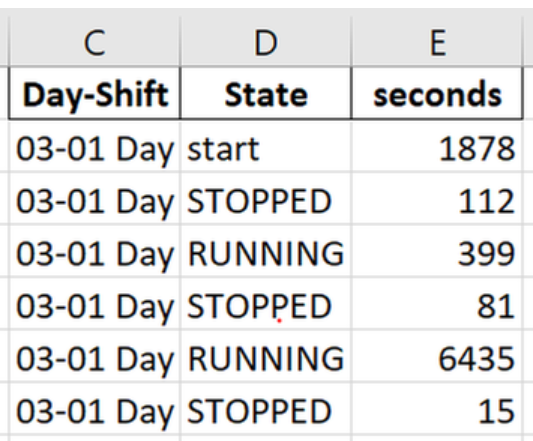
Sample dataset and output from jupyter is shown below.

enter image description here

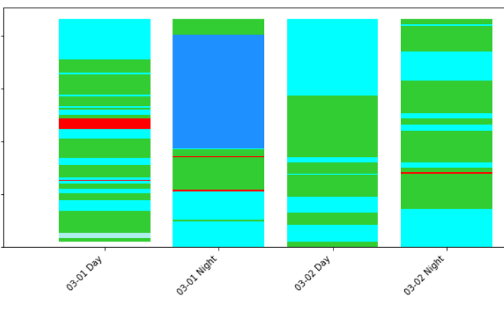
Output:

enter image description here

But when I'm going to plot this using powerbi Stack bar chart. It shows aggregates ,instead of real values.

Ex: 03-01 Day First START >STOPPED> RUNNING>STOPPED and goes on...... In powerBi stack bar shows STOPPED,RUNNING and other states' (aggregate values(summations) instead of real values with order). Is there any way to get the same output as i have got from jupyter notebook.?

Really appreciate your support!!!

Marceau answered 29/3, 2021 at 9:46 Comment(0)
S
1

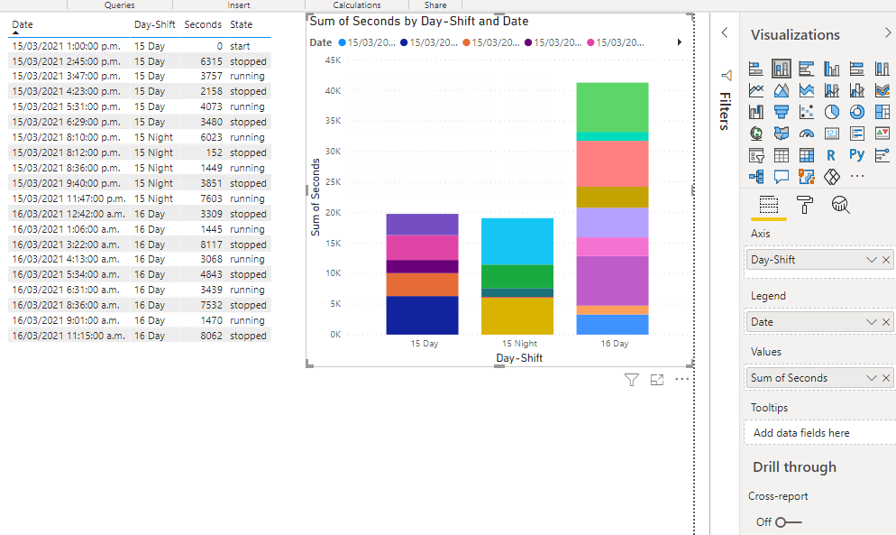
You will need a column with unique values for each data point, like a date/time value. Then use that value into the Legend of the stacked column chart.

That, of course, will not colour code your state values, so that's also not an ideal solution.

But if Python can produce the chart you want, why don't you use that in Power BI??

https://learn.microsoft.com/en-us/power-bi/connect-data/desktop-python-visuals

enter image description here

Sachsen answered 30/3, 2021 at 20:52 Comment(1)
Need to set all my visualization in powerBi. I set this graph using powerBi python script, but it gives the wrong state orderMarceau

© 2022 - 2024 — McMap. All rights reserved.