ggplot2: geom_bar with custom y limits [duplicate]
Asked Answered
T

2

6

I want to draw a bar chart with ggplot2 along with custom y limits.

Type <- LETTERS[1:5]
Y    <- c(99, 99.5, 99.0, 98.8, 98.5)

df <- data.frame(Type, Y)

The following code works fine for bar chart:

library(ggplot2)
ggplot(data = df, mapping = aes(x = Type, y = Y, fill = Type)) +
  geom_bar(stat = "identity") +
  theme_bw()

However, I'm not able to set the y limits. See the code below.

ggplot(data = df, mapping = aes(x = Type, y = Y, fill = Type)) +
  geom_bar(stat = "identity") +
  scale_y_continuous(limits = c(90, 100)) + 
  theme_bw()

ggplot(data = df, mapping = aes(x = Type, y = Y, fill = Type)) +
  geom_bar(stat = "identity") +
  ylim(90, 100) + 
  theme_bw()

Edited

I guess this behavior is due to stat = "identity".

Treasurer answered 23/12, 2017 at 8:42 Comment(2)
I don't know if this is possible as geom_bar goes from 0 to y (its like inserting break in y axis). Why not to plot geom_point?Karwan
Thanks @PoGibas for your comment. Yes, geom_point could be another possibility. However, I want to show these points throw bars. Any thought.Treasurer
K
5

Solution using geom_rect() instead of geom_bar():

# Generate data
Type <- LETTERS[1:5]
Y    <- c(99, 99.5, 99.0, 98.8, 98.5)
df   <- data.frame(Type, Y)

# Plot data
library(ggplot2)
ggplot() +
    geom_rect(data = df, 
              aes(xmin = as.numeric(Type) - 0.3, 
                  xmax = as.numeric(Type) + 0.3, 
                  ymin = 90, ymax = Y,
                  fill = Type)) +
    scale_x_continuous(label = df$Type, breaks = 1:nrow(df))

In geom_rect() specify x coordinates as as.numeric(X) -/+ value; ymin coordinates as wanted lower limit and ymax as actual Y values.

enter image description here

Karwan answered 23/12, 2017 at 8:56 Comment(3)
Thanks @PoGibas for useful answer. Would highly appreciate if you help me to remove the blank space below the rectangles so that y should start from 90. ThanksTreasurer
@Treasurer you mean space between rectangles and ticks?Karwan
yes the extra space between rectangles and x ticks.Treasurer
S
10

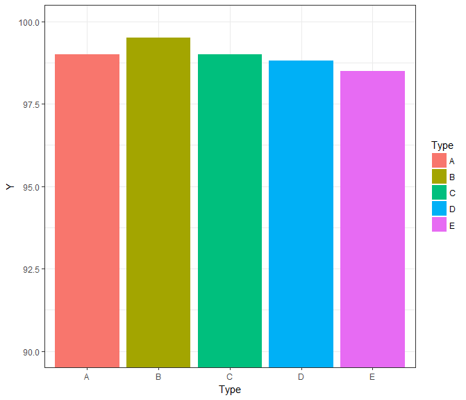
Alternative, using coord_cartesian:

ggplot(data = df, mapping = aes(x = Type, y = Y, fill = Type)) +
  geom_bar(stat = "identity") +
  coord_cartesian(ylim = c(90, 100)) + 
  theme_bw()

Gives you:

enter image description here

Sievert answered 23/12, 2017 at 9:13 Comment(3)
This solution is more appealing. Thanks @Luke C for your nice answer.Treasurer
This is what I was looking for with coord_cartesian(ylim = range(df$Y)).Treasurer
@Treasurer - Good call, that's pretty slick.Sievert
K
5

Solution using geom_rect() instead of geom_bar():

# Generate data
Type <- LETTERS[1:5]
Y    <- c(99, 99.5, 99.0, 98.8, 98.5)
df   <- data.frame(Type, Y)

# Plot data
library(ggplot2)
ggplot() +
    geom_rect(data = df, 
              aes(xmin = as.numeric(Type) - 0.3, 
                  xmax = as.numeric(Type) + 0.3, 
                  ymin = 90, ymax = Y,
                  fill = Type)) +
    scale_x_continuous(label = df$Type, breaks = 1:nrow(df))

In geom_rect() specify x coordinates as as.numeric(X) -/+ value; ymin coordinates as wanted lower limit and ymax as actual Y values.

enter image description here

Karwan answered 23/12, 2017 at 8:56 Comment(3)
Thanks @PoGibas for useful answer. Would highly appreciate if you help me to remove the blank space below the rectangles so that y should start from 90. ThanksTreasurer
@Treasurer you mean space between rectangles and ticks?Karwan
yes the extra space between rectangles and x ticks.Treasurer

© 2022 - 2024 — McMap. All rights reserved.