Problem : When Plotting Multiple Histograms in Matplotlib, i cannot differentiate a plot from another
Problem as Image : ** 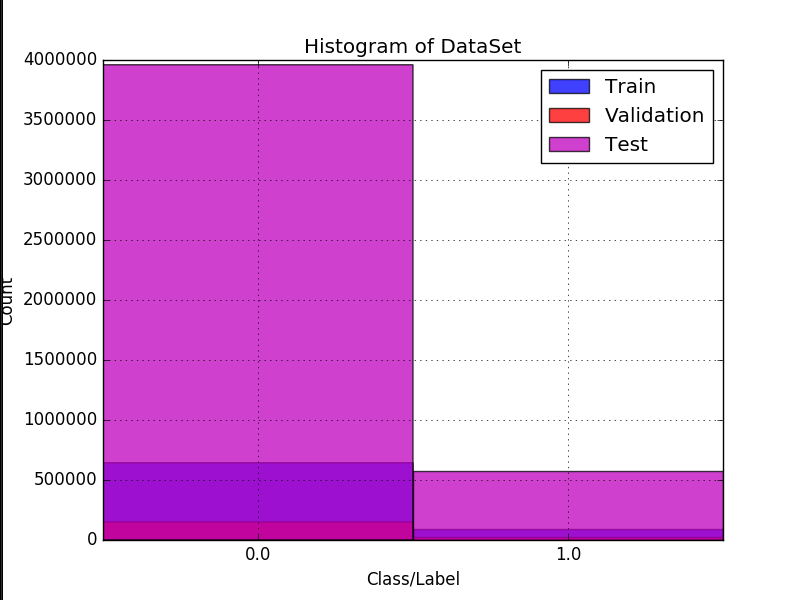 **Minor Problem : The left label 'Count' is out of the image, partially. Why?
Description
I want to plot the histogram of the 3 different sets. Each set, is an array with 0's and 1's. I want the histogram of each so i can detect imbalances on the dataset.
I have them plotted separately but i wanted a graphic of them together.
It would be okay to have a different graphic with bars side-by-side or, i even googled about plotting it as 3D, but i dont know how easy would be to "read" or "look" at the graphic and understand it.
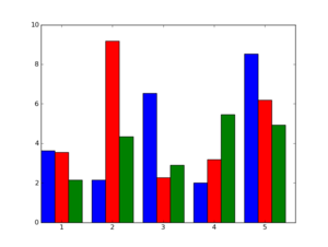
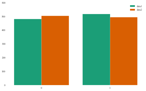
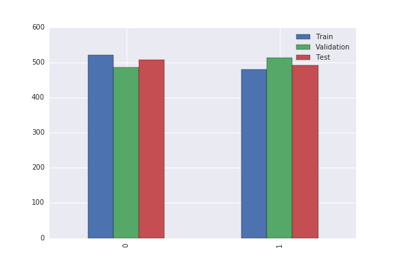
Right now, i want to plot the [train],[validation] and [test] bars at each side on the same graphic, something like this :
PS : My googling didnt return any code that was understandable to me. Also, i would like if someone would check if im doing any insanity on my code.
Thanks a lot guys!
Code :
def generate_histogram_from_array_of_labels(Y=[], labels=[], xLabel="Class/Label", yLabel="Count", title="Histogram of Trainset"):
    plt.figure()
    plt.clf()

    colors = ["b", "r", "m", "w", "k", "g", "c", "y"]

    information = []
    for index in xrange(0, len(Y)):
        y = Y[index]

        if index > len(colors):
            color = colors[0]
        else:
            color = colors[index]

        if labels is None:
            label = "?"
        else:
            if index < len(labels):
                label = labels[index]
            else:
                label = "?"

        unique, counts = np.unique(y, return_counts=True)
        unique_count = np.empty(shape=(unique.shape[0], 2), dtype=np.uint32)

        for x in xrange(0, unique.shape[0]):
            unique_count[x, 0] = unique[x]
            unique_count[x, 1] = counts[x]

        information.append(unique_count)

        # the histogram of the data
        n, bins, patches = plt.hist(y, unique.shape[0], normed=False, facecolor=color, alpha=0.75, range=[np.min(unique), np.max(unique) + 1], label=label)

    xticks_pos = [0.5 * patch.get_width() + patch.get_xy()[0] for patch in patches]

    plt.xticks(xticks_pos, unique)

    plt.xlabel(xLabel)
    plt.ylabel(yLabel)
    plt.title(title)
    plt.grid(True)
    plt.legend()
    # plt.show()

    string_of_graphic_image = cStringIO.StringIO()

    plt.savefig(string_of_graphic_image, format='png')
    string_of_graphic_image.seek(0)

    return base64.b64encode(string_of_graphic_image.read()), information
Edit
Following the answer of hashcode, this new code :
def generate_histogram_from_array_of_labels(Y=[], labels=[], xLabel="Class/Label", yLabel="Count", title="Histogram of Trainset"):
    plt.figure()
    plt.clf()

    colors = ["b", "r", "m", "w", "k", "g", "c", "y"]
    to_use_colors = []
    information = []


    for index in xrange(0, len(Y)):
        y = Y[index]

        if index > len(colors):
            to_use_colors.append(colors[0])
        else:
            to_use_colors.append(colors[index])

        unique, counts = np.unique(y, return_counts=True)
        unique_count = np.empty(shape=(unique.shape[0], 2), dtype=np.uint32)

        for x in xrange(0, unique.shape[0]):
            unique_count[x, 0] = unique[x]
            unique_count[x, 1] = counts[x]

        information.append(unique_count)

    unique, counts = np.unique(Y[0], return_counts=True)
    histrange = [np.min(unique), np.max(unique) + 1]
    # the histogram of the data
    n, bins, patches = plt.hist(Y, 1000, normed=False, alpha=0.75, range=histrange, label=labels)


    #xticks_pos = [0.5 * patch.get_width() + patch.get_xy()[0] for patch in patches]

    #plt.xticks(xticks_pos, unique)

    plt.xlabel(xLabel)
    plt.ylabel(yLabel)
    plt.title(title)
    plt.grid(True)
    plt.legend()
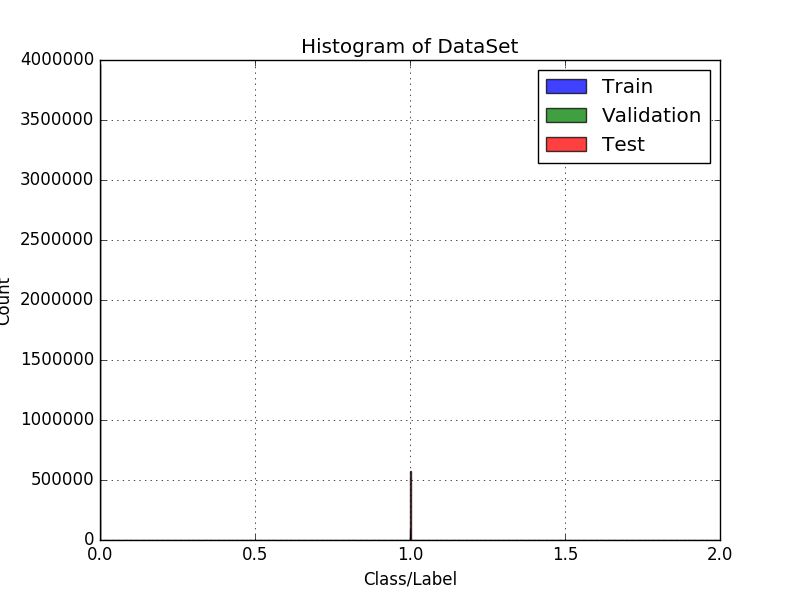
Is producing this :
-- New Edit :
def generate_histogram_from_array_of_labels(Y=[], labels=[], xLabel="Class/Label", yLabel="Count", title="Histogram of Trainset"):
    plt.figure()
    plt.clf()

    information = []

    for index in xrange(0, len(Y)):
        y = Y[index]

        unique, counts = np.unique(y, return_counts=True)
        unique_count = np.empty(shape=(unique.shape[0], 2), dtype=np.uint32)

        for x in xrange(0, unique.shape[0]):
            unique_count[x, 0] = unique[x]
            unique_count[x, 1] = counts[x]

        information.append(unique_count)

    n, bins, patches = plt.hist(Y, normed=False, alpha=0.75, label=labels)

    plt.xticks((0.25, 0.75), (0, 1))

    plt.xlabel(xLabel)
    plt.ylabel(yLabel)
    plt.title(title)
    plt.grid(True)
    plt.legend()
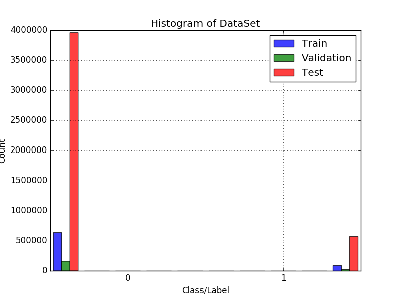
Is working now but, the label from the left side is kinda out of bounds and i wanted to center the bars better... How can i do that?


binsparam, by default it is set to 10. Just add a bins param like this -n, bins, patches = plt.hist(Y, bins = 2, normed=False, alpha=0.75, range=histrange, label=labels)– Strappadorcparams...from matplotlib import rcParams– StrappadorcParams['figure.figsize'] = (20, 20)adjust the value accordingly – Strappado