Single pcolormesh with more than one colormap using Matplotlib
Asked Answered
W

2

0

I'm creating a GUI where there is live 'point in time' data for several records ("things") and fields. records are comparable based on field, but fields are not necessarily related (at least not on same scale). For my eventual GUI, I want to have the main page be a heatmap (really a bunch of 1-D heatmaps based on columns (fields), then if you click on one it will give a time series history and some other charts.

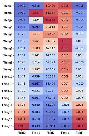
Anyway, what I'm after here, is trying to get the initial heatmap to show the way I want. As of now I can get the pcolormesh from Matplotlib to essentially show individual 1-D heatmaps based on field by hacking it and heatmapping based on percentile of column, and then adding text of the actual value on top.

But, as I said, fields are not necessarily related, and I would like to be able to have individual colormaps for each field. For example: say Fields 3 and 4 are qualitatively related to one another, but not to Fields 0-3 - so it would be nice to have those mapped to say the 'greens' colormesh rather than 'coolwarm'.

Here is my code so far and resulting pcolormesh/heatmap:

import pandas as pd
import matplotlib.pyplot as plt

def DFPercentiles(df,bycols=True):
    p=pd.DataFrame(index=df.index,columns=df.columns)
    if bycols!=True:
        for j in df.index:
            for i in df.columns:
                p.loc[j,i]=(df.loc[j,i]-min(df.loc[j,:]))/(max(df.loc[j,:])-min(df.loc[j,:]))
    else:
        for i in df.index:
            for j in df.columns:
                p.loc[i,j]=(df.loc[i,j]-min(df.loc[:,j]))/(max(df.loc[:,j])-min(df.loc[:,j]))
    return p

def Heatmap(df,figsize='auto'):
    if figsize=='auto':
        figsize=[shape(df)[1],shape(df)[0]/2]
    fig=figure(figsize=figsize)
    pdf=array(DFPercentiles(df,bycols=True)).astype(float)[::-1]
    plt.pcolormesh(pdf,cmap=cm.coolwarm,alpha=0.8)
    plt.yticks(arange(0.5,len(df)),df.index[::-1])
    plt.xticks(arange(0.5,len(df.columns)),df.columns)
    for y in range(df.shape[0]):
        for x in range(df.shape[1]):
            plt.text(x + 0.5, y + 0.5, '%.3f' % df[::-1].iloc[y, x],
                     horizontalalignment='center',
                     verticalalignment='center',
                     )
    return plt

hmap=Heatmap(mydf)
hmap.show()

And the result:

Multiple 1-D heatmaps on one pcolormesh, but can't get multiple colormaps

I've had no luck trying to get multiple colormaps for separate fields.

Wang answered 3/5, 2017 at 13:26 Comment(1)
we prefer solutions not to be appended to questions here. Would you move that section of your question to a self-answer please? Thanks!Shaughnessy
M
1

Each colormesh plot has one colormap associated to it. In order to use several colormaps in one diagram, I therefore see the following options:

  1. Individual rectangles: Don't use pcolormesh but draw individual rectangles in the color of your liking.
  2. Create your custom colormap which incorporates different colormaps within different ranges. E.g. values from 0 to 0.4 are mapped to colors from one colormap and values from 0.4 to 1 to colors from another colormap. This may then look like:

    import matplotlib.pyplot as plt
    import matplotlib.colors
    import numpy as np
    
    x,y = np.meshgrid(range(4), range(4))
    z = np.array([[0.2,.3,.95],[.5,.76,0.4],[.3,.1,.6]]).astype(float)
    mask= np.array([[1,0,0],[1,0,0],[1,1,1]]).astype(float)
    Z = z + mask
    
    c2 = plt.cm.Greens(np.linspace(0,1,128))
    c1 = plt.cm.coolwarm(np.linspace(0,1,128))
    cols = np.vstack((c1, c2))
    cmap=matplotlib.colors.LinearSegmentedColormap.from_list("q", cols)
    
    fig, ax=plt.subplots()
    ax.pcolormesh(x,y,Z, vmin=0, vmax=2, cmap=cmap)
    
    plt.show()
    
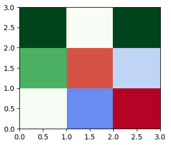
  3. Mask the arrays and plot several pcolormesh plots. The following example shows how this might then look like:

        import matplotlib.pyplot as plt
        import numpy as np
        import numpy.ma as ma
    
        x,y = np.meshgrid(range(4), range(4))
        z = np.array([[1,1.3,3],[2.2,2.8,1.8],[3,1,3]]).astype(float)
        mask= np.array([[1,0,0],[1,0,0],[1,1,1]]).astype(bool)
        z1 = np.copy(z)
        z1[mask] = np.nan
    
        z2 = np.copy(z)
        z2[~mask] = np.nan
    
        fig, ax=plt.subplots()
        ax.pcolormesh(x,y,ma.masked_invalid(z1), vmin=1, vmax=3, cmap="coolwarm")
        ax.pcolormesh(x,y,ma.masked_invalid(z2), vmin=1, vmax=3, cmap="Greens")
    
        plt.show()
    

enter image description here

Martineau answered 3/5, 2017 at 15:8 Comment(2)
Thank you for the example, I'm going to try to apply it, but I also think custom colormaps might be easier. Since I'm mapping based on percentiles, i could just add 1 to each series I want on a different map (I think?). How to properly implement colormaps for values always confused me, but will try to look into that more and update here with what solution worked best for me.Wang
you are a gentleman and a scholar good sir. thanks for the help. appended implementation of solution 2 to question.Wang
W
1

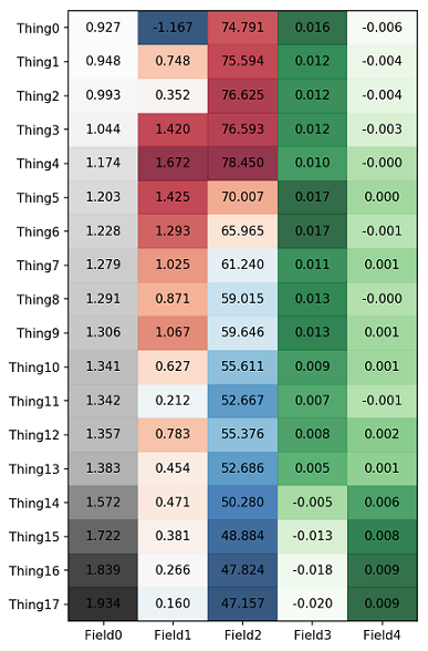
Implementation of @ImportanceOfBeingErnest solution:

Used the stacking of colormaps to create a custom colormap of maps. Basically my function now takes tuples of ([list of columns],multiplier,colormap to apply) and stacks the unique colormaps and groups the percentile data to match the individual colormaps (endpoints were tricky to avoid overlap of coloring). I probably didn't implement it super efficiently, but it works well:

def DFPercentiles_hmapshift(df,bycols=True):
    p=pd.DataFrame(index=df.index,columns=df.columns)
    if bycols!=True:
        for j in df.index:
            for i in df.columns:
                pct=(df.loc[j,i]-min(df.loc[j,:]))/((max(df.loc[j,:])-min(df.loc[j,:]))*1.)
                pct=pct-(pct-0.5)*1./40 #have to rescale it to account for endpoints of cmaps
                p.loc[j,i]=pct
                #print '('+str(max(p.loc[j,:]))+', '+str(min(p.loc[j,:]))+')'

    else:
        for i in df.index:
            for j in df.columns:
                pct=(df.loc[i,j]-min(df.loc[:,j]))/((max(df.loc[:,j])-min(df.loc[:,j]))*1.)
                pct=pct-(pct-0.5)*1./40 #have to rescale it to account for endpoints of cmaps
                p.loc[i,j]=pct
                #print '('+str(max(p.loc[:,j]))+', '+str(min(p.loc[:,j]))+')'
    return p

def Heatmap(df,figsize='auto',ccmaps=[(['Default'],0,'coolwarm')]):
    if figsize=='auto':
        figsize=[shape(df)[1],shape(df)[0]/2]
    fig=figure(figsize=figsize)
    #pdf=array(DFPercentiles(df,bycols=True)).astype(float)[::-1]
    pdf=DFPercentiles_hmapshift(df,bycols=True)
    if len(ccmaps)==1:
        cmap=ccmaps[0][2]
    else:
        cmapl=[]
        for x in ccmaps:
            if x[1]!=0:
                for y in x[0]:
                    pdf[y]=pdf[y]+x[1]
            cmapl.append(getattr(plt.cm,x[2])(np.linspace(0,1,256,endpoint=False)+0.5/256.))
        pdf=np.divide(pdf,len(ccmaps))
        cs=np.vstack(cmapl)
        cmap=matplotlib.colors.LinearSegmentedColormap.from_list("custom",cs)
    pdf=array(pdf).astype(float)[::-1]
    plt.pcolormesh(pdf,cmap=cmap,alpha=0.8)
    plt.yticks(arange(0.5,len(df)),df.index[::-1])
    plt.xticks(arange(0.5,len(df.columns)),df.columns)
    for y in range(df.shape[0]):
        for x in range(df.shape[1]):
            plt.text(x + 0.5, y + 0.5, '%.3f' % df[::-1].iloc[y, x],
                     horizontalalignment='center',
                     verticalalignment='center',
                     )
    return plt

hmap=Heatmap(mydf,ccmaps=[(['Default'],0,'RdBu_r'),(['Field3','Field4'],1,'Greens'),
                     (['Field0'],2,'Greys')])
hmap.show()

for the beautiful (ok, it's just an example!) result:

enter image description here

Wang answered 4/5, 2017 at 19:3 Comment(0)

© 2022 - 2024 — McMap. All rights reserved.