Setting a max axis value or range step for a Morris Bar Chart?
Asked Answered
P

4

6

I was wondering if it is possible to set a max axis value (say, I want the highest point of my data to be the top end of the y-axis) on a bar chart? I see there are options for ymin and ymax on line charts but I can't seem to find any information about the bar charts.

Also, it would be helpful if anyone knew how to force the range between axis lanes to be a certain amount (say step up by 250 each line instead of the generated amount which in my case is too high for my liking).

Ponceau answered 9/8, 2015 at 10:37 Comment(0)
M
12
  • Set a maximum value for the y axis

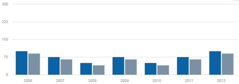
You can, indeed, set the ymax for bar charts also (even though this is not documented).

Morris.Bar({
  element: 'bar-example',
  data: [
    { y: '2006', a: 100, b: 90 },
    { y: '2007', a: 75,  b: 65 },
    { y: '2008', a: 50,  b: 40 },
    { y: '2009', a: 75,  b: 65 },
    { y: '2010', a: 50,  b: 40 },
    { y: '2011', a: 75,  b: 65 },
    { y: '2012', a: 100, b: 90 }
  ],
  xkey: 'y',
  ymax: 300, // set this value according to your liking
  ykeys: ['a', 'b'],
  labels: ['Series A', 'Series B']
});

And have your y axis set to this maximum value:

enter image description here

  • Set a range value for the y axis

It seems that it's not possible to set a range value for the y axis. This value appears to be computed according to the values of the data passed to Morris.Bar.

Marquismarquisate answered 15/9, 2015 at 18:46 Comment(0)
P
11

Not documented, but you can set maximum y by applying ymax. You can manipulate the range by setting numLines (also not documented).

E.g.

var chart = new Morris.Bar({
...
    ymin: 0,
    ymax: 7,
    numLines: 8,
...
});

The above defined chart will display values from 0 to 7 and display a grid line for each integer between 0 and 7 (therefore 8 as a parameter)

Poussette answered 27/7, 2016 at 14:59 Comment(0)
R
1

I want the highest point of my data to be the top end of the y-axis

The documentation is very sparse and confusing but this is possible using the ymin variable which is only documented in the Lines & Area Charts. The default value for that variable seems to be auto 0 and changing it to just auto seems to produce the desired result as you can see below.

ymin:auto

how to force the range between axis lanes to be a certain amount

This does not seem to be possible, natively. However, you can kind of hack the axis label with the following function. It will round the value to multiples of 250 BUT the grid lines won't be at the number shown. E.g. say a grid line is at 570. The function below will change the label to 500 but the line will still show at 570 mark.

yLabelFormat: function(d) {
    return Math.round(d) - (Math.round(d) % 250);
},

As others have mentioned, you can set ymax to a value that you want your upper bound to be but since you want the highest data point to be the upper bound, set ymax to auto. You can also try changing numLines to different values for a better aesthetic.

Runic answered 12/3, 2021 at 22:10 Comment(0)
T
0

To change to ymax call this

chart.options["ymax"] = 300;

Where chart is your chart variable

Trivium answered 17/3, 2016 at 13:22 Comment(0)

© 2022 - 2024 — McMap. All rights reserved.