What are the differences between the flexbox and grid systems? Under which circumstances should I use each system?
Difference between Grid And Flexbox
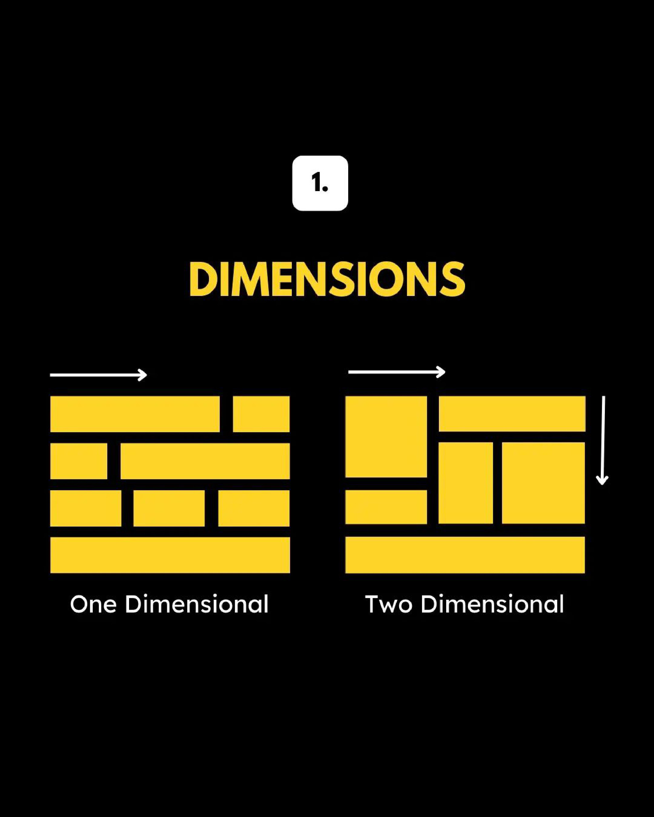
Flexbox is best for one-dimensional Layouts (like Row or Column)
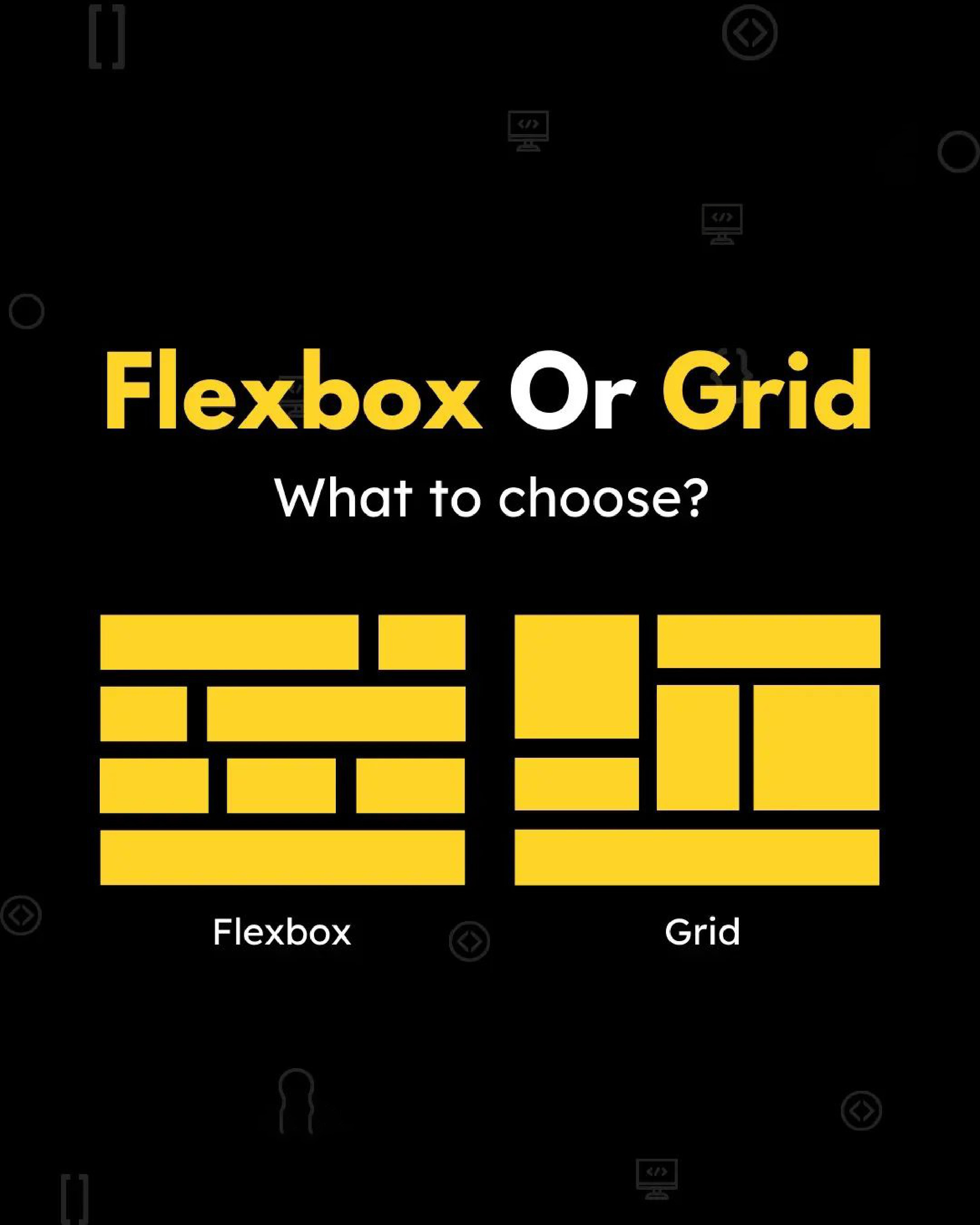
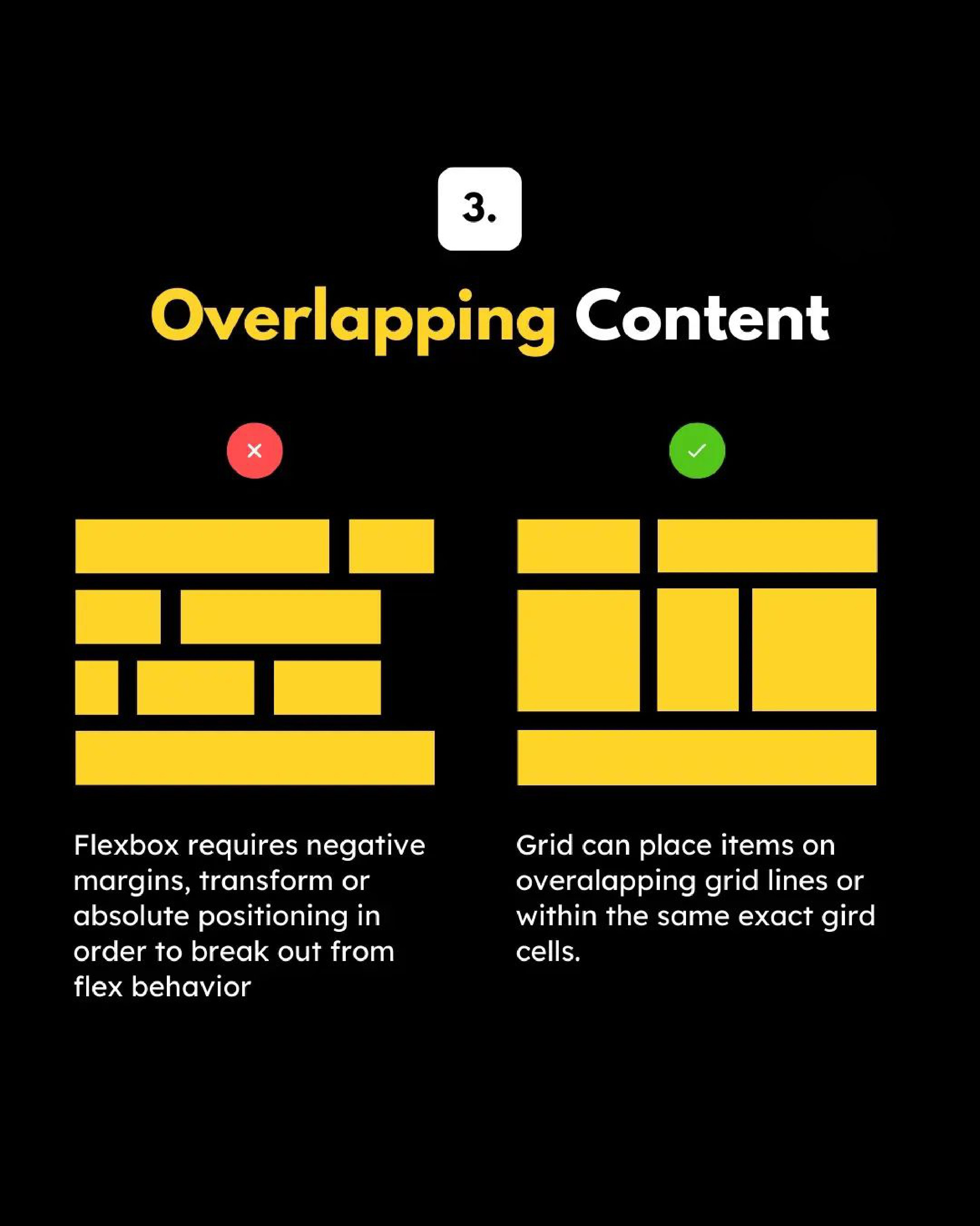
Grid can do things Flexbox can't do, Flexbox can do things Grid can't do.
![enter image description here]()
They can work together: a grid item can be a flexbox container. A flex item can be a grid container.
With CSS Grid, we can set relationships horizontally and vertically but at the same time. On the other hand,__Flexbox__is stuck doing vertical or horizontal layouts.
Flexbox is 1-dimensional and enables all its direct children (‘flex items’) to sit along its main defined axis and context can potentially change if width isn’t already defined.
Whereas, CSS grids are designed to be a 2-dimensional layout system: CSS Grids can handle both columns and rows.
https://developer.mozilla.org/en-US/docs/Web/CSS/CSS_Grid_Layout/Relationship_of_Grid_Layout
This is a nuanced subject area and there's no straight forward answer, so to help demonstrate the differences, I'll provide examples. As there are too many to cover I can refer you to a recent guide I wrote called CSS Grid vs flexbox
Can only be achieved with Flexbox
The following layout (suitable for tags and other inline-like content) can only be achieved with Flexbox, therefore there is an obvious choice between Flexbox or CSS Grid:
.flex-container {
  display: flex;
  flex-flow: row wrap;
  gap: 8px;
  padding: 16px;
}

.flex-item {
  border: 1px solid;
  padding: 8px;
  border-radius: 8px;
}
<div class="flex-container">
  <div class="flex-item">1. The quick brown fox</div>
  <div class="flex-item">2. Jumps over the lazy dog.</div>
  <div class="flex-item">3. Flexbox makes CSS layout a breeze!</div>
  <div class="flex-item">4. Pack my box with five dozen liquor jugs.</div>
  <div class="flex-item">
    5. A man provided with paper, pencil, and rubber, and subject to strict
    discipline, is in effect a universal machine.
  </div>
  <div class="flex-item">6. I am a demo for Flexbox layout.</div>
</div>
Can only be achieved with CSS Grid
.grid-container {
  display: grid;
  grid-template-columns: 1fr 1fr 1fr;
  gap: 8px;
  padding: 16px;
}

.grid-item {
  border: 1px solid;
  padding: 8px;
  border-radius: 8px;
}
<div class="grid-container">
  <div class="grid-item">1. The quick brown fox</div>
  <div class="grid-item">2. Jumps over the lazy dog.</div>
  <div class="grid-item">3. CSS Grid makes CSS layout a breeze!</div>
  <div class="grid-item">4. Pack my box with five dozen liquor jugs.</div>
  <div class="grid-item">5. A man provided with paper, pencil, and rubber, and subject to strict discipline, is in effect a universal machine.</div>
  <div class="grid-item">6. I am a demo for CSS Grid layout.</div>
</div>
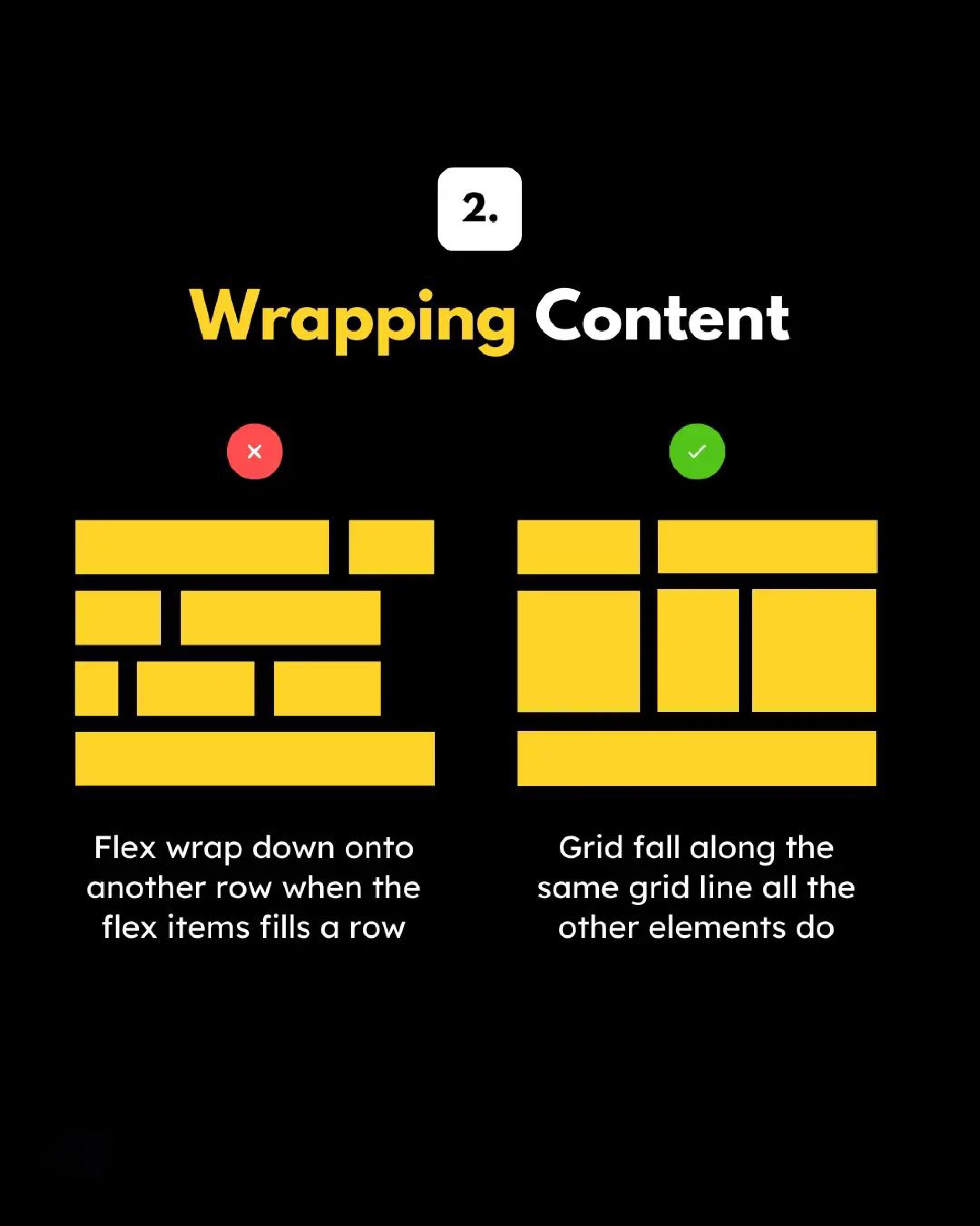
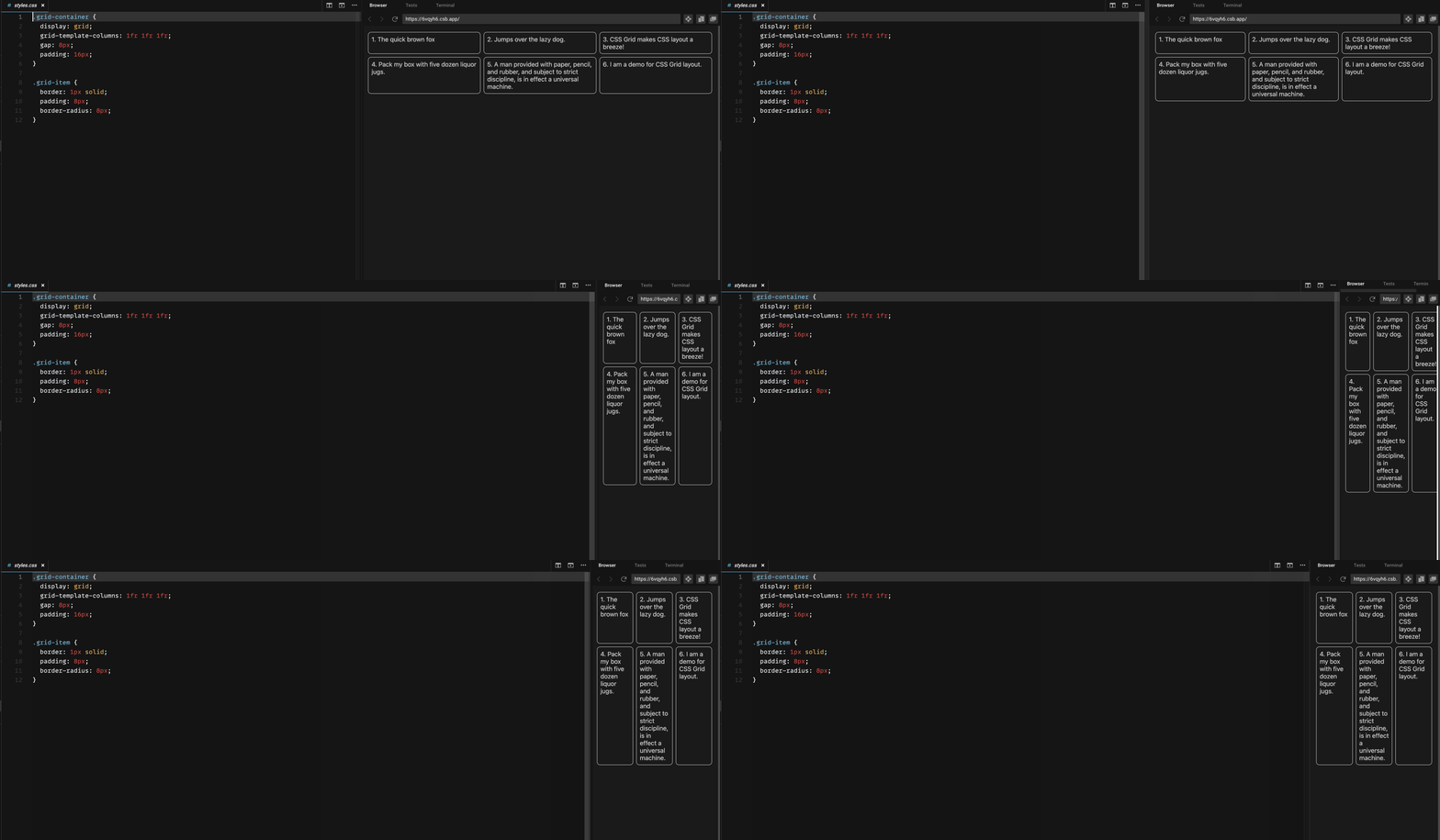
Because I specified three columns, as there are six <div> elements in the layout there are a total of two rows created implicitly. Flex cannot create rows due to its one dimensional nature.
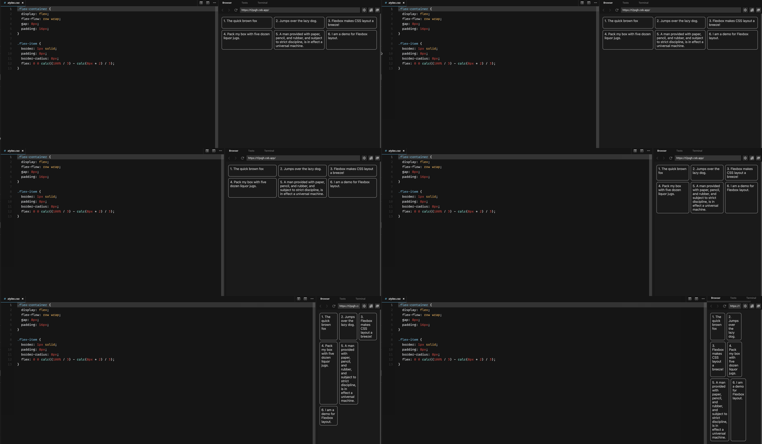
An equivalent with flexbox is difficult and eventually fails as (demonstrated in the following gifs)
.flex-container {
  display: flex;
  flex-flow: row wrap;
  gap: 8px;
  padding: 16px;
}

.flex-item {
  border: 1px solid;
  padding: 8px;
  border-radius: 8px;
  flex: 0 0 calc((100% / 3) - calc(8px * 2) / 3);
}
Flex
Grid
Grid systems
The two dimensional nature of CSS Grid removes the need for describing layouts using markup, there's no need to do this kind of thing as Bootstrap do it (which resembles a table):
<div class="grid">
 <div class="row">
  <div class="col">content</div>
 </div>
</div>
Instead, you can do this (like Tailwind do it):
<div class="grid">
 <div class="col">content</div>
</div>
Finally, a complex layout
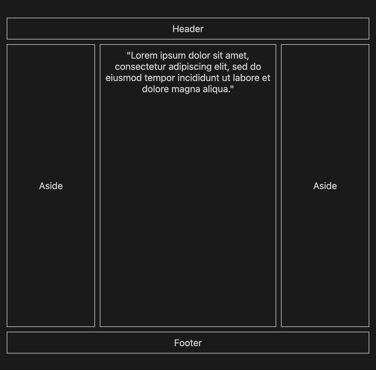
Take the following layout known as Holy Grail:
To create it with CSS Grid can be done like so:
.grid-container {
  min-height: 100vh;
  display: grid;
  gap: 8px;
  padding: 36px 18px;
  text-align: center;
  grid-template-columns: 1fr 2fr 1fr;
  grid-template-rows: auto 1fr auto;
}

header,
footer {
  grid-column: span 3;
}
<div class="grid-container">
  <header>Header</header>
  <aside>Aside</aside>
  <div class="grid-item">"Lorem ipsum dolor sit amet, consectetur adipiscing elit, sed do eiusmod tempor incididunt ut labore et dolore magna aliqua."</div>
  <aside>Aside</aside>
  <footer>Footer</footer>
</div>
Whereas with Flex I need to add more CSS, and due to the one dimensional nature of flex, more markup:
.flex-container {
  min-height: 100vh;
  display: flex;
  flex-direction: column;
  padding: 36px 18px;
  gap: 8px;
  text-align: center;
}

main {
  flex: 2;
}

aside {
  flex: 1;
  display: flex;
  flex-direction: column;
}

article {
  flex: 1;
  display: flex;
  flex-direction: row;
  gap: 8px;
}
<div class="flex-container">
  <header>Header</header>
  <article>
    <aside>Aside</aside>
    <main>"Lorem ipsum dolor sit amet, consectetur adipiscing elit, sed do eiusmod tempor incididunt ut labore et dolore magna aliqua."</main>
    <aside>Aside</aside>
  </article>
  <footer>Footer</footer>
</div>
© 2022 - 2024 — McMap. All rights reserved.

