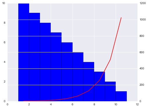
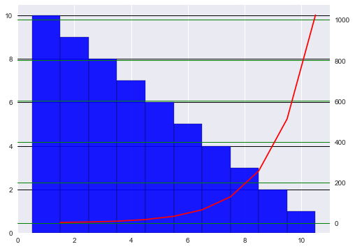
After some searches and tries I'm sharing the solution I found, so others can use it as a reference in the future. This is not exactly what I was looking for, since I would like horizontal grid lines just for the right axis, however, it provided a much better visualization than the original plot.
From this, i found out how to align the left and right axis ticks (this problem also happens with line plots, but the effect is not as disturbing as in a bar plot).
import matplotlib.pyplot as plt
import seaborn as sb
import numpy as np

x  = np.arange(1,11)
y1 = x[::-1]
y2 = 2 ** x

fig  = plt.figure(figsize = (8,6))
ax1 = fig.add_subplot(111)
plt.bar(x, y1, 1, color = 'blue')
ax2 = ax1.twinx()
ax2.plot(x+0.5, y2, color = 'red')
ax2.set_yticks(np.linspace(ax2.get_yticks()[0],ax2.get_yticks()[-1],len(ax1.get_yticks())))
![enter image description here]()
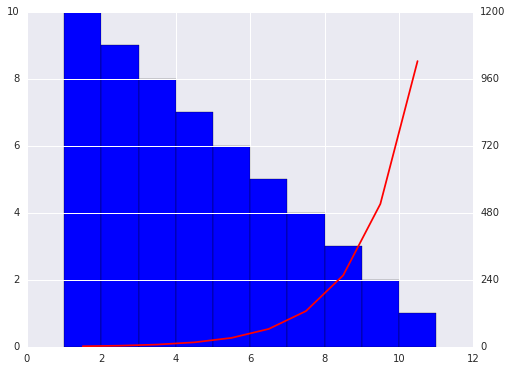
The grid lines are still above the bars. However, since the tick marks are aligned, we can now remove the grid of the second line plot by adding the explicit command: ax2.grid(False) at the end of the previous code.
![enter image description here]()
IMPORTANT: Note that in this example the labels in both left and right axis are pretty nice. However, in a real situation this approach may to lead to ugly labels (floats or rough integers) on the right axis. Using this approach we are still not able to set the position of the right tick marks, so it is not an exact answer for the question.


set_axisbelow(True)with the documentation here. I just seem to be doing a terrible job of implementing it so maybe you get there before me. – Mchail