I'm trying to plot patient flows between 3 clusters in a Sankey diagram. I have a pd.DataFrame counts with from-to values, see below. To reproduce this DF, here is the counts dict that should be loaded into a pd.DataFrame (which is the input for the visualize_cluster_flow_counts function).
    from    to      value
0   C1_1    C1_2    867
1   C1_1    C2_2    405
2   C1_1    C0_2    2
3   C2_1    C1_2    46
4   C2_1    C2_2    458
... ... ... ...
175 C0_20   C0_21   130
176 C0_20   C2_21   1
177 C2_20   C1_21   12
178 C2_20   C0_21   0
179 C2_20   C2_21   96
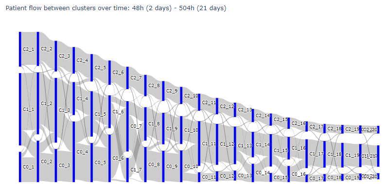
The from and to values in the DataFrame represent the cluster number (either 0, 1, or 2) and the amount of days for the x-axis (between 1 and 21). If I plot the Sankey diagram with these values, this is the result:

Code:
import plotly.graph_objects as go

def visualize_cluster_flow_counts(counts):
    all_sources = list(set(counts['from'].values.tolist() + counts['to'].values.tolist()))

    froms, tos, vals, labs = [], [], [], []
    for index, row in counts.iterrows():
        froms.append(all_sources.index(row.values[0]))
        tos.append(all_sources.index(row.values[1]))
        vals.append(row[2])
        labs.append(row[3])

    fig = go.Figure(data=[go.Sankey(
        arrangement='snap',
        node = dict(
          pad = 15,
          thickness = 5,
          line = dict(color = "black", width = 0.1),
          label = all_sources,
          color = "blue"
        ),
        link = dict(
          source = froms,
          target = tos,
          value = vals,
          label = labs
      ))])

    fig.update_layout(title_text="Patient flow between clusters over time: 48h (2 days) - 504h (21 days)", font_size=10)
    fig.show()

visualize_cluster_flow_counts(counts)
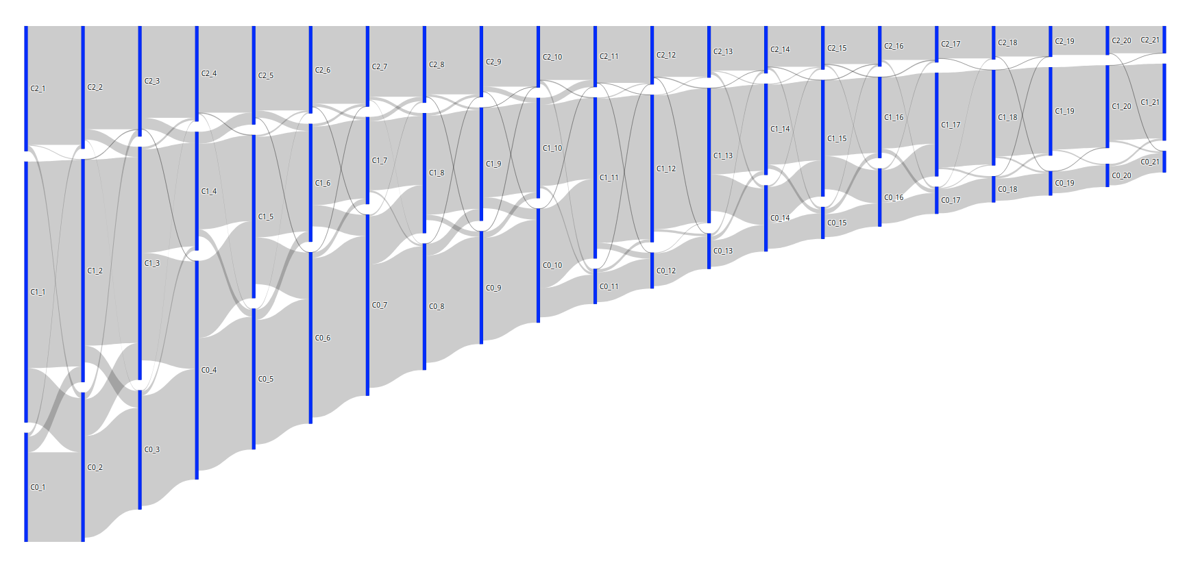
However, I would like to vertically order the bars so that the C0's are always on top, the C1's are always in the middle, and the C2's are always at the bottom (or the other way around, doesn't matter). I know that we can set node.x and node.y to manually assign the coordinates. So, I set the x-values to the amount of days * (1/range of days), which is an increment of +- 0.045. And I set the y-values based on the cluster value: either 0, 0.5 or 1. I then obtain the image below. The vertical order is good, but the vertical margins between the bars are obviously way off; they should be similar to the first result.
The code to produce this is:
import plotly.graph_objects as go

def find_node_coordinates(sources):
    x_nodes, y_nodes = [], []

    for s in sources:
        # Shift each x with +- 0.045
        x = float(s.split("_")[-1]) * (1/21)
        x_nodes.append(x)

        # Choose either 0, 0.5 or 1 for the y-value
        cluster_number = s[1]
        if cluster_number == "0": y = 1
        elif cluster_number == "1": y = 0.5
        else: y = 1e-09

        y_nodes.append(y)

    return x_nodes, y_nodes


def visualize_cluster_flow_counts(counts):
    all_sources = list(set(counts['from'].values.tolist() + counts['to'].values.tolist()))

    node_x, node_y = find_node_coordinates(all_sources)

    froms, tos, vals, labs = [], [], [], []
    for index, row in counts.iterrows():
        froms.append(all_sources.index(row.values[0]))
        tos.append(all_sources.index(row.values[1]))
        vals.append(row[2])
        labs.append(row[3])

    fig = go.Figure(data=[go.Sankey(
        arrangement='snap',
        node = dict(
          pad = 15,
          thickness = 5,
          line = dict(color = "black", width = 0.1),
          label = all_sources,
          color = "blue",
          x = node_x,
          y = node_y,
        ),
        link = dict(
          source = froms,
          target = tos,
          value = vals,
          label = labs
      ))])

    fig.update_layout(title_text="Patient flow between clusters over time: 48h (2 days) - 504h (21 days)", font_size=10)
    fig.show()


visualize_cluster_flow_counts(counts)
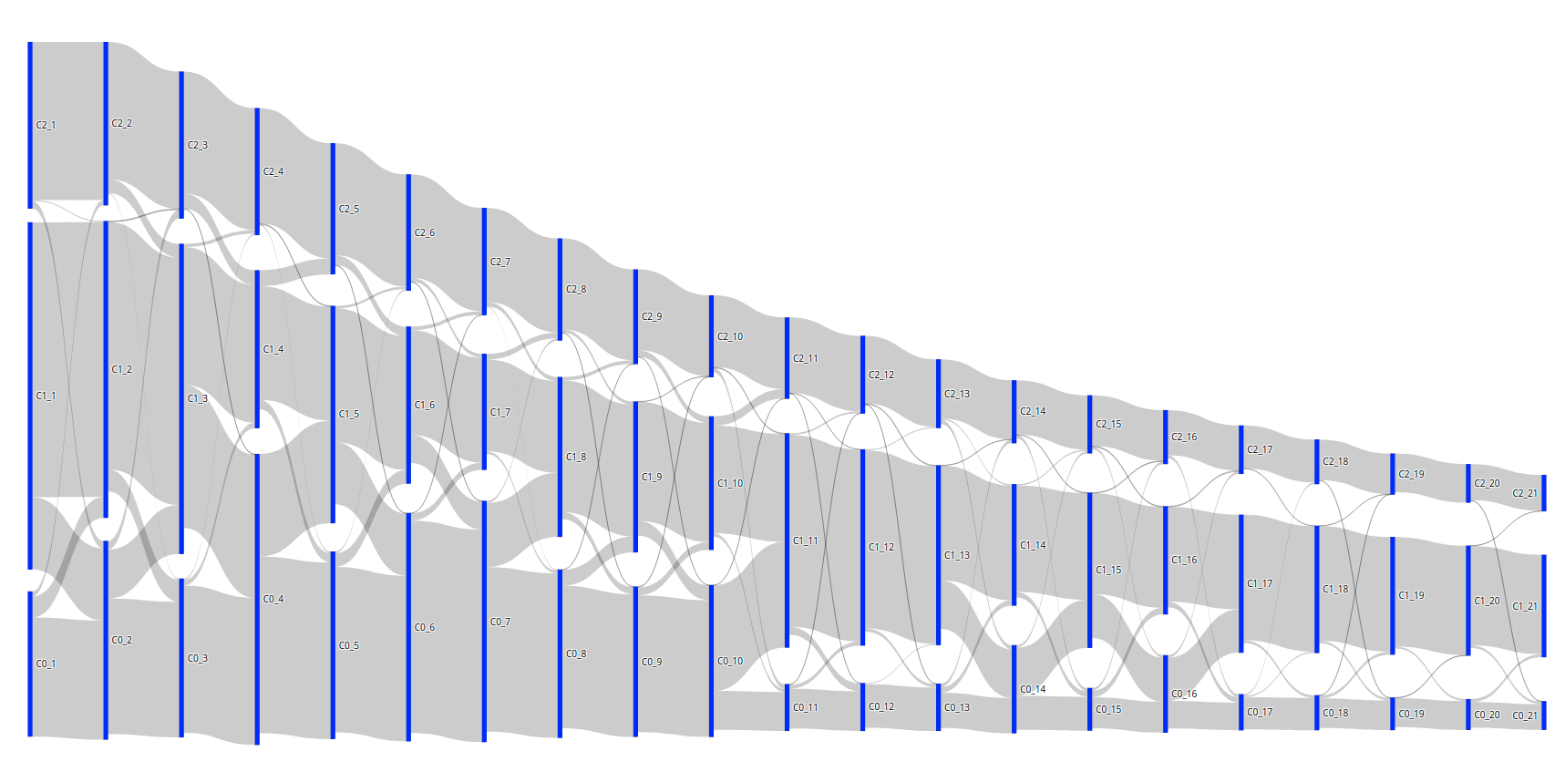
Question: how do I fix the margins of the bars, so that the result looks like the first result? So, for clarity: the bars should be pushed to the bottom. Or is there another way that the Sankey diagram can vertically re-order the bars automatically based on the label value?


