Safe Area of Xcode 9
Asked Answered
P

5

154

While exploring Xcode9 Beta Found Safe Area on Interface builders View hierarchy viewer. Got curious and tried to know about Safe Area on Apples documentation, in gist the doc says "The the view area which directly interacts with Auto layout" But it did not satisfy me, I want to know Practical use of this new thing.

Do any one have some clue?

enter image description here

Conclusion paragraph from Apple doc for Safe area.

The UILayoutGuide class is designed to perform all the tasks previously performed by dummy views, but to do it in a safer, more efficient manner. Layout guides do not define a new view. They do not participate in the view hierarchy. Instead, they simply define a rectangular region in their owning view’s coordinate system that can interact with Auto Layout.

Pavkovic answered 12/6, 2017 at 6:6 Comment(2)
You can watch the WWDC Session. Everything is explained there. I'm not sure about the name. Something with Xcode or InterfaceBuilder in its name.Intensifier
Have a look at WWDC17 #204 - Updating Your App for iOS 11 and WWDC17 #412 - Auto Layout Techniques in Interface BuilderChud
D
294

Safe Area is a layout guide (Safe Area Layout Guide).
The layout guide representing the portion of your view that is unobscured by bars and other content. In iOS 11+, Apple is deprecating the top and bottom layout guides and replacing them with a single safe area layout guide.

When the view is visible onscreen, this guide reflects the portion of the view that is not covered by other content. The safe area of a view reflects the area covered by navigation bars, tab bars, toolbars, and other ancestors that obscure a view controller's view. (In tvOS, the safe area incorporates the screen's bezel, as defined by the overscanCompensationInsets property of UIScreen.) It also covers any additional space defined by the view controller's additionalSafeAreaInsets property. If the view is not currently installed in a view hierarchy, or is not yet visible onscreen, the layout guide always matches the edges of the view.

For the view controller's root view, the safe area in this property represents the entire portion of the view controller's content that is obscured, and any additional insets that you specified. For other views in the view hierarchy, the safe area reflects only the portion of that view that is obscured. For example, if a view is entirely within the safe area of its view controller's root view, the edge insets in this property are 0.

According to Apple, Xcode 9 - Release note
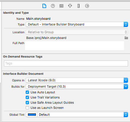
Interface Builder uses UIView.safeAreaLayoutGuide as a replacement for the deprecated Top and Bottom layout guides in UIViewController. To use the new safe area, select Safe Area Layout Guides in the File inspector for the view controller, and then add constraints between your content and the new safe area anchors. This prevents your content from being obscured by top and bottom bars, and by the overscan region on tvOS. Constraints to the safe area are converted to Top and Bottom when deploying to earlier versions of iOS.

enter image description here


Here is simple reference as a comparison (to make similar visual effect) between existing (Top & Bottom) Layout Guide and Safe Area Layout Guide.

Safe Area Layout: enter image description here

AutoLayout

enter image description here


How to work with Safe Area Layout?

Follow these steps to find solution:

  • Enable 'Safe Area Layout', if not enabled.
  • Remove 'all constraint' if they shows connection with with Super view and re-attach all with safe layout anchor. OR Double click on a constraint and edit connection from super view to SafeArea anchor

Here is sample snapshot, how to enable safe area layout and edit constraint.

enter image description here

Here is result of above changes

enter image description here


Layout Design with SafeArea
When designing for iPhone X, you must ensure that layouts fill the screen and aren't obscured by the device's rounded corners, sensor housing, or the indicator for accessing the Home screen.

enter image description here

Most apps that use standard, system-provided UI elements like navigation bars, tables, and collections automatically adapt to the device's new form factor. Background materials extend to the edges of the display and UI elements are appropriately inset and positioned.

enter image description here

For apps with custom layouts, supporting iPhone X should also be relatively easy, especially if your app uses Auto Layout and adheres to safe area and margin layout guides.

enter image description here


Here is sample code (Ref from: Safe Area Layout Guide):
If you create your constraints in code use the safeAreaLayoutGuide property of UIView to get the relevant layout anchors. Let’s recreate the above Interface Builder example in code to see how it looks:

Assuming we have the green view as a property in our view controller:

private let greenView = UIView()

We might have a function to set up the views and constraints called from viewDidLoad:

private func setupView() {
  greenView.translatesAutoresizingMaskIntoConstraints = false
  greenView.backgroundColor = .green
  view.addSubview(greenView)
}

Create the leading and trailing margin constraints as always using the layoutMarginsGuide of the root view:

 let margins = view.layoutMarginsGuide
    NSLayoutConstraint.activate([
      greenView.leadingAnchor.constraint(equalTo: margins.leadingAnchor),
      greenView.trailingAnchor.constraint(equalTo: margins.trailingAnchor)
 ])

Now unless you are targeting iOS 11 only you will need to wrap the safe area layout guide constraints with #available and fall back to top and bottom layout guides for earlier iOS versions:

if #available(iOS 11, *) {
  let guide = view.safeAreaLayoutGuide
  NSLayoutConstraint.activate([
   greenView.topAnchor.constraintEqualToSystemSpacingBelow(guide.topAnchor, multiplier: 1.0),
   guide.bottomAnchor.constraintEqualToSystemSpacingBelow(greenView.bottomAnchor, multiplier: 1.0)
   ])

} else {
   let standardSpacing: CGFloat = 8.0
   NSLayoutConstraint.activate([
   greenView.topAnchor.constraint(equalTo: topLayoutGuide.bottomAnchor, constant: standardSpacing),
   bottomLayoutGuide.topAnchor.constraint(equalTo: greenView.bottomAnchor, constant: standardSpacing)
   ])
}


Result:

enter image description here


Following UIView extension, make it easy for you to work with SafeAreaLayout programatically.

extension UIView {

  // Top Anchor
  var safeAreaTopAnchor: NSLayoutYAxisAnchor {
    if #available(iOS 11.0, *) {
      return self.safeAreaLayoutGuide.topAnchor
    } else {
      return self.topAnchor
    }
  }

  // Bottom Anchor
  var safeAreaBottomAnchor: NSLayoutYAxisAnchor {
    if #available(iOS 11.0, *) {
      return self.safeAreaLayoutGuide.bottomAnchor
    } else {
      return self.bottomAnchor
    }
  }

  // Left Anchor
  var safeAreaLeftAnchor: NSLayoutXAxisAnchor {
    if #available(iOS 11.0, *) {
      return self.safeAreaLayoutGuide.leftAnchor
    } else {
      return self.leftAnchor
    }
  }

  // Right Anchor
  var safeAreaRightAnchor: NSLayoutXAxisAnchor {
    if #available(iOS 11.0, *) {
      return self.safeAreaLayoutGuide.rightAnchor
    } else {
      return self.rightAnchor
    }
  }

}

Here is sample code in Objective-C:


Here is Apple Developer Official Documentation for Safe Area Layout Guide


Safe Area is required to handle user interface design for iPhone-X. Here is basic guideline for How to design user interface for iPhone-X using Safe Area Layout

Dumah answered 26/7, 2017 at 18:4 Comment(3)
As for the difference between margins and view.leadingAnchor: when you use let margins = view.layoutMarginsGuide and later use margins.leadingAnchor, you are constraining the view to the margins of the view. This will add some extra space to the sides. If you don't want that then just use view.leadingAnchor and view.trailingAnchor and you won't see any white space on the left or right...Acuna
"The safe area of a view reflects the area covered by navigation bars, tab bars, toolbars, and other ancestors that obscure a view controller's view" Don't you mean not covered? The document says "unobscured by bars and other content."Acuna
I have seen a strange behavior in Xcode 10.1 where the Safe Area would not extend to the bottom of the screen on a full screen View. I believe I caused it by accidentally dragging a 'Tab Bar' to the bottom, and then deleting it. I found this line in the .storyboard file which I manually deleted with a text editor. <simulatedToolbarMetrics key="simulatedBottomBarMetrics"/> . This fixed it.Eolande
T
21

I want to mention something that caught me first when I was trying to adapt a SpriteKit-based app to avoid the round edges and "notch" of the new iPhone X, as suggested by the latest Human Interface Guidelines: The new property safeAreaLayoutGuide of UIView needs to be queried after the view has been added to the hierarchy (for example, on -viewDidAppear:) in order to report a meaningful layout frame (otherwise, it just returns the full screen size).

From the property's documentation:

The layout guide representing the portion of your view that is unobscured by bars and other content. When the view is visible onscreen, this guide reflects the portion of the view that is not covered by navigation bars, tab bars, toolbars, and other ancestor views. (In tvOS, the safe area reflects the area not covered the screen's bezel.) If the view is not currently installed in a view hierarchy, or is not yet visible onscreen, the layout guide edges are equal to the edges of the view.

(emphasis mine)

If you read it as early as -viewDidLoad:, the layoutFrame of the guide will be {{0, 0}, {375, 812}} instead of the expected {{0, 44}, {375, 734}}

Tautologize answered 15/9, 2017 at 5:58 Comment(1)
Same here. I always jump at the available properties of a type, guided by their names only, without fully reading the docs...Tautologize
S
18

enter image description here

  • Earlier in iOS 7.0–11.0 <Deprecated> UIKit uses the topLayoutGuide & bottomLayoutGuide which is UIView property
  • iOS11+ uses safeAreaLayoutGuide which is also UIView property

  • Enable Safe Area Layout Guide check box from file inspector.

  • Safe areas help you place your views within the visible portion of the overall interface.

  • In tvOS, the safe area also includes the screen’s overscan insets, which represent the area covered by the screen’s bezel.

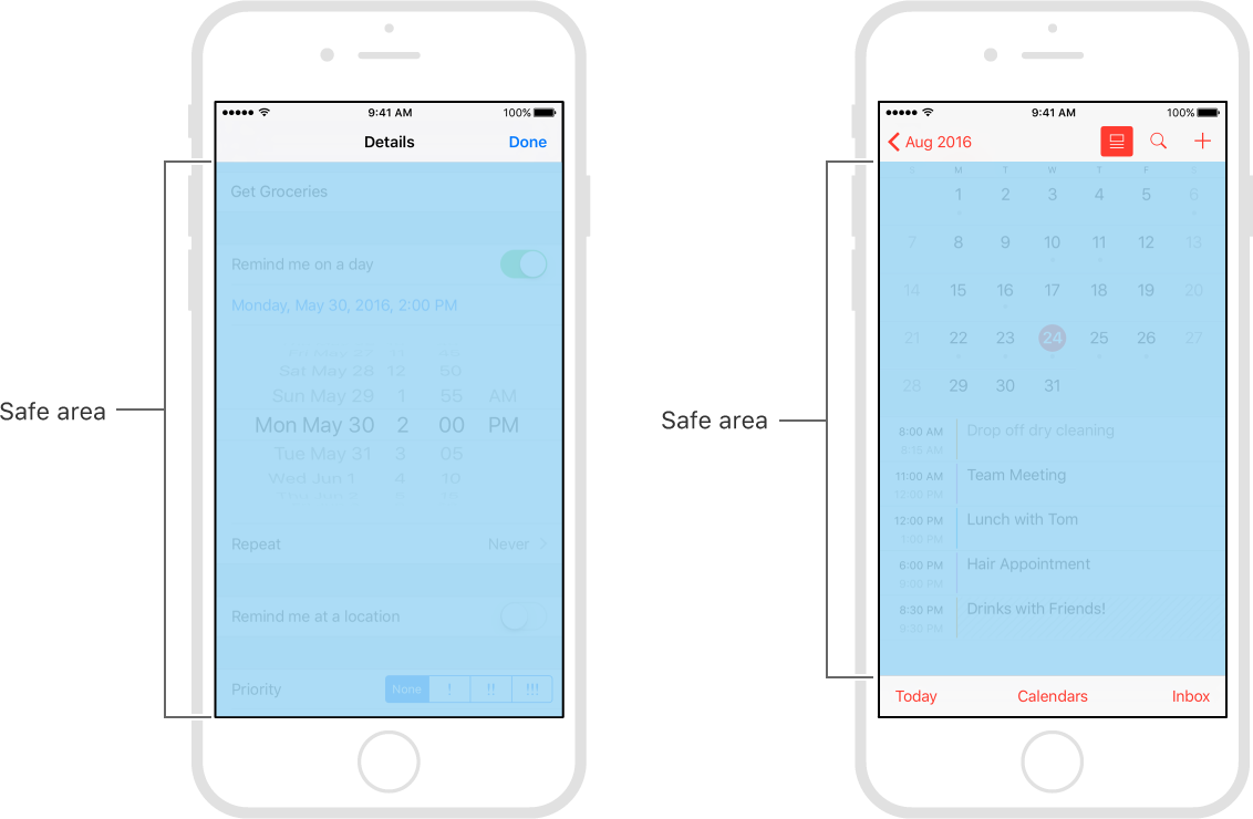
  • safeAreaLayoutGuide reflects the portion of the view that is not covered by navigation bars, tab bars, toolbars, and other ancestor viewss.
  • Use safe areas as an aid to laying out your content like UIButton etc.

  • When designing for iPhone X, you must ensure that layouts fill the screen and aren't obscured by the device's rounded corners, sensor housing, or the indicator for accessing the Home screen.

  • Make sure backgrounds extend to the edges of the display, and that vertically scrollable layouts, like tables and collections, continue all the way to the bottom.

  • The status bar is taller on iPhone X than on other iPhones. If your app assumes a fixed status bar height for positioning content below the status bar, you must update your app to dynamically position content based on the user's device. Note that the status bar on iPhone X doesn't change height when background tasks like voice recording and location tracking are active print(UIApplication.shared.statusBarFrame.height)//44 for iPhone X, 20 for other iPhones

  • Height of home indicator container is 34 points.

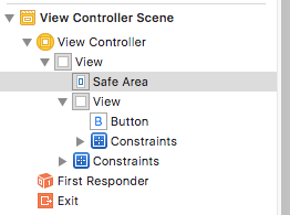
  • Once you enable Safe Area Layout Guide you can see safe area constraints property listed in the interface builder.

enter image description here

You can set constraints with respective of self.view.safeAreaLayoutGuide as-

ObjC:

  self.demoView.translatesAutoresizingMaskIntoConstraints = NO;
    UILayoutGuide * guide = self.view.safeAreaLayoutGuide;
    [self.demoView.leadingAnchor constraintEqualToAnchor:guide.leadingAnchor].active = YES;
    [self.demoView.trailingAnchor constraintEqualToAnchor:guide.trailingAnchor].active = YES;
    [self.demoView.topAnchor constraintEqualToAnchor:guide.topAnchor].active = YES;
    [self.demoView.bottomAnchor constraintEqualToAnchor:guide.bottomAnchor].active = YES;

Swift:

   demoView.translatesAutoresizingMaskIntoConstraints = false
        if #available(iOS 11.0, *) {
            let guide = self.view.safeAreaLayoutGuide
            demoView.trailingAnchor.constraint(equalTo: guide.trailingAnchor).isActive = true
            demoView.leadingAnchor.constraint(equalTo: guide.leadingAnchor).isActive = true
            demoView.bottomAnchor.constraint(equalTo: guide.bottomAnchor).isActive = true
            demoView.topAnchor.constraint(equalTo: guide.topAnchor).isActive = true
        } else {
            NSLayoutConstraint(item: demoView, attribute: .leading, relatedBy: .equal, toItem: view, attribute: .leading, multiplier: 1.0, constant: 0).isActive = true
            NSLayoutConstraint(item: demoView, attribute: .trailing, relatedBy: .equal, toItem: view, attribute: .trailing, multiplier: 1.0, constant: 0).isActive = true
            NSLayoutConstraint(item: demoView, attribute: .bottom, relatedBy: .equal, toItem: view, attribute: .bottom, multiplier: 1.0, constant: 0).isActive = true
            NSLayoutConstraint(item: demoView, attribute: .top, relatedBy: .equal, toItem: view, attribute: .top, multiplier: 1.0, constant: 0).isActive = true
        }

enter image description here

enter image description here

enter image description here

Senhor answered 10/10, 2017 at 11:28 Comment(2)
I find this bullet point guide very useful, but what does "Safe area not covers navigation bars, tab bars, toolbars, and other ancestor views" mean exactly?Coridon
Example - As in above last screen Toolbar(Today, Calendars & inbox) which is not covered by safreAreaGuideSenhor
Q
8

Apple introduced the topLayoutGuide and bottomLayoutGuide as properties of UIViewController way back in iOS 7. They allowed you to create constraints to keep your content from being hidden by UIKit bars like the status, navigation or tab bar. These layout guides are deprecated in iOS 11 and replaced by a single safe area layout guide.

Refer link for more information.

Quaker answered 17/8, 2017 at 4:58 Comment(0)
G
5

The Safe Area Layout Guide helps avoid underlapping System UI elements when positioning content and controls.

The Safe Area is the area in between System UI elements which are Status Bar, Navigation Bar and Tool Bar or Tab Bar. So when you add a Status bar to your app, the Safe Area shrink. When you add a Navigation Bar to your app, the Safe Area shrinks again.

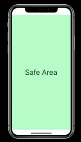
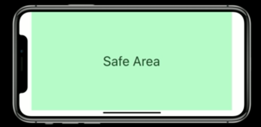
On the iPhone X, the Safe Area provides additional inset from the top and bottom screen edges in portrait even when no bar is shown. In landscape, the Safe Area is inset from the sides of the screens and the home indicator.

This is taken from Apple's video Designing for iPhone X where they also visualize how different elements affect the Safe Area.

Gallant answered 13/9, 2017 at 9:48 Comment(0)

© 2022 - 2024 — McMap. All rights reserved.