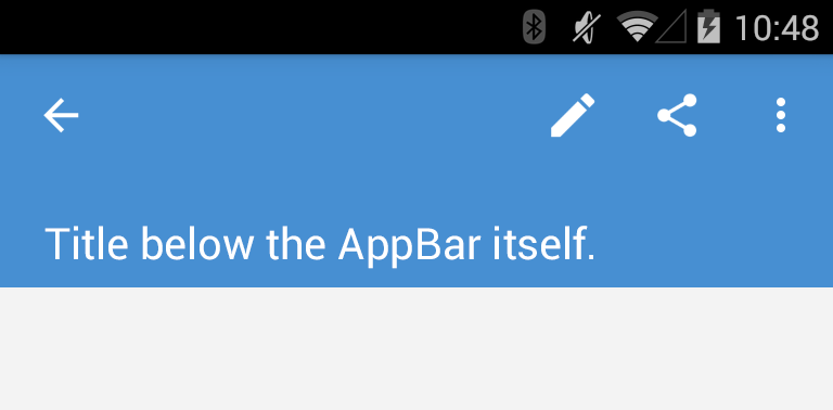
Normally, the title always has to fit between the toolbar's menu & action items in order to move the title up when the toolbar is collapsing.
An easy way around this is to put a TextView inside the toolbar and set the toolbar's background to transparent. Also notice how I've set the elevation to the LinearLayout and disabled it on the toolbar (although the shadow isn't visible in the screenshot since I was running it on a KitKat device).
<!-- App Bar container -->
<LinearLayout
    android:layout_width="match_parent"
    android:layout_height="wrap_content"
    android:background="@color/blue"
    android:elevation="2dp"
    android:orientation="vertical">

    <!-- App Bar -->
    <android.support.v7.widget.Toolbar
        android:layout_width="match_parent"
        android:layout_height="wrap_content"
        android:background="@android:color/transparent"
        android:elevation="0dp"
        android:gravity="center"
        android:minHeight="?attr/actionBarSize">
    </android.support.v7.widget.Toolbar>

    <TextView
        android:layout_width="match_parent"
        android:layout_height="wrap_content"
        android:layout_marginBottom="6dp"
        android:layout_marginLeft="20dp"
        android:layout_marginRight="20dp"
        android:text="Title below the AppBar itself."
        android:textColor="#fff"
        android:textSize="20sp"/>
</LinearLayout>
Which gives the following result:
![Full width title between appbar]()
This might look like two extra views, but keep in mind that if you don't set a title to the ToolBar, no TextView is inflated there. Net result is still one extra view though.


