I'm opening a CNContactPickerViewController for use in an application, but I want to alter the way it presents to suit my apps needs, preferably without rolling my own and doing a lot of re-inventing of the wheel. This is how I am opening it using Objective-C ....
self.contactPicker = [[CNContactPickerViewController alloc] init];
self.contactPicker.delegate = self;

//Only enable contacts to be selected that have atleast one email address
NSArray *propertyKeys = @[CNContactGivenNameKey, CNContactFamilyNameKey, CNContactEmailAddressesKey];
NSPredicate *enablePredicate = [NSPredicate predicateWithFormat:@"emailAddresses.@count != 0"];

self.contactPicker.displayedPropertyKeys = propertyKeys;
self.contactPicker.predicateForEnablingContact = enablePredicate;

[self presentViewController:self.contactPicker animated:YES completion:nil];
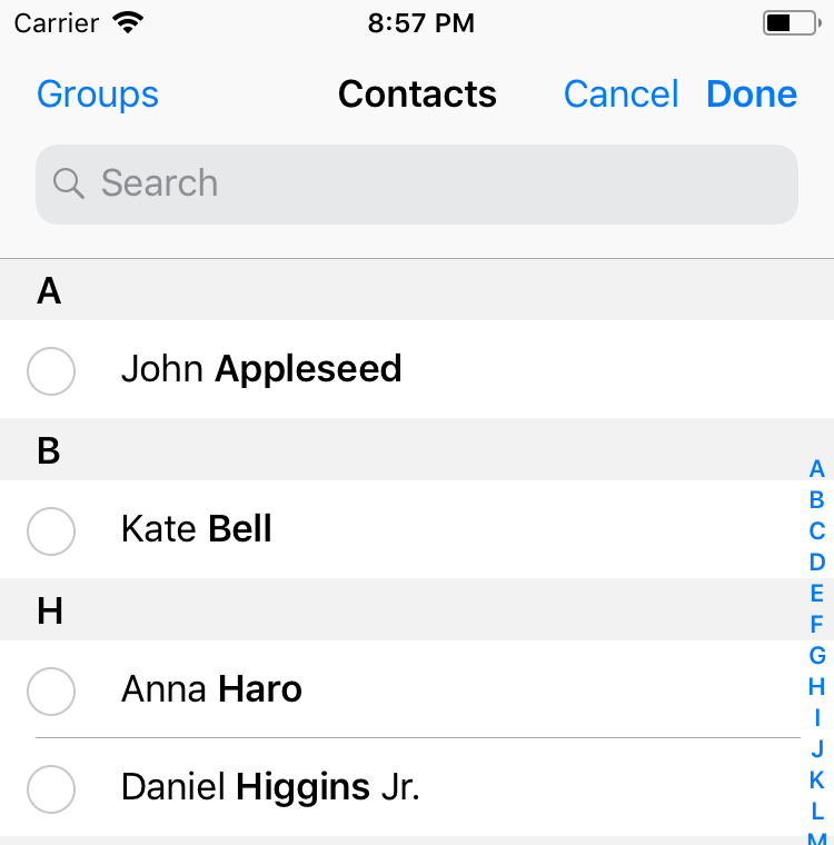
When it opens it currently looks like this:
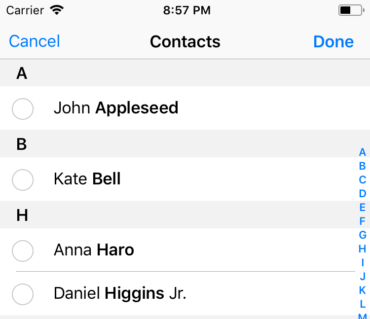
However due to a bug in the SDK the search for people on this kind of view doesn't work, as you can not select from the search results. I'm going to file a bug for this but in the mean time firstly I want to hide the Search Bar. I found some old questions on removing the SearchBar but they related to the ABPeoplePickerNavigationController and are not relevant to CNContacts. I also don't wish to use Groups and if I could remove that button and move the Cancel button over to the left that would be great, and would make the selection interface in my app much cleaner looking. This is how I would like it to look:
Could anyone tell me if this is possible and maybe point me in the right direction? I have the delegate method to receive the contacts array after selection, my problem is the way it looks in the app.
Thanks in advance!
Plasma


