TL;DR:
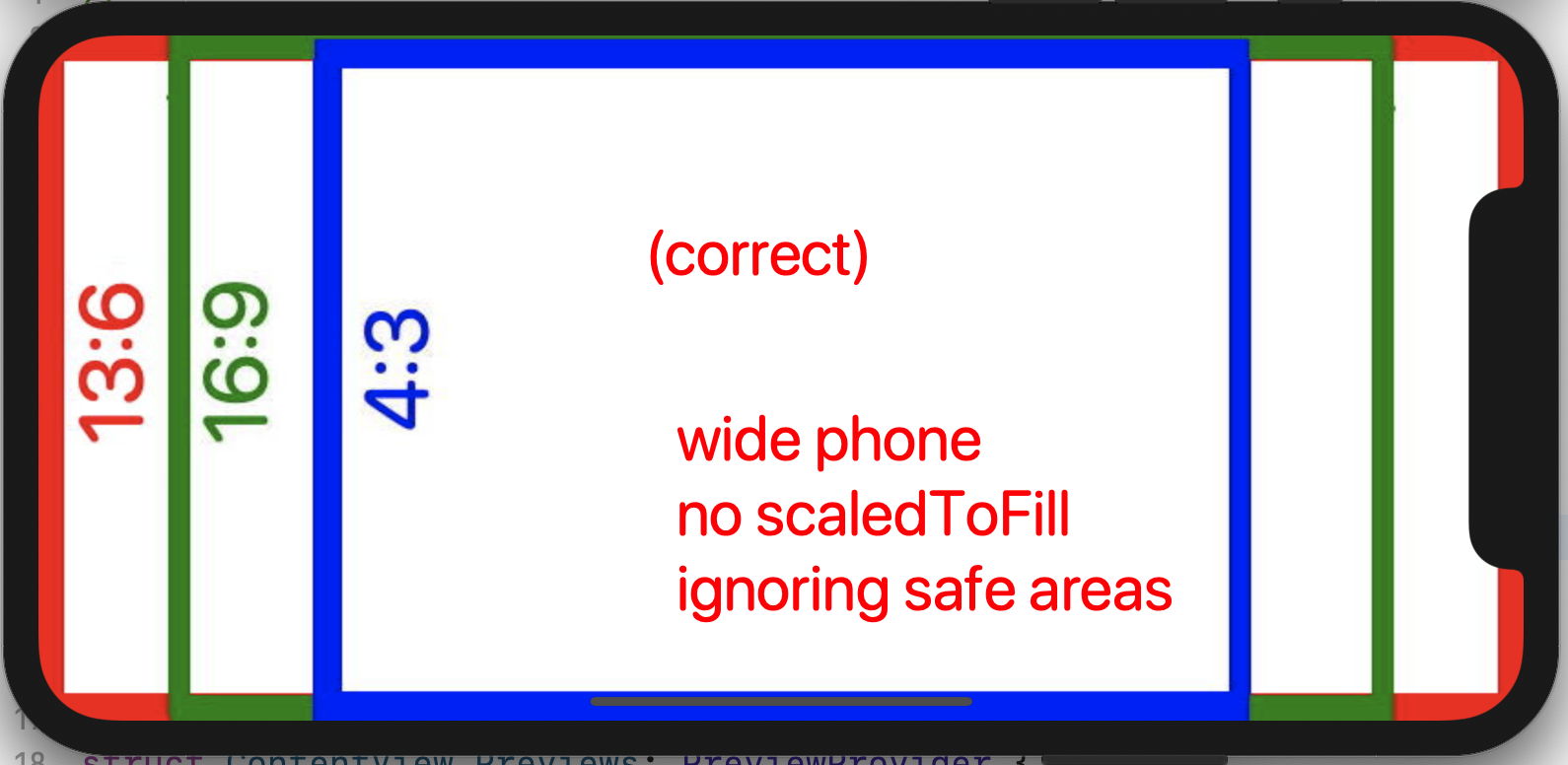
I can't draw an image exactly onto the full screen on wide-aspect (13:6) phones. If I observe the safe area, the error is (predictably) underscan. Using .edgesIgnoringSafeArea() goes (unexpectedly) too far in the other direction.
Update
Apple DTS have suggested this is a bug, refunded me one support incident, and invited me to submit a bug report. It is in the pipeline at https://feedbackassistant.apple.com/feedback/8192204
Caveat Lector
My presumptions about .scaledToFill might be wrong. I address that at the end.
Code
So elementary I can put it here and it won't even slow you down
struct ContentView: View {
    var body: some View {
        Image("testImage").resizable().scaledToFill()
//        .edgesIgnoringSafeArea(.all)
    }
}
Test Image
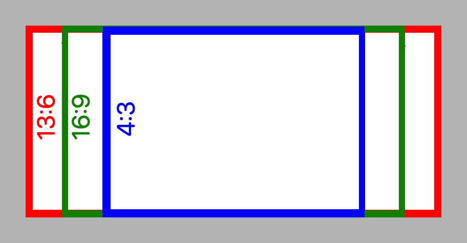
The Test Image is a landscape rectangle, proportioned at 13:6, like the wide phone. (E.g. the 812:375 proportion of the original iPhone X.) The gray periphery is not part of the image.
It has its sub-frames marked, that correspond to the narrow (older) phones (16:9) and pads (4:3).
Runtime Results
The Xcode project settings are explicitly landscape-only, for both pads and phones.
For narrow phones and all pads, the code above, observing safe areas, renders the Test Image like I expect:
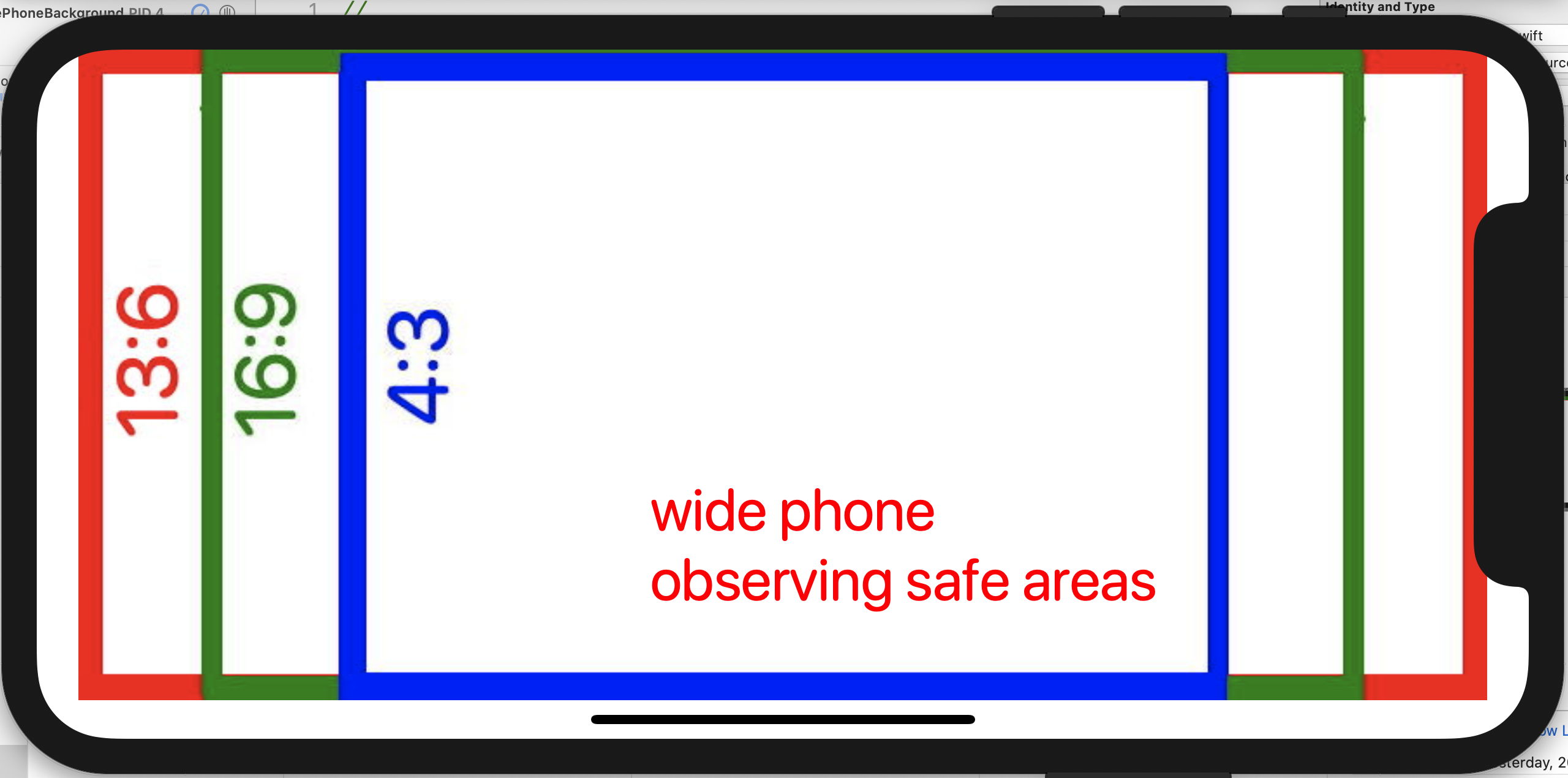
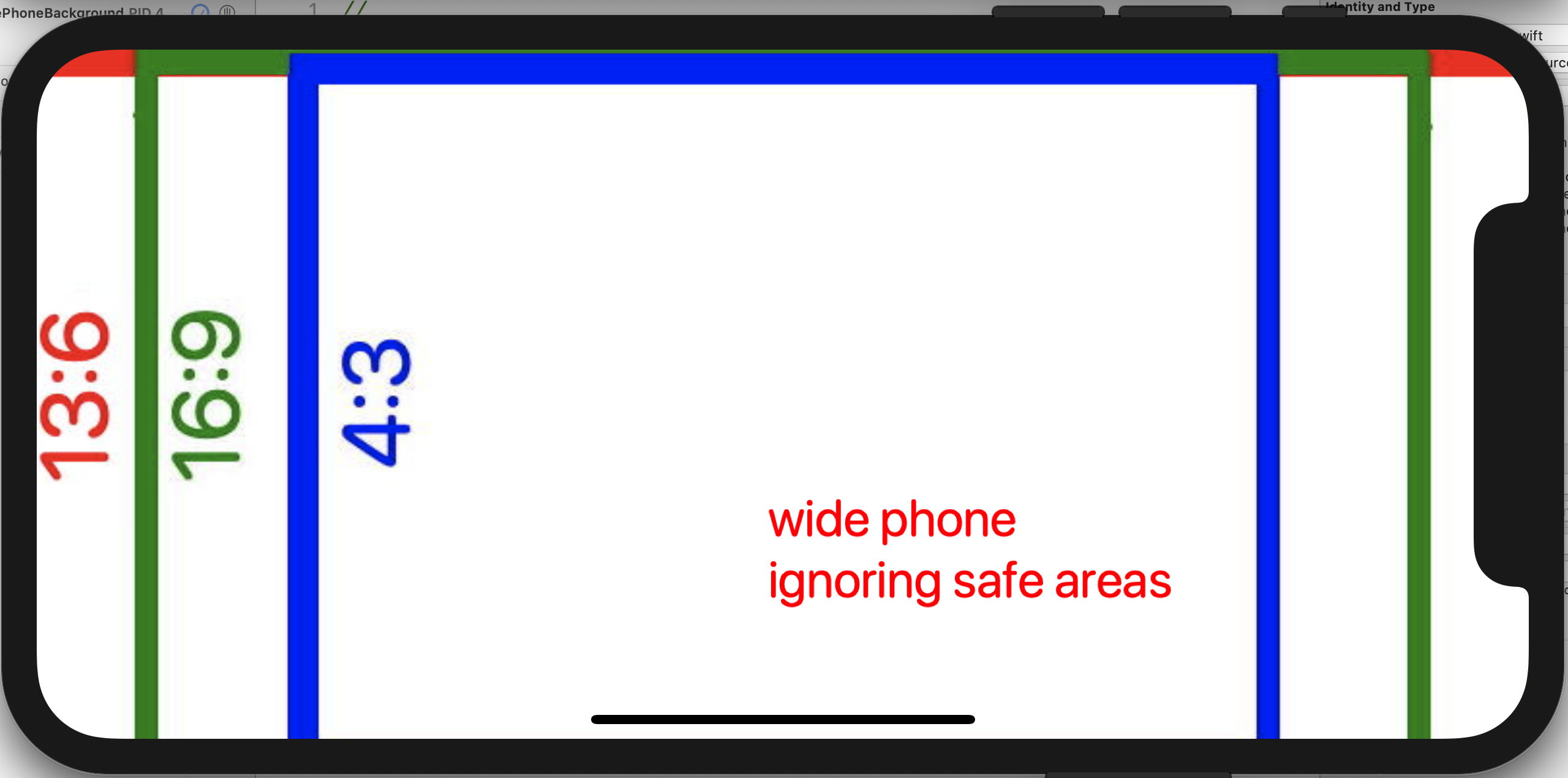
But on wide phones, I can't get the red rect to coincide with the screen edges.
Wide Phones
With no call to .edgesIgnoringSafeArea(), that is we are observing safe area. Naturally, our image is mapped to a subset of the full screen.
With the call to .edgesIgnoringSafeArea(). I expected this to exactly fill the screen but it overscans:
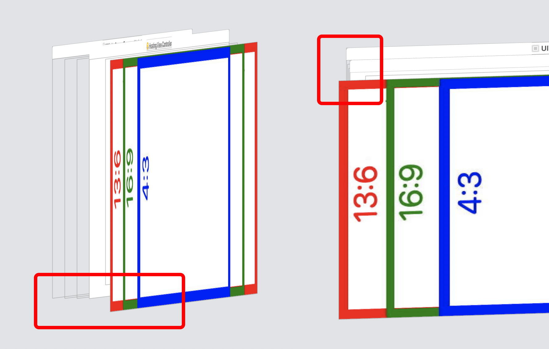
Here is the Xcode view-hierarchy debugger's perspective on the previous: the image is being mapped to a rect larger than the full screen. Why?
Order of Events
If I reverse the order of modifiers, and call .edgesIgnoringSafeArea() before .scaledToFill(), I get aspect ratio distortion, which .scaledToFill() is supposed to prevent. (See circle become ellipse in screen shot.) An explanation of how these operations compose, and why they do not commute, might go a long way to answering my primary questions.
Workaround
I think the above should work, and I don't see why not. What does work — on wide phones — is to eliminate the .scaledToFill modifier. Then you get this. But it only works because the test image is already the exact aspect ratio as the display — not a very general solution.
Scale to Fill
In the restricted domain of landscape images and displays, I expect the operation of scale-to-fill on the 13:6 test image to be equivalent to (to have the semantics of):
- Center the test image in the destination (container) rect, sized to fit entirely in the container.
- I have been expecting that ignoring safe areas means the "destination" will be the full screen, but that may be where I err.
- Expand the test image, maintaining proportion and center, until one pair of sides coincides with those of the container.
- For narrower displays, the left and right edges will meet first, and the top and bottom will be inside the destination rect.
- But don’t stop now. That would be scale to fit, or letterboxing.
- Expand until your top and bottom coincide with those of the container.
- For narrower displays this means there will be content cropped on both sides
- For 13:6 displays all four image edges will to coincide with the display edges at the same time.

