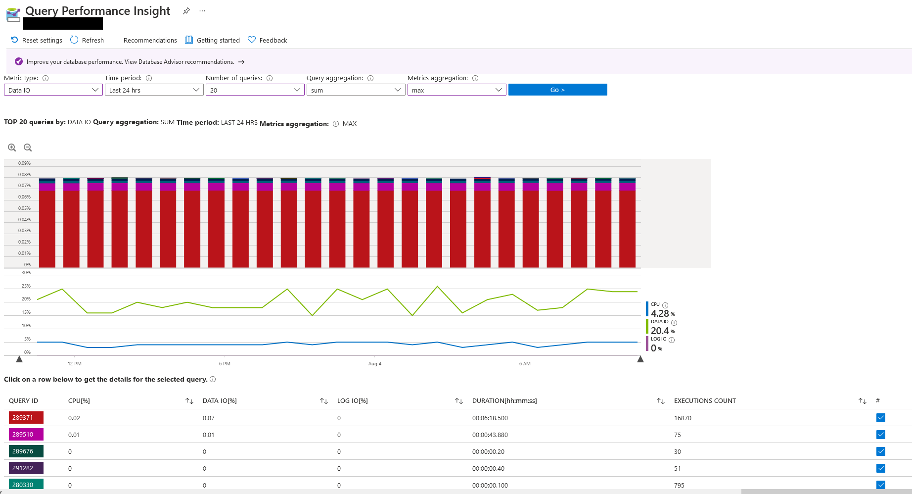
The following screenshot shows a day of SQL queries and the amount of resources they consume.
As you can see, single queries, while there are many don't seem to consume much resources.
The bar chart shows a load of 0.08% of Data IO load. The line chart below on the other hand shows a constant utilization of about 15% to 25%. Even if the line is a running average, it does not match the bar chart. The single queries in the table below also don't seem to consume much resources.
Where does this overhead come from? Does it just hide internal queries? Do I read the visualization wrong?

