Clustering overlapping ellipses
Asked Answered
U

1

7

I have a data set, which consists of more than one subsets of data. If I plot Y vs. X, I get few overlapping ellipses and I want to cluster them*.

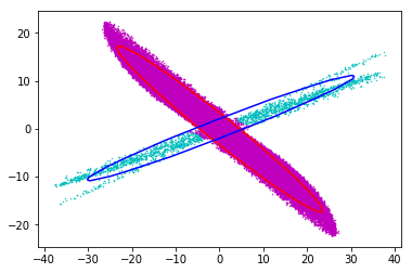
I have tried with the mixture from sklearn, the Bayesian Gaussian Mixture Model gives the best result, however, it does not recognize the overlapping data:

enter image description here

import itertools
import numpy as np
import pylab as plt
from sklearn import mixture
from matplotlib.patches import Ellipse
field_File_1 = './dummy_distrib_3.txt' 
'''
    link to data: 
    https://www.dropbox.com/s/jd3wx1ee8r1mj8p/dummy_distrib_3.txt?dl=0
'''
my_dis_1 = np.loadtxt(field_File_1)

X = my_dis_1[:50000,:2]

BaGaMiMo = mixture.BayesianGaussianMixture(n_components=2, covariance_type='full', 
                                         weight_concentration_prior_type='dirichlet_distribution').fit(X)

X1 = X[BaGaMiMo.predict(X) == 0, :]
X2 = X[BaGaMiMo.predict(X) == 1, :]

plt.figure(figsize=(18.0, 6.0))
plt.subplot(1,3,1)
plt.scatter(X[:,0], X[:,1], 0.2, color='m')

plt.subplot(1,3,2)
plt.scatter(X[BaGaMiMo.predict(X) == 0, 0], X[BaGaMiMo.predict(X) == 0, 1], .2, color='navy')

plt.subplot(1,3,3)
plt.scatter(X[BaGaMiMo.predict(X) == 1, 0], X[BaGaMiMo.predict(X) == 1, 1], .2, color='c')
plt.show()

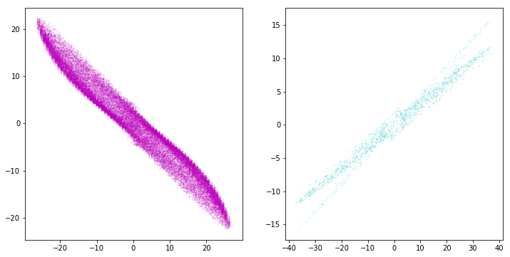
What I do next, is to fit two ellipses to the cyan and navy colored distribution and remove the particles in the cross-section from the cyan distribution,

enter image description here

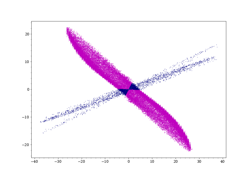
then assign them randomly to the navy and cyan distributions with the calculated ratio:

enter image description here

One issue is that If I do a histogram of the data, I notice that there is an over-population/discontinuity in the cyan data at the intersection line of the two ellipses and I am looking for ways to reduce that over-population, any help is appreciated.

The jupyter-notebook could be downloaded here: https://www.dropbox.com/s/z1tdgpx1g1lwtb5/Clustering.ipynb?dl=0

.* The data points belong to two sets of charged particles.

Undercut answered 1/3, 2019 at 13:47 Comment(6)
Besides proximity, ts there any form of relationship within the points belonging to the cyan distribution ? Likewise, is there any relationship within the data points which belong to the navy distribution ?Mass
The reason for my earlier question is as follows: Consider the cyan data set to be all boys standing in a football pitch and navy data set to be all girls. If such a relationship were to be found, then identifying the cyan and navy clusters is super easy. The question boils down to appropriate feature engineering.Mass
In my opinion, this problem could be solved through appropriate feature engineering and then finding a good distance function which can give you a clean cyan and a clean navy cluster.Mass
@Sau001, the two sets of points belong to two different species, however, the whole clustering is to diagnose which point belong to which species.Undercut
Understood. If you can determine some other feature attribute or a which makes points in Cluster1 distinguishable from points in Cluster2 , then this could be solved by spectral clustering methods where you build up a similarity matrix. en.wikipedia.org/wiki/Spectral_clustering . Otherwise, it would just be a random guess as to which cluster does a point in the intersection region belong to.Mass
I am afraid I am left (and would be happy) with the random selection.Undercut
H
3

Maybe this will help. I used predict_proba() instead of predict() to get the probabilities that a point belongs to either group. Then I played with the cutoff. Setting the cutoff to 0.5, I got the same results as you. After some trial and error, a cutoff of 0.933 seems to do the trick.

p1 = X[BaGaMiMo.predict_proba(X)[:,0] > 0.933, :]
p2 = X[BaGaMiMo.predict_proba(X)[:,0] <= 0.933, :]
plt.scatter(p1[:,0], p1[:,1], 0.2, color='m')
plt.scatter(p2[:,0], p2[:,1], 0.2, color='navy')

Scatter plot with 0.933 cutoff between groups

Heirship answered 6/3, 2019 at 8:59 Comment(3)
I am getting an "IndexError: too many indices for array" on the first lineUndercut
@Undercut predict_proba() returns an array with probabilities for each group, only need one. I fixed the code in the answer.Heirship
Now I get your result, the mixture is still there. The desired outcome is something like the last pair of plots in the question.Undercut

© 2022 - 2024 — McMap. All rights reserved.