This is an ancient post, but it's a good question so I'll give it an answer.
I'll give an example of how this might be done with rasterVis::levelplot, using the 3-channel R logo raster data that comes with raster.
library(rasterVis)
b <- brick(system.file("external/rlogo.grd", package="raster"))
Plotting three-channel RGB rasters with levelplot
Create an empty raster with the same dimensions and extent as the brick.
r <- raster(b)
Calculate the hexadecimal colours corresponding to the values of the RGB channels, and coerce to factor.
cols <- factor(rgb(b[], maxColorValue=255))
Assign these factor values to the raster's cells.
r[] <- cols
Plot with levelplot, extracting the hexadecimal colours from the levels of cols and passing them to col.regions.
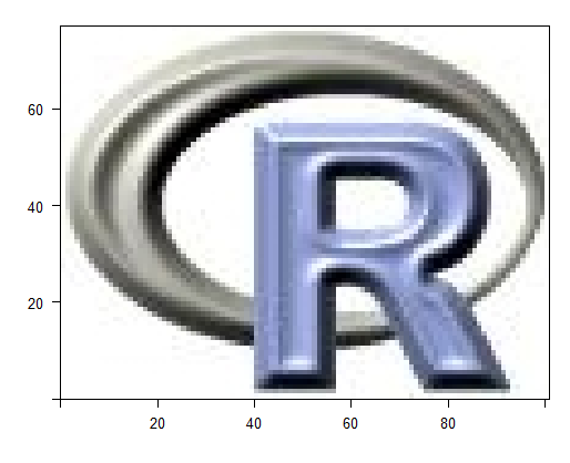
levelplot(r, col.regions=as.character(levels(cols)), colorkey=FALSE)
![enter image description here]()
Adding north arrow and scale bar
For the north arrow and the scale bar, we will look to @OscarPerpiñán's docs.
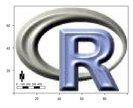
levelplot(r, col.regions=as.character(levels(cols)), colorkey=FALSE) +
  layer(SpatialPolygonsRescale(layout.north.arrow(), offset = c(5, 10), scale = 10)) +
  layer({
    xs <- seq(5, 25, by=5)
    grid.rect(x=xs, y=5,
              width=5, height=2,
              gp=gpar(fill=rep(c('transparent', 'black'), 2)),
              default.units='native')
    grid.text(x=xs-2.5, y=8, seq(0, 400, by=100),
              gp=gpar(cex=0.7),
              default.units='native')
  })
I'll leave it up to you to calculate the true distance (passed to grid.text) associated with the width, in map units, of the rectangles.
![enter image description here]()


