When I have a full width, fluid container my text in google chrome becomes distorted (too big), but none of the other browsers. Why?
Asked Answered
H

1

7
.container-fluid{
    background-color: $white;
    padding: 0;

    &.featured{
        max-width: 1300px;
    }
}

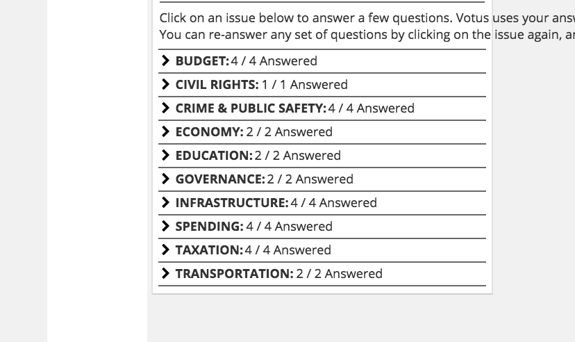
So, I set this to container fluid, and set max width on the main content (.featured), I have a top nav which remains full page width. If i zoom out a lot in chrome, the text becomes distorted. I can't see any font changes I'm making on media queries to cause this, and it's working fine in safari and firefox.

Any Ideas on how to resolve this or what I should dig more into?

chrome:

enter image description here

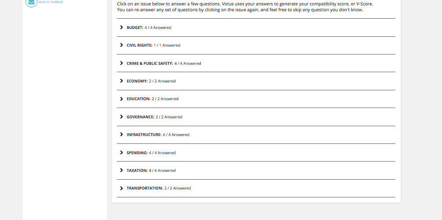
same zoom, but with firefox:

enter image description here

Hinduism answered 12/9, 2015 at 7:41 Comment(4)
What's your font-size declarations for body?Electrotype
Can you post more html and css, and / or create a simple demo on jsfiddle or similar site?Teamwork
@Hinduism Please post a jsfiddle of your side so far.Biotechnology
According to bootstrap zooming in some browsers are not supporting See this Bootstrap Zooming Can you post a simple demo on jsfiddle ? .. so that we can get for more information about your issueBarrator
E
4

If I got your question right, you need to end to your featured definition:

.featured {
    overflow-wrap: break-word;
}

Make sure the featured element can scale horizontally, i.e. does not have max height.

If this was not the problem, please post a codepen/fiddle

Eupatorium answered 21/9, 2015 at 15:4 Comment(0)

© 2022 - 2024 — McMap. All rights reserved.