Python - Calculate ongoing 1 Standard Deviation from linear regression line
Asked Answered
C

3

7

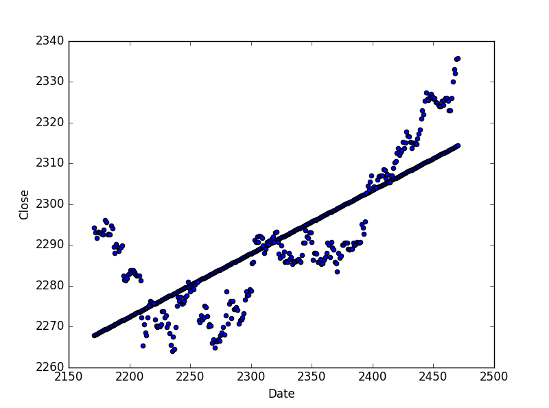
I have managed to get a linear regression line for time series data, much thanks to stackoverflow prior. So I have the following plots/line drawn over from python:

Linear Regression Line

I got this regression line with the following code, originally importing price/time series data from a csv file:

f4 = open('C:\Users\cost9\OneDrive\Documents\PYTHON\TEST-ASSURANCE FILES\LINEAR REGRESSION MULTI TREND IDENTIFICATION\ES_1H.CSV')    
ES_1H = pd.read_csv(f4)
ES_1H.rename(columns={'Date/Time': 'Date'}, inplace=True)
ES_1H['Date'] = ES_1H['Date'].reset_index()
ES_1H.Date.values.astype('M8[D]')
ES_1H_Last_300_Periods = ES_1H[-300:]
x = ES_1H_Last_300_Periods['Date']
y = ES_1H_Last_300_Periods['Close']
x = sm.add_constant(x)
ES_1H_LR = pd.ols(y = ES_1H_Last_300_Periods['Close'], x = ES_1H_Last_300_Periods['Date'])
plt.scatter(y = ES_1H_LR.y_fitted.values, x = ES_1H_Last_300_Periods['Date'])

What I'm looking for is to be able to plot/identify 1 standard deviation from the regression line (shown in the picture above). Most of the above code is just to conform the data to successfully be able to plot the regression line - change the Date/Time data so it will work in the ols formula, cut off the data to the last 300 periods and so on. But I am not sure how to grab 1 standard deviation from the line that is drawn via linear regression.

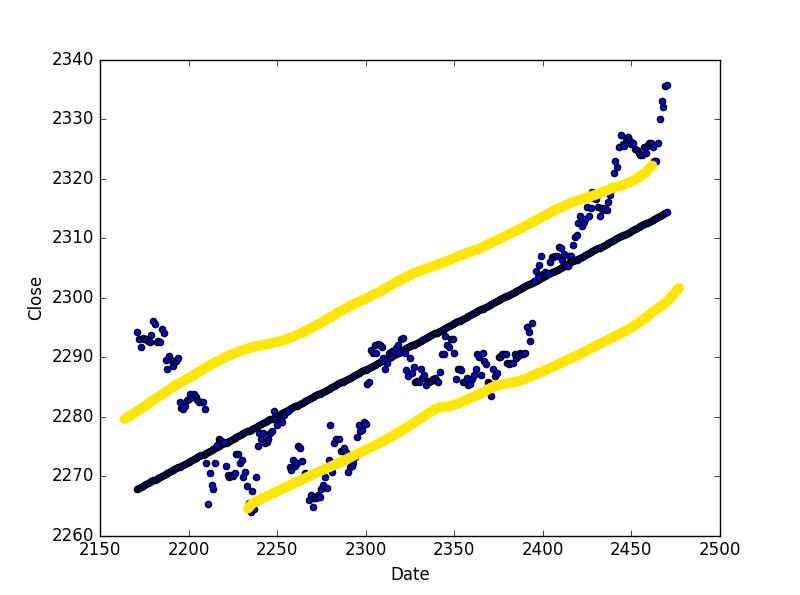
So ideally what I'm looking for would look something like this:

Linear Regression channel

...with the yellow lines being 1 standard deviation away from the regression line. Does anyone know how to get 1 standard deviation from the linear regression line here? For reference, here are the stats for linear regression:

Linear Regression Stats

edit: For reference here's what I ended up doing:

plt.scatter(y = ES_1D_LR.y_fitted.values, x = ES_1D_Last_30_Periods['Date'])
plt.scatter(y = ES_1D_Last_30_Periods.Close, x = ES_1D_Last_30_Periods.Date)
plt.scatter(y = ES_1D_LR.y_fitted.values - np.std(ES_1D_LR.y_fitted.values), x = ES_1D_Last_30_Periods.Date)
plt.scatter(y = ES_1D_LR.y_fitted.values + np.std(ES_1D_LR.y_fitted.values), x = ES_1D_Last_30_Periods.Date)
plt.show()
Carousal answered 15/2, 2017 at 19:23 Comment(0)
P
2

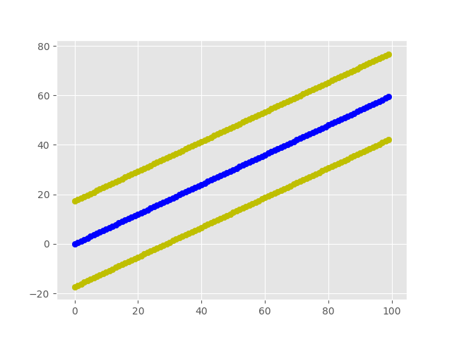
IIUC you can do it this way:

In [185]: x = np.arange(100)

In [186]: y = x*0.6

In [187]: plt.scatter(x, y, c='b')
Out[187]: <matplotlib.collections.PathCollection at 0xc512390>

In [188]: plt.scatter(x, y - np.std(y), c='y')
Out[188]: <matplotlib.collections.PathCollection at 0xc683940>

In [189]: plt.scatter(x, y + np.std(y), c='y')
Out[189]: <matplotlib.collections.PathCollection at 0xc69a550>

Result:

enter image description here

Pizor answered 15/2, 2017 at 21:19 Comment(3)
Great, thanks something similar to that works for my data. So I have the 'regression channel' plotted similar to above, but would you know how to retrieve a value for the regression line at a certain x point? For instance in your example I'm looking for the value of the regression line at x = 60 (looks like about 35 in your graph).Carousal
@ColeStarbuck, something like this: y[np.where(x == 60)[0][0]]?Pizor
I am currently using z = ES_1D['Date'][-1:] n = z*1.8758 + 1865.8121 where z gets me the last date for instance, and then n take the intercept + z*slope to get 2310.38, which looks right according to the graph. I suppose that's working, would just like to validate it makes senseCarousal
M
2

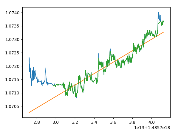
I just wanted to achieve the same thing. Here's how I did it.

import matplotlib.pyplot as plt
import numpy as np

Given this data:

plt.plot(time, price)
plt.plot(time, predicted_price)
plt.show()

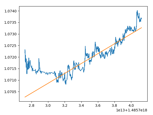
enter image description here

Plot a window around the predicted_price regression line:

sq_dis = (price - predicted_price) ** 2
limit = (sq_dis.mean() + sq_dis.std()) * 0.3 # < - adjust window here
filter = np.abs(sq_dis) < limit
plt.plot(time, price)
plt.plot(time, predicted_price)
plt.plot(time[filter], price[filter])
plt.show()

enter image description here

Memoirs answered 4/2, 2018 at 0:56 Comment(0)
D
0

I found this method closer to the way I had planned to plot my regression plots, so maybe you will find it interesting as well:

Use the function "plt.fill_between" to gray the area between mean and (mean+-standard deviation) like the following link: https://jakevdp.github.io/PythonDataScienceHandbook/04.03-errorbars.html

Danish answered 11/5, 2020 at 14:6 Comment(0)

© 2022 - 2024 — McMap. All rights reserved.