Chartjs 2 scaling lots of data points
Asked Answered
D

1

7

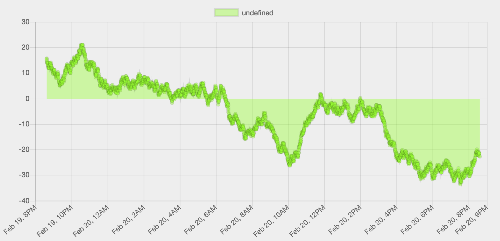
I'm trying to render a line chart with 24 hours of data (collected every 30 seconds). I can't figure out from the docs how to get it to scale nicely.

The docs say:

When building its ticks, it will automatically calculate the most comfortable unit base on the size of the scale.

But I can't get my line chart to scale "comfortably". I'm not sure it's what they mean, but I get far too many data points to render nicely. So I guess I'm looking for a way to drop data points (using chartjs, not hand rolled).

enter image description here

I'm doing something like this with my options;

const options = {
  spanGaps: false,
  scales: {
    xAxes: [{
      type: 'time',
      time: {
        displayFormats: {
          quarter: 'HH:mm'
        }
      }
    }]
  }
};

Any pointers where to look?

Dendrite answered 20/2, 2017 at 21:13 Comment(2)
If by "far too many data points to render nicely" you mean that you find overlapping points annoying, you could try reducing the radius of the points. You could even set it to 0. Try radius: 0 under your line data. (Ticks are the dates below your chart (which seem quite comfortable), so they are not relevant to your problem.)Ybarra
Thanks, good point / comment. That looks much better and seems to render faster too. Would you like to add an answer and I'll mark it as correct?Dendrite
L
4

In the case that you are still interested in 'dropping data points', you can have a look at the github issue which is recently active again. See link

https://github.com/chartjs/chartjs-plugin-zoom/issues/75.

There you can find a plugin written earlier this year in js for filtering datasets to include only those which are visible; it can be customized with your own filtering rule. I personally filter the dataset on my backend prior to sending it to javascript though....

Else, if you want to render even more time series data in a 'scalable' way, why not use the Chartjs time series/financial line plot ? You can check it out at the official documentation here ...

http://www.chartjs.org/samples/latest/scales/time/financial.html ... Which is a variant of the line chart ; check out the source code. Caveat is, use it as is (the source example) if you don't mind not having interactive tooltips.

Nonetheless in addition to xnakos's comment , a final thought (a bit of extra that crossed my mind..) on performance renders for even larger data sets, you may experiment with the combination of setting smaller pointRadius (non zero), and not rendering the lines instead. I have found this trick useful as well for allot of points on screen. In your datasets, just set showLine = 'false' and see how to make it work for you.

Linda answered 4/4, 2018 at 0:9 Comment(0)

© 2022 - 2024 — McMap. All rights reserved.