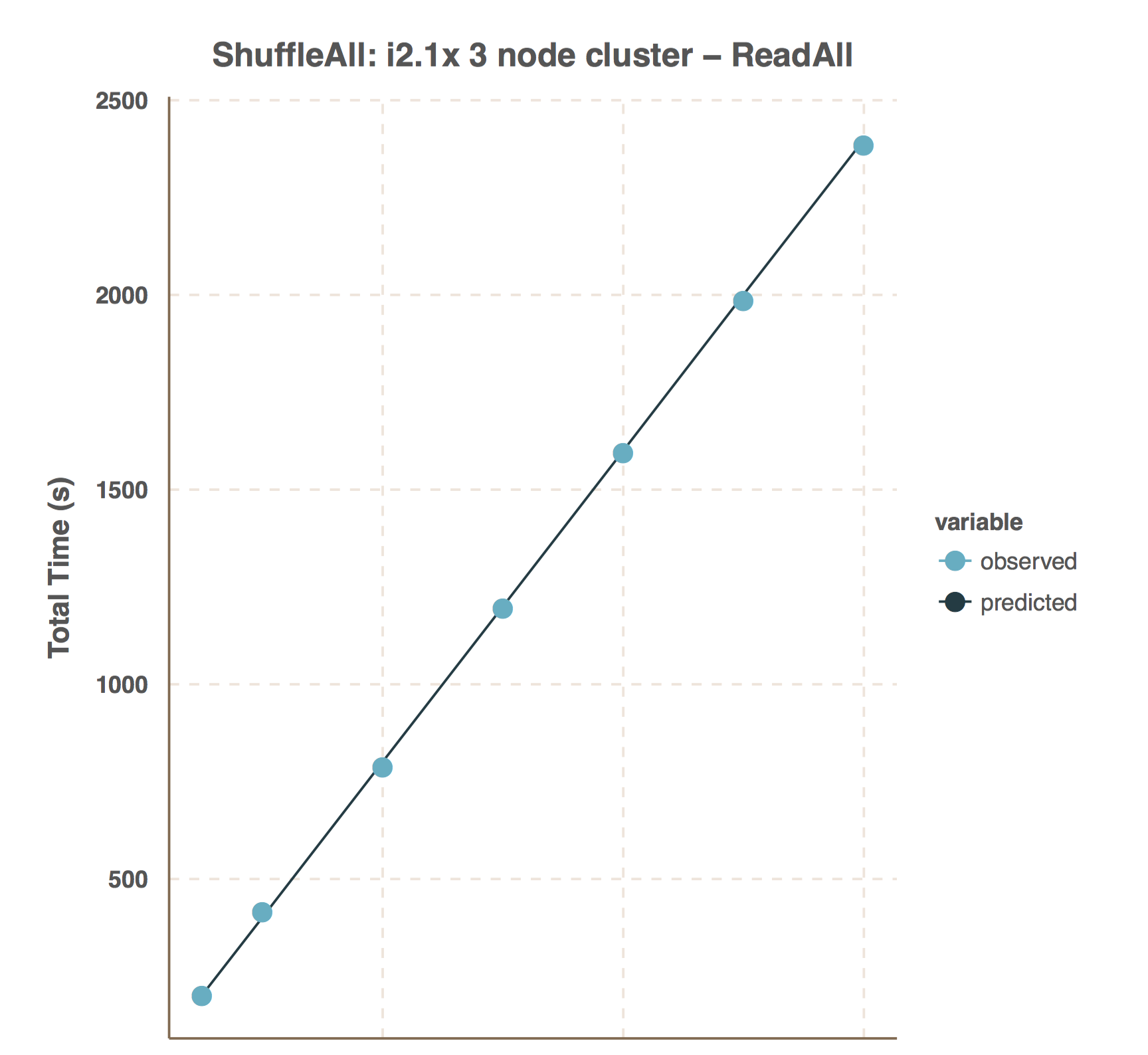
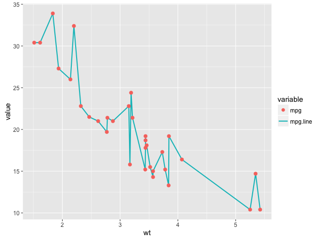
I'm graphing two data sets with ggplot. One should be a line, the other should be points. I can get this working as below:
d1 <- filter(d, variable==lineVar)
d2 <- filter(d, variable==dotVar)
g <- ggplot(d1, aes(clarity, x=xv, y=yv))
g <- g + geom_line(aes(colour=variable))
g <- g + ggtitle(title)
g <- g + xlab(xl)
g <- g + ylab(yl)
g <- g + geom_point(data=d2, size=4, aes(colour=variable))
The only issue is the legend! As you can see, the "observed" data set has a line + point in the legend, when it really should just be a point. And reverse for "predicted", it should just be a line.
Is there some way to get a cleaner / more accurate legend?


