Shift x-axis ticks with scale_x_datetime and geom_col so bars are NOT centered on tick mark
Asked Answered
M

1

7

I am plotting time series data in half-hour intervals, using geom_col() to show number of birds counted in each interval. ggplot2 plots each bar centered over the x-axis tick mark, but I need each bar to begin to the right of each tick mark. In other words, I need each bar to span the width of its corresponding half-hour interval.

I have tried the suggested solutions in these posts without luck:

Below is example code that reproduces the issue:

    ``` r
library(lubridate)
#> 
#> Attaching package: 'lubridate'
#> The following objects are masked from 'package:base':
#> 
#>     date, intersect, setdiff, union
library(ggplot2)
library(tidyverse)

df <- data.frame(
  date = c("2019-05-16", "2019-05-16", "2019-05-16", "2019-05-16", "2019-05-16", "2019-05-16", "2019-05-16", "2019-05-16"),
  time = c("16:30:00", "17:00:00", "17:30:00", "18:00:00", "18:30:00", "19:00:00", "19:30:00", "20:00:00"),
  count = c(5, 100, 14, 342, 59, 321, 44, 98),
  stringsAsFactors = FALSE)

datetime_df <- df %>% 
  mutate(time_stamp = paste(date, time) %>% as_datetime())

plot <- ggplot(datetime_df, aes(x = time_stamp, y = count)) +
  geom_col() +
  scale_x_datetime(breaks = scales::date_breaks("30 mins"), date_labels = "%H:%M",
                                    limits = c(as_datetime("2019-05-16 16:00:00"), 
                                               as_datetime("2019-05-16 20:30:00"))) +
  scale_y_continuous(expand = c(0,0), breaks = seq(0, 500, by = 50), limits = c(0,500))

Created on 2020-10-01 by the reprex package (v0.3.0)

Here is the resulting bar chart

Many thanks for any ideas on how to solve this issue!

Module answered 1/10, 2020 at 4:17 Comment(2)
By the way, welcome to the site! Great job having your first question be clear, obviously researched, and include a reproducible example!Charisecharisma
Thank you! You made my first experience on the site very rewarding -- drives home the power of providing reproducible examples! Thank you again for your time.Module
C
5

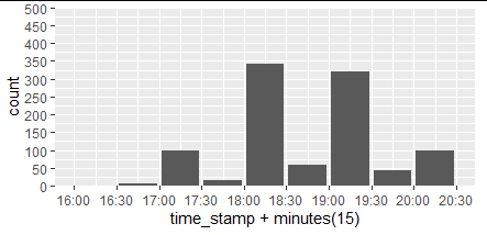
You can mimic this easily by adding 15 minutes to your times:

plot <- ggplot(datetime_df, aes(x = time_stamp + minutes(15), y = count)) +
  geom_col() +
  scale_x_datetime(breaks = scales::date_breaks("30 mins"), date_labels = "%H:%M",
                                    limits = c(as_datetime("2019-05-16 16:00:00"), 
                                               as_datetime("2019-05-16 20:30:00"))) +
  scale_y_continuous(expand = c(0,0), breaks = seq(0, 500, by = 50), limits = c(0,500))
plot

enter image description here

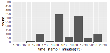
To make the ticks line up exactly with the start of the bar, you'll need to set the width parameter in geom_col to match the number of minutes added. After a little trial and error, this seems to work:

half_width_in_min = 13
plot <- ggplot(datetime_df, aes(x = time_stamp + minutes(half_width_in_min ), y = count)) +
  geom_col(width = 60 * 24 * 1.25 * half_width_in_min / 15) +
  scale_x_datetime(breaks = scales::date_breaks("30 mins"), date_labels = "%H:%M",
                                    limits = c(as_datetime("2019-05-16 16:00:00"), 
                                               as_datetime("2019-05-16 20:30:00"))) +
  scale_y_continuous(expand = c(0,0), breaks = seq(0, 500, by = 50), limits = c(0,500))
plot

enter image description here

Charisecharisma answered 1/10, 2020 at 4:48 Comment(1)
Thank you so much, @GregorThomas !! Your first suggestion to add 15 minutes to the times worked beautifully. I really appreciate your help!Module

© 2022 - 2024 — McMap. All rights reserved.