How to create a clickable histogram in Shiny?
Asked Answered
B

4

7

I want to create a clickable histogram in shiny but I don't know if it is possible.

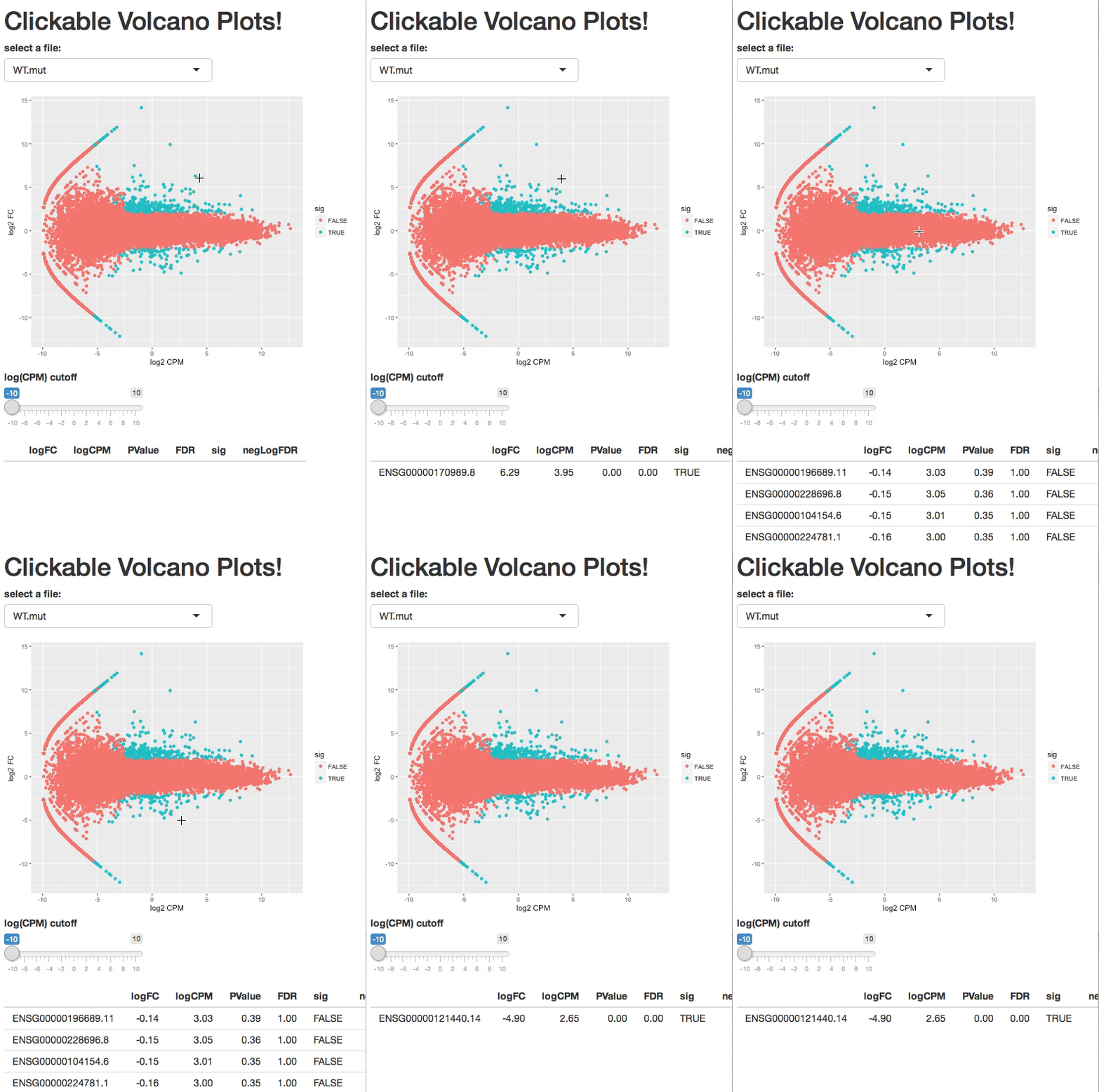
Some months ago I saw a clickable volcano plot which gives you a table of what you click.

gif1

Source: https://2-bitbio.com/2017/12/clickable-volcano-plots-in-shiny.html

The closest post that I found about creating clickable histograms is this one Click to get coordinates from multiple histogram in shiny

However, I don't want to get the coordinates. I want the rownames of the dataframe.

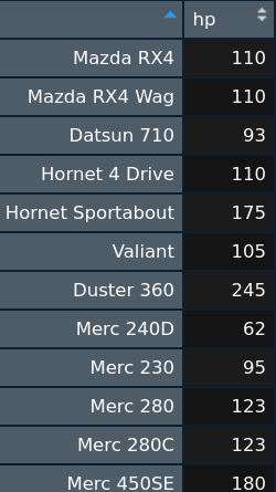
Having this dataframe, can I get the rownames everytime I click a bar from the histogram?

mtcars <- mtcars %>% 
  select("hp")
mtcars <- as.matrix(mtcars)

image2

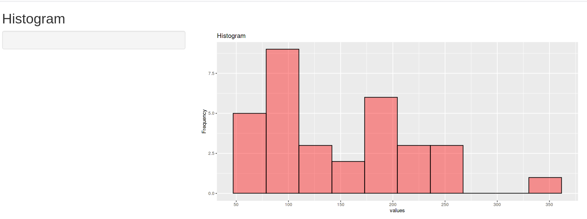
One example (but not clickable) in shiny:

library(shiny)
library(ggplot2)
library(scales)
library(dplyr)

ui <- fluidPage(
  
  titlePanel("Histogram"),
  
  sidebarLayout(
    sidebarPanel(
    ),
    
    mainPanel(
      plotOutput("hist"),
    )
  )
)

mtcars <- mtcars %>% 
  select("hp")
mtcars <- as.matrix(mtcars)

server <- function(input, output) {
  
  output$hist <- renderPlot({
    
    pp <- qplot(mtcars, geom = "histogram", bins = 10, xlab="values", 
                ylab="Frequency", main="Histogram",
                fill=I("red"), col=I("black"), alpha=I(0.4))
    
   pp + scale_x_continuous(breaks=pretty(mtcars, n=10))
  })
  
  
}

shinyApp(ui = ui, server = server)

image3

Does anyone know how to do it?

Thanks very much in advance!

Regards

Bunde answered 26/11, 2021 at 17:47 Comment(0)
D
2

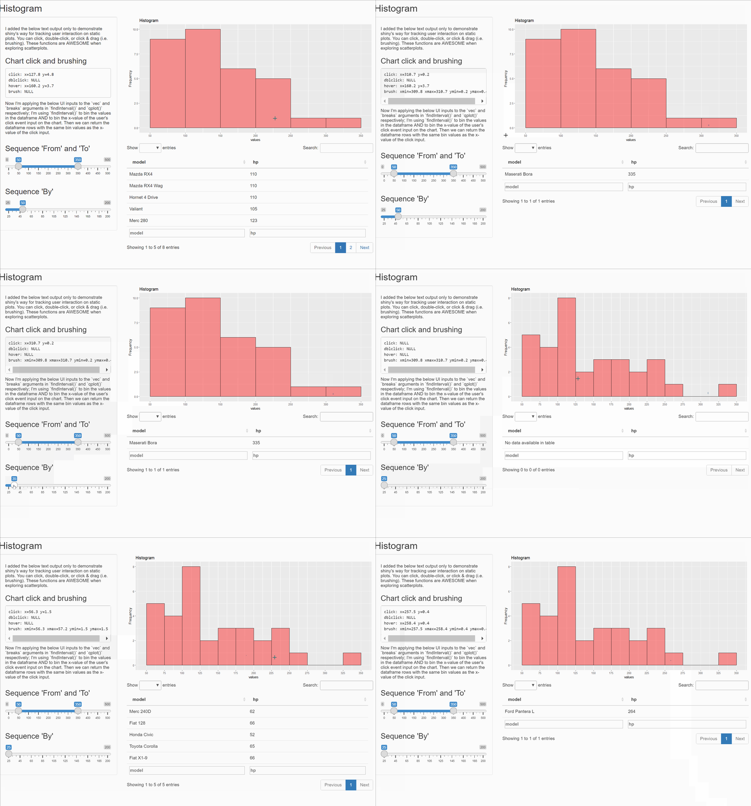
This is a great question, and what makes it challenging is that the qplot/ggplot charts are static images. The below app.r is an example of how I would do it. I'd love to see other approaches.

In essence:

  1. Create a sequence of numbers that will be used both as the breaks in your histogram and as intervals in your dataframe. I based these on user inputs, but you could hardcode them.
  2. Assign a "bin" value to each row in the dataframe based on the interval in which the value falls.
  3. Record the x-coordinate from the user's click event and assign that a "bin" value based on the same set of intervals.
  4. Subset your dataframe and retain only those records where the "bin" value of the data matches the "bin" value of the x-coordinate from the user's click event.

Otherwise, if you're willing to go the d3 route, you could explore something like this posted by R Views.

#Load libraries ----------------------------------------------------
library(shiny)
library(ggplot2)
library(scales)
library(dplyr)


# Prepare data -----------------------------------------------------
df <- mtcars
df <- cbind(model = rownames(df), data.frame(df, row.names = NULL)) # setting the rownames as the first column
dm <- df$hp %>% as.matrix()


# UI function ------------------------------------------------------
ui <- fluidPage(

  titlePanel("Histogram"),

  sidebarLayout(
    sidebarPanel(

      tags$h5("I added the below text output only to demonstrate shiny's way for tracking user interaction on static plots. You can click, double-click, or click & drag (i.e. brushing). These functions are AWESOME when exploring scatterplots."),

      tags$h3("Chart click and brushing"),

      verbatimTextOutput("info"),

      tags$h5("Now I'm applying the below UI inputs to the `vec` and `breaks` arguments in `findInterval()` and `qplot()` respectively; I'm using `findInterval()` to bin the values in the dataframe AND to bin the x-value of the user's click event input on the chart. Then we can return the dataframe rows with the same bin values as the x-value of the click input."),

      sliderInput("seq_from_to"
                  , label = h3("Sequence 'From' and 'To'")
                  , min = 0
                  , max = 500
                  , value = c(50, 350)
                  ),

      sliderInput("seq_by"
                  , label = h3("Sequence 'By'")
                  , min = 25
                  , max = 200
                  , value = 50
                  , step = 5)

    ),

    mainPanel(

      plotOutput("hist",
                 click = "plot_click",
                 dblclick = "plot_dblclick",
                 hover = "plot_hover",
                 brush = "plot_brush"),

      dataTableOutput("table")

    )
  )
)


# Server function --------------------------------------------------
server <- function(input, output) {

  # Render Histogram Plot
  output$hist <- renderPlot({

    # Using the same `qplot` function but inserting the user inputs to set the breaks values in the plot
    pp <- qplot(dm
                , geom = "histogram"
                , breaks = seq(from = input$seq_from_to[1], to = input$seq_from_to[2], by = input$seq_by)
                , xlab = "values"
                , ylab = "Frequency"
                , main = "Histogram"
                , fill = I("red")
                , col = I("black")
                , alpha = I(0.4)
                )

    # Also using the user inputs to set the breaks values for the x-axis
    pp + scale_x_continuous(breaks = seq(from = input$seq_from_to[1], to = input$seq_from_to[2], by = input$seq_by))
  })

  # This is purely explanatory to help show how shiny can read user interaction on qplot/ggplot objects
  # It's taken from the Shiny docs here: https://shiny.rstudio.com/articles/plot-interaction.html
  output$info <- renderText({

    # Retain the x and y coords of the user click event data
    xy_str <- function(e) {
      if(is.null(e)) return("NULL\n")
      paste0("x=", round(e$x, 1), " y=", round(e$y, 1), "\n")
    }

    # Retain the x and y range coords of click & drag (brush) data
    xy_range_str <- function(e) {
      if(is.null(e)) return("NULL\n")
      paste0("xmin=", round(e$xmin, 1), " xmax=", round(e$xmax, 1),
             " ymin=", round(e$ymin, 1), " ymax=", round(e$ymax, 1))
    }

    # Paste this together so we can read it in the UI function for demo purposes
    paste0(
      "click: ", xy_str(input$plot_click),
      "dblclick: ", xy_str(input$plot_dblclick),
      "hover: ", xy_str(input$plot_hover),
      "brush: ", xy_range_str(input$plot_brush)
    )
  })

  # Back to the story. Set a listener to trigger when one of the following is updated:
  toListen <- reactive({list(
    input$plot_click    # user clicks on the plot
    , input$seq_from_to # user updates the range slider
    , input$seq_by      # user updates the number input
    )
  })

  # When one of those events are triggered, update the datatable output
  observeEvent(toListen(), {

    # Save the user click event data
    click_data <- input$plot_click
    print(click_data) # during your app preview, you can watch the R Console to see what click data is accessible

    # Assign bin values to each row using the intervals that are set by the user input
    df$bin <- findInterval(dm, vec = seq(from = input$seq_from_to[1], to = input$seq_from_to[2], by = input$seq_by))

    # Similarly assign a bin value to the click event based on what interval the x values falls within
    click_data$x_bin <- findInterval(click_data$x, vec = seq(from = input$seq_from_to[1], to = input$seq_from_to[2], by = input$seq_by))

    # Lastly, subset the df to only those records within the same interval as the click event x-value
    df_results <- subset(df, bin == click_data$x_bin)

    # Select what values to view in the table
    df_results <- df_results %>% select(model, hp)

    # And push these back out to the UI
    output$table <- renderDataTable(df_results,
                                     options = list(
                                       pageLength = 5
                                     )
    )

  })


}

shinyApp(ui = ui, server = server)

enter image description here

Dictatorship answered 27/11, 2021 at 15:57 Comment(1)
Thanks very much! Your answer is very complete. Just in case, do you know how can I show the table of the brush? I would like to have that option too, apart from the "click option". I was thinking in brushedPoints but I need x and y, and I don't have the y. (shiny.rstudio.com/reference/shiny/0.12.0/brushedPoints.html)Bunde
M
2

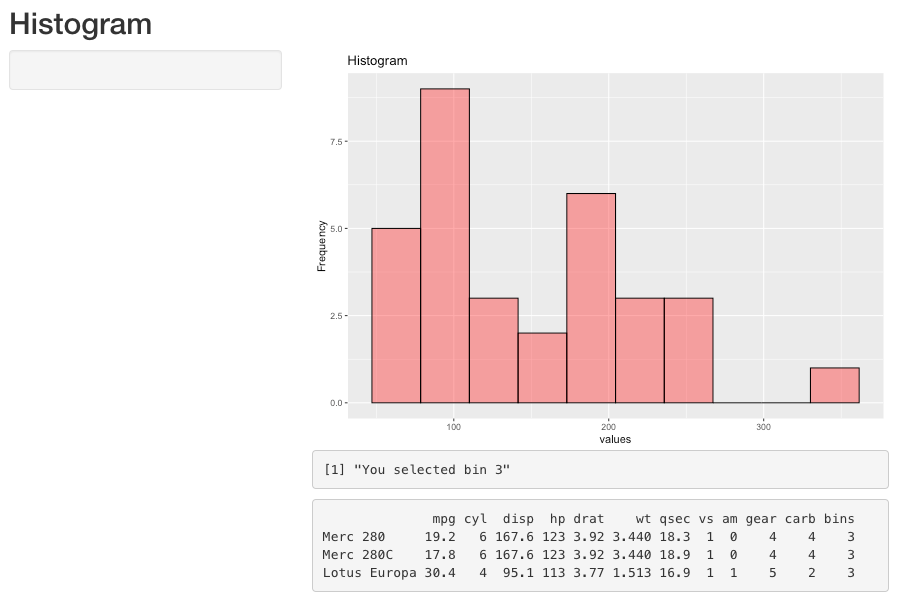
Well, someone answered. Since I took the time to put it together, here is another potential solution.

library(shiny)
library(ggplot2)
library(scales)
library(dplyr)
library(DescTools)                             # added for Closest()

ui <- fluidPage(                    
  
  titlePanel("Histogram"),
  sidebarLayout(
    sidebarPanel(
    ),
    
    mainPanel(
      plotOutput("hist", click = 'plot_click'),  # added plot_click
      verbatimTextOutput("x_value"),             # added queues for interactivity
      verbatimTextOutput("selected_rows")        # added table for bin values
    )
  )
)

# this can be a dataframe or matrix for qplot or ggplot 
           # (not sure if there was another reason you had this code?)
# mtcars <- mtcars %>% 
#   select("hp")                      # if you only want hp
# mtcars <- as.matrix(mtcars)         # I suggest making row names a column
                                      # to keep 2 columns 

pp <- ggplot(mtcars) +
  geom_histogram(aes(x = hp),
                 bins = 10,
                 fill = "red",
                 color = "black",
                 alpha = .4) +
  labs(x = "values",
       y = "Frequency",
       title = "Histogram")

# extract data from plot to find where each value falls within the histogram bins
        # I kept the pkg name, function in more than one library
bd <- ggplot_build(ggplot2::last_plot())$data[[1]]   

# add the assigned bin number to the mtcars frame; used for filtering matches
mtcars$bins <- lapply(mtcars$hp,
                      function(y) {
                        which(bd$x == Closest(bd$x, y))
                      }) %>% unlist()

server <- function(input, output) { 

  output$hist <- renderPlot({
    # moved the plot outside of server, so that global variables could be created
    
    # pp <- qplot(mtcars[,"hp"], geom = "histogram", bins = 10, xlab="values", 
    #             ylab = "Frequency", main = "Histogram",
    #             fill = I("red"), col = I("black"), alpha = I(0.4))
    # scale_x_continuous(breaks=pretty(mtcars, n=10)) # can't use this

    pp
  })
  # # Print the name of the x value                 # added all that's below with server()
  output$x_value <- renderPrint({
    if (is.null(input$plot_click$x)) return()

    # find the closest bin center to show where the user clicked on the histogram
    cBin <- which(bd$x == Closest(bd$x, input$plot_click$x))
    paste0("You selected bin ", cBin)   # print out selected value based on bin center
  })
  # Print the rows of the data frame which match the x value
  output$selected_rows <- renderPrint({
    if (is.null(input$plot_click$x)) return()
    
    # find the closest bin center to show where the user clicked on the histogram
    cBin <- which(bd$x == Closest(bd$x, input$plot_click$x))
    mtcars %>% filter(bins == cBin)
    # mtcars
  })
}

shinyApp(ui = ui, server = server)

enter image description here enter image description here

Mountaintop answered 27/11, 2021 at 16:56 Comment(0)
B
1

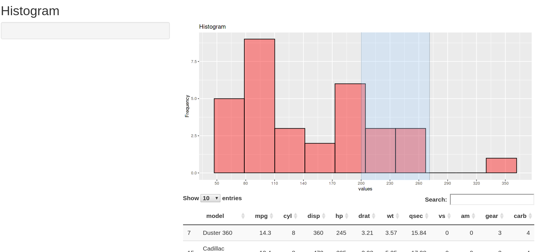
Just in case someone ends in this post looking a way to include brushedPoints... inspired on this post, I found a way to do it!

image

Code:

#Load libraries ----------------------------------------------------
library(shiny)
library(ggplot2)
library(scales)
library(dplyr)


# Prepare data -----------------------------------------------------
df <- mtcars
df <- cbind(model = rownames(df), data.frame(df, row.names = NULL)) # setting the rownames as the first column
breaks_data = pretty(mtcars$hp, n=10)
my_breaks = seq(min(breaks_data), to=max(breaks_data), by=30)


# UI function ------------------------------------------------------
ui <- fluidPage(
  
  titlePanel("Histogram"),
  
  sidebarLayout(
    sidebarPanel(
      actionButton("draw_plot", "Draw the plot")
    ),
    
    mainPanel(
      
      plotOutput("hist",
                 brush = brushOpts("plot_brush", resetOnNew = T, direction = "x")),
      
      dataTableOutput("table"),
    )
  )
)


# Server function --------------------------------------------------
server <- function(input, output) {
  

  observeEvent(input$plot_brush, {
   info_plot <- brushedPoints(df, input$plot_brush)
   output$table <- renderDataTable(info_plot)
   
  })
  
  # If the user didn't choose to see the plot, it won't appear.
  output$hist <- renderPlot({
    df %>% ggplot(aes(hp)) +
      geom_histogram(alpha=I(0.4), col = I("black"), fill = I("red"), bins=10) +
      labs(x = "values",
           y = "Frequency",
           title = "Histogram") +
      scale_x_continuous(breaks = my_breaks)
    
    
  })
  
}

shinyApp(ui = ui, server = server)
Bunde answered 6/1, 2022 at 10:14 Comment(0)
B
0

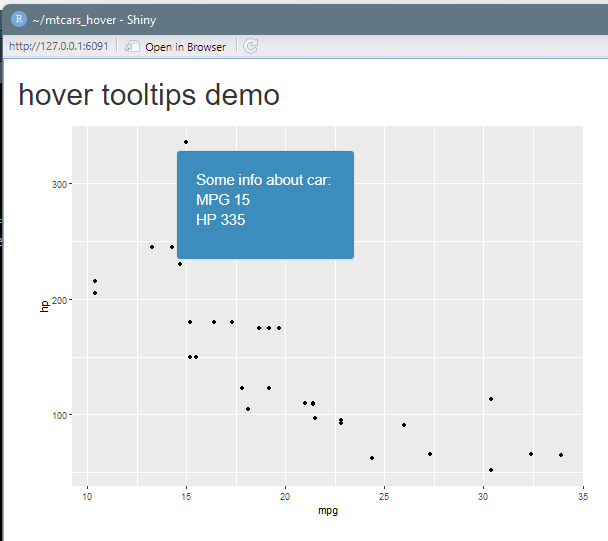
How to do a scatterplot with hover

library(shiny)
library(tidyverse)

ui <- fluidPage(
    titlePanel("hover tooltips demo"),
    mainPanel(
        plotOutput("plot1", hover = hoverOpts(id = "plot_hover", delay = 100, delayType = "debounce")),
    uiOutput("hover_info") # , style = "pointer-events: none")
    )
)

server <- function(input, output) {

output$plot1 <- renderPlot({
  
  mtcars %>% 
    ggplot(aes(mpg, hp)) +
    geom_point()
})

output$hover_info <- renderUI({
  
  hover <- input$plot_hover
  
  point <- shiny::nearPoints(mtcars,
                             coordinfo = hover,
                             xvar = 'mpg',
                             yvar = 'hp',
                             threshold = 20, 
                             maxpoints = 1, 
                             addDist = TRUE)
  
  if (nrow(point) == 0) return(NULL)

  style <- paste0("position:absolute; z-index:100; background-color: #3c8dbc; color: #ffffff;",
                  "font-weight: normal; font-size: 11pt;",
                  "left:", hover$coords_css$x + 5, "px;",
                  "top:",  hover$coords_css$y + 5, "px;")
  
  wellPanel(
    style = style,
    p(HTML(paste0("Some info about car: <br/>MPG ", point$mpg, "<br/>HP ", point$hp)))
  )
})
}

shinyApp(ui = ui, server = server)

enter image description here

Bellanca answered 25/7, 2022 at 18:39 Comment(0)

© 2022 - 2024 — McMap. All rights reserved.