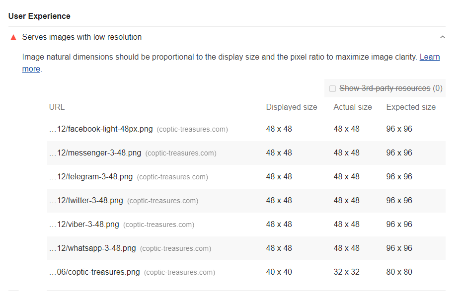
One of the recommendations I get when I audit my website using https://web.dev/measure, is "Serves images in low resolution".
As you can see from the screenshot below, my displayed image size matches the actual size. I don't know what's wrong here and what's the expected size.
If I made the images larger, I get an opposite error saying that my images are not properly sized and should reduce the size.
All these images have an explicit height of 48px and width: auto; to make it responsive.
Any suggestions to fix this issue?
Thanks in advance.


<picture>element orsrcsetattribute to offer different resolutions of the image? If not that is likely where the problem lies as one test will check it can get an image at native resolution (1x and correctly sized) and another will check that it can get a higher pixel density image (2x resolution) for devices that support it. – Babylon<picture>element and it worked. – Insulatorscrsetattribute but still the same problem. I have a32pxsmall icon that fits to all screen sizes, which mean whether small or large screen, I still use the same size:<img width="32" height="32" src="/images/icons/menu.png" srcset="/images/icons/menu.png 32w" sizes="32px" alt="Menu">Anything wrong with it? – Diadromous