Logarithmic heatmap in Plotly
Asked Answered
C

2

7

I am using heatmap from Plotly. I want to use a logarithmic scale for the color but cannot find how to do so. Here is a MWE:

import plotly.graph_objects as go
import numpy as np

z = [[1e-4,1e-3,1e-2],
    [1e-1, 1, 1e1],
    [1e2, 1e3, 1e4]]

go.Figure(
    data = go.Heatmap(
        z = z,
    )
).show()

go.Figure(
    data = go.Heatmap(
        z = np.log(z),
    )
).show()

In the MWE I manually calculate the logarithm of the data. I want the color map to be shown as in the second figure but without having to manually transform the data, and also displaying the real z values in the color scale, not the logarithm.

Conifer answered 13/7, 2021 at 20:5 Comment(4)
Is the provided answer what you were looking for?Tyrannosaur
Did not have time to look in in detail yet. It looks like a good approximation to what I want, tough the colorbar still is linear.Conifer
If you find my answer useful, I'd appreciate it if you accept it!Tyrannosaur
I ended up just plotting the logarithm of the data because with your method the legend is still linear and it becomes hard to read when there are many orders of magnitude spanned. I can give you an up vote anyway.Conifer
C
2

I got tired of manually doing this every time so I wrote a simple function to automate this, which can be found here and is called imshow_logscale. It is fully compatible with plotly.express.imshow, it displays the real value (i.e. not the log) in the hover box as well as in the color scale, and it is really a logarithmic. Below a working example.

import plotly_utils # https://github.com/SengerM/plotly_utils
import numpy

z1 = numpy.random.randint(1,100000,(33,33))
z2 = numpy.random.randint(1,500,(33,33))

for title,img in {'spanning many orders of magnitude':z1,'spanning few orders of magnitude':z2}.items():
    fig = plotly_utils.imshow_logscale(img, title=title)
    fig.show()

enter image description here

enter image description here

Edit

I recently added the option to draw contours: A heatmap with logarithmic scale made with Plotly

Conifer answered 27/7, 2023 at 9:54 Comment(0)
T
4

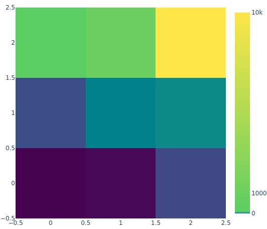
There is an example on the plotly homepage which I adapted to use the viridis colorscale. It's not perfect... you can play with the colorscale denominator to adapt it as you need.

import plotly.graph_objects as go
import plotly.express as px
import numpy as np

viridis = px.colors.sequential.Viridis

z = [[1e-4,1e-3,1e-2],
    [1e-1, 1, 1e1],
    [1e2, 1e3, 1e4]]

fig1 = go.Figure(
    data = go.Heatmap(
        z = z,
    colorscale = [
        [0, viridis[0]],
        [1./1000000, viridis[2]],
        [1./10000, viridis[4]],
        [1./100, viridis[7]],
        [1., viridis[9]],
    ],
    colorbar= dict(
        tick0= 0,
        tickmode= 'array',
        tickvals= [0, 1000, 10000]
    )
    )
)

Another option would be to use:

colorscale = [
        [0, viridis[0]],
        [1./1000000, viridis[2]],
        [1./10000, viridis[4]],
        [1./100, viridis[7]],
        [1., viridis[9]],
]
px.imshow(z, color_continuous_scale=colorscale, height=600, width=600)

The first one gives you (the second option is rather similar...):

enter image description here

Tyrannosaur answered 14/7, 2021 at 13:46 Comment(1)
Does this really interpolate the colors logarithmically in a fully continuous manner, or does it only look like this scales by the identity function with logarithmic jumps between four or five stops?Oleta
C
2

I got tired of manually doing this every time so I wrote a simple function to automate this, which can be found here and is called imshow_logscale. It is fully compatible with plotly.express.imshow, it displays the real value (i.e. not the log) in the hover box as well as in the color scale, and it is really a logarithmic. Below a working example.

import plotly_utils # https://github.com/SengerM/plotly_utils
import numpy

z1 = numpy.random.randint(1,100000,(33,33))
z2 = numpy.random.randint(1,500,(33,33))

for title,img in {'spanning many orders of magnitude':z1,'spanning few orders of magnitude':z2}.items():
    fig = plotly_utils.imshow_logscale(img, title=title)
    fig.show()

enter image description here

enter image description here

Edit

I recently added the option to draw contours: A heatmap with logarithmic scale made with Plotly

Conifer answered 27/7, 2023 at 9:54 Comment(0)

© 2022 - 2024 — McMap. All rights reserved.