I'd like to set up a CSS layout where a container contains a fixed number of flexible width tiles with the following properties:
- Spacing in between tiles is fixed and consistent
- They can expand in size between a fixed min and max width, but should all be the same width irrespective of their content. In the example below I'm using 100px min width and 200px max width.
- They should wrap onto multiple lines if at their minimum width they don't all fit horizontally in the container.
- If the container is much larger they should not expand larger than their maximum fixed width, should remain centered in the container and the space between them should not expand.
Perhaps it's not possible with pure CSS, but it feels like it should be! There's a minimal example below, which I'll detail here:
https://jsfiddle.net/vztskh6f/1/
Option 1: CSS Grid
This seems to be the best candidate, seeing as we always want tile widths to be consistent. In order to get columns to wrap I believe you need to use the repeat() syntax and repeat(auto-fit, ...) seems best for this use case. The obvious solution seems to be to use repeat(auto-fit, minmax(100px, 200px)). However, this does not work tiles always remain at 200px irrespective of the width of the container. In every other way this is behaving as desired:
.gridContainer {
  display: grid;
  grid-template-columns: repeat(auto-fit, minmax(100px, 200px));
  padding: 10px;
  gap: 10px;
  justify-items: center;
  justify-content: center;
}

.child {
  width: 100%;
  height: 30px;
  background: #0f0;
  text-align: center;
}
It could be possible to enforce the desired spec with Option 1, by using grid-template-columns: repeat(auto-fit, minmax(100px, 1fr)) and then setting a computed max-width on the container and forcing it to center too, but it feels like this should be possible with CSS Grid alone?
Option 2: Flexbox
Wrapping is much simpler to achieve with flexbox and using the flex on a child means we can easily set flexible tiles with min and max widths. However once a child wraps onto a second line, it will obviously expand to its max width and will be inconsistent with other tiles:
.flexContainer {
  display: flex;
  flex-wrap: wrap;
  justify-content: center;
}

.child {
  height: 30px;
  background: #0f0;
  text-align: center;
  min-width: 100px;
  max-width: 200px;
  // this seems to create consistent widths better than flex: 1 1 100px;
  flex: 1 1 0;
  // could use gap if it wasn't for Safari
  margin: 0 5px 10px;
}
Screenshots
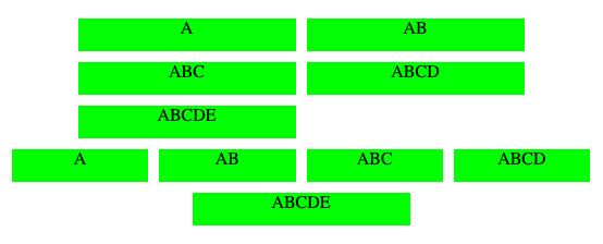
The first row is the grid layout, the second is the flex layout, you can see these are behaving nicely at full width, not expanding beyond their max widths with consistent spacing between them:
As the container shrinks you can see that the grid layout items are not shrinking with it, but immediately wrap. flex layout behaves nicely:
As the container continues to shrink, the flex starts to wrap in the desired place, but immediately the tile on the next row expands to its max width:


