How to connect scatterplot points with line using matplotlib
Asked Answered
C

5

165

I have two lists, dates and values. I want to plot them using matplotlib. The following creates a scatter plot of my data.

import matplotlib.pyplot as plt

plt.scatter(dates,values)
plt.show()

plt.plot(dates, values) creates a line graph.

But what I really want is a scatterplot where the points are connected by a line.

Similar to in R:

plot(dates, values)
lines(dates, value, type="l")

which gives me a scatterplot of points overlaid with a line connecting the points.

How do I do this in python?

Coparcenary answered 21/11, 2013 at 19:31 Comment(1)
Call show() after calling both scatter() and plot() first?Falco
E
214

I think @Evert has the right answer:

plt.scatter(dates,values)
plt.plot(dates, values)
plt.show()

Which is pretty much the same as

plt.plot(dates, values, '-o')
plt.show()

You can replace -o with another suitable format string as described in the documentation. You can also split the choices of line and marker styles using the linestyle= and marker= keyword arguments.

Encaustic answered 21/11, 2013 at 21:24 Comment(6)
'linestyle' was the good keyword search clue for me to path through the (gynormous) matplotlib docs.Hawaiian
@aaronsnoswell Size and color only makes sense for the points, which you can still plot via scatter, as per my first example. The question does not say anything about a varying line thickness or color, so I think your criticism is a bit unfair, really.Oleoresin
The keyword argument you want is not linestyle but marker. I'll add an answer because, somehow, this has not come up for this questin.Surplus
Thank you for the correction @eric. I have updated the answer to describe format strings, marker and linestyle.Oleoresin
@HannesOvrén no worries that wasn't aimed at you as much as the first comment. :)Surplus
Thanks, this is exactly what I was looking for! Using that, I can set a different marker style to a dedicated "special" point in my plot.Bleed
A
40

For red lines an points

plt.plot(dates, values, '.r-') 

or for x markers and blue lines

plt.plot(dates, values, 'xb-')
Atomic answered 21/11, 2013 at 19:40 Comment(1)
It looks like you, Evert and kigurai are all right. You can call both scatter() and plot() before calling show(). Or just call plot() with the line and point attributes as Steve Barnes described. ThanksCoparcenary
D
22

In addition to what provided in the other answers, the keyword "zorder" allows one to decide the order in which different objects are plotted vertically. E.g.:

plt.plot(x,y,zorder=1) 
plt.scatter(x,y,zorder=2)

plots the scatter symbols on top of the line, while

plt.plot(x,y,zorder=2)
plt.scatter(x,y,zorder=1)

plots the line over the scatter symbols.

See, e.g., the zorder demo

Debidebilitate answered 3/8, 2016 at 13:32 Comment(0)
S
4

They keyword argument for this is marker, and you can set the size of the marker with markersize. To generate a line with scatter symbols on top:

plt.plot(x, y, marker = '.', markersize = 10)

To plot a filled spot, you can use marker '.' or 'o' (the lower case letter oh). For a list of all markers, see:
https://matplotlib.org/stable/api/markers_api.html

Surplus answered 16/3, 2021 at 21:47 Comment(0)
O
0

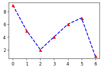
Logically, connecting scatter plot points with a line is the same as marking specific points on a line plot with a marker, so you can just use plot (which is mentioned elsewhere on this page). You can set marker facecolor, edgecolor and size along with line style, color and width all in the same plot() call.

import matplotlib.pyplot as plt

x = list(range(7))
y = [9, 5, 2, 4, 6, 7, 1]

plt.plot(x, y, marker='^', mfc='r', mec='r', ms=6, ls='--', c='b', lw=2)

result

With that being said, using scatter + plot is a little different from defining markers in a plot call like above because scatter creates a list of collections (which points to scatter points). You can check it using ax.lines and ax.collections. So if you have to change marker properties after plotting the figure, you'll have to access it via .collections while with plot, everything is stored in ax.lines.

import random

plt.plot(x, y, '--b')
plt.scatter(x, y, s=36, c='r', marker='^', zorder=2)
plt.gca().lines         # <Axes.ArtistList of 1 lines>
plt.gca().collections   # <Axes.ArtistList of 1 collections>


plt.plot(x, y, marker='^', mfc='r', mec='r', ms=6, ls='--', c='b')
plt.gca().lines         # <Axes.ArtistList of 1 lines>
plt.gca().collections   # <Axes.ArtistList of 0 collections>

An immediate consequence I found rather important was that the scatter + plot syntax consumes much more memory than just using plot(). This becomes rather important if you're creating many figures in a loop. The following memory profiling example shows that plot with markers consumes over 3 times less peak size of memory blocks (tested on Python 3.12.0 and matplotlib 3.8.0).

# .\profiling.py
import tracemalloc
import random
import matplotlib.pyplot as plt

def plot_markers(x, y, ax):
    ax.plot(x, y, marker='^', mfc='r', mec='r', ms=6, ls='--', c='b')

def scatter_plot(x, y, ax):
    ax.plot(x, y, '--b')
    ax.scatter(x, y, s=36, c='r', marker='^', zorder=2)

if __name__ == '__main__':
    x = list(range(10000))
    y = [random.random() for _ in range(10000)]
    for func in (plot_markers, scatter_plot):
        fig, ax = plt.subplots()
        tracemalloc.start()
        func(x, y, ax)
        size, peak = tracemalloc.get_traced_memory()
        tracemalloc.stop()
        plt.close(fig)
        print(f"{func.__name__}: size={size/1024:.2f}KB, peak={peak/1024:.2f}KB.")


> py .\profiling.py
plot_markers: size=445.83KB, peak=534.86KB.
scatter_plot: size=636.88KB, peak=1914.20KB.
Olympium answered 7/3 at 19:20 Comment(0)

© 2022 - 2024 — McMap. All rights reserved.