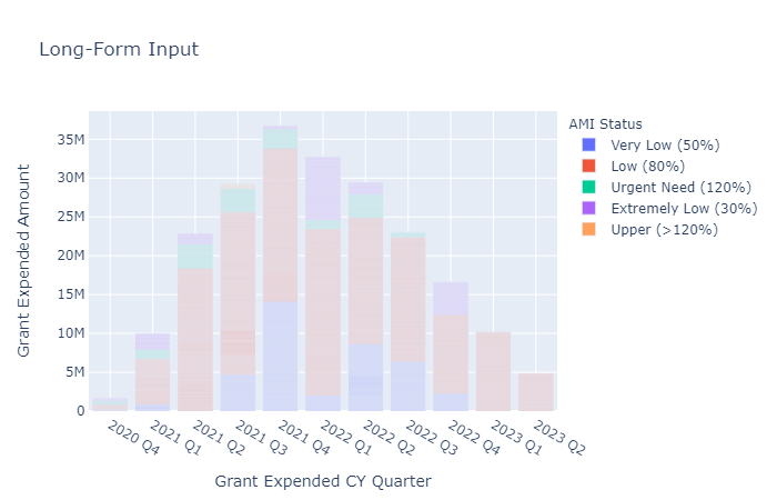
I am having issues with plotly express in Jupyter notebook. The colors in the plot are faded and do not match the colors in the legend, which they are supposed to look like. Does anyone have any suggestions? Happy to provide more info, but I am not sure what would be useful - I am still new to Python.
fig = px.bar(funded_apps_mask_kewt, x='Grant Expended CY Quarter', y='Grant
Expended Amount', color='AMI Status',title='Long-Form Input')
fig.update_xaxes(categoryorder='category ascending')
fig.show()


AMI Statu | Grant Exp | Grant Exp Q | Grant Exp Q | Grant Exp Year | Grant Exp QY
0 Very Low (50%)    20086.72 Q4 2020    Q4              2020           2020 Q4
1 Urgent Need (120%)20086.7  Q4 2020    Q4              2020           2020 Q4
2 Urgent Need (120%)20086.72 Q4 2020    Q4              2020           2020 Q4
3 Very Low (50%)    20086.72 Q4 2020    Q4              2020           2020 Q4
4 Low (80%)         20086.72 Q4 2020    Q4              2020           2020 Q4
5 Low (80%)         20086.72 Q4 2020    Q4              2020           2020 Q4
6 Low (80%)         20086.72 Q4 2020    Q4              2020           2020 Q4
82Low (80%)         35602.75 Q1 2021    Q1              2021           2021 Q1
This is what my data looks like. I changed the column names so they could fit, but the columns I used are 'AMI Status', 'Grant Exp', and 'Grant Exp QY'. It has ~7K rows.

