How to create a circular plot showing monthly presence or absence using radial.plot / ggplot2
Asked Answered
G

2

6

enter image description here

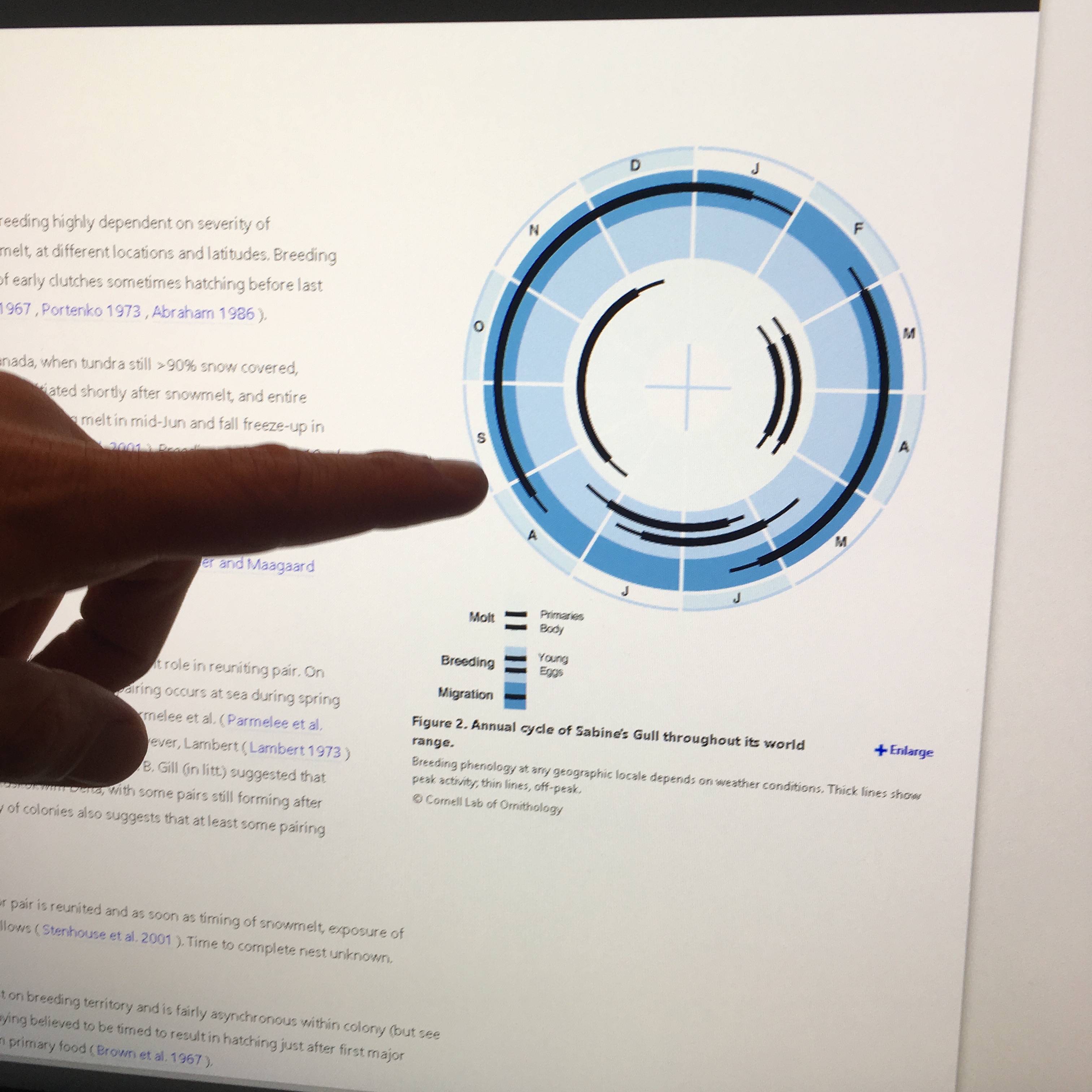
I want to create a figure (similar looking to the attached) in ggplot2 that is circular with month of year represented on axis so twelve tick marks around the circumference, with one inner arc of a certain color corresponding to months where pa = 1 (the other options is pa = 0) and another inner arc (outside of the first arc) corresponding to sampled = 1 (other option is sampled = 0). Data looks like this:

 m
   season pa month sampled occupancy
1  spring  1     3       1   present
2  spring  1     4       1   present
3  spring  1     5       1   present
4  summer  1     6       1   present
5  summer  1     7       1   present
6  summer  1     8       1   present
7  winter  0    12       1    absent
8  winter  0     1       0    absent
9  winter  0     2       0    absent
10   fall  1     9       1   present
11   fall  1    10       1   present
12   fall  1    11       1   present

I was previously using ggplot(m, aes(season, fill=season)) with geom_bar(width=1) and coord_polar() but that just gives me a pie chart.

Now trying:

radial.plot(m, radial.pos=c(1,2,3,4,5,6,7,8,9,10,11,12), labels="", rp.type="r",
            line.col=8, lwd=3, add=TRUE)

and getting the error

plot.new has not been called yet

I think I'm misunderstanding what input radial.plot needs and potentially using the wrong function for my desired output.

Glycol answered 10/12, 2016 at 23:22 Comment(3)
Could you post an example of the plot you wish to generate (even if done quickly and manually in paint or gimp)?Refinery
@Refinery I attached a photo ... any ideas? Thank you!Glycol
It looks like you might need to use geom_rect as all the objects you are trying to plot are rectangles (in polar coordinates).Gonfanon
G
3

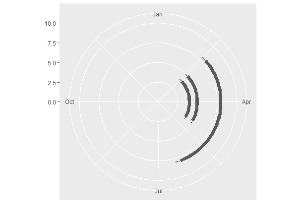
I wasn't sure how to relate your data to the plot above, but does the following code help?

df <- data.frame(startdate  = as.Date(c("2016-02-20", "2016-02-20", "2016-02-20")),
             finishdate = as.Date(c("2016-04-30", "2016-04-30", "2016-06-10")),
             y          = c(4,5,8))


library(ggplot2)

ggplot(df) +
  geom_rect(aes(xmin = startdate, 
                xmax = finishdate,
                ymin = y-0.2,
                ymax = y + 0.2)) +
  geom_rect(aes(xmin = startdate - 5, 
                xmax = finishdate + 5,
                ymin = y-0.05,
                ymax = y + 0.05)) +
  xlim(as.Date("2016-01-01"), as.Date("2016-12-31")) +
  ylim(0,10) +
  coord_polar()

enter image description here

Gonfanon answered 12/12, 2016 at 6:43 Comment(0)
J
9

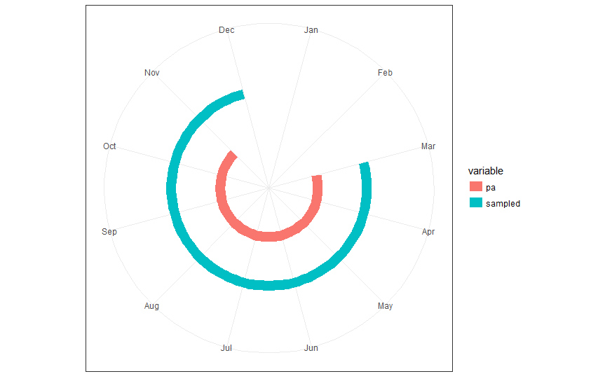
Here are two different approaches in ggplot2 to convert the supplied data into a polar plot. The two approaches differ in the way month is treated.

Read data

library(data.table)
m <- fread("id   season pa month sampled occupancy
           1  spring  1     3       1   present
           2  spring  1     4       1   present
           3  spring  1     5       1   present
           4  summer  1     6       1   present
           5  summer  1     7       1   present
           6  summer  1     8       1   present
           7  winter  0    12       1    absent
           8  winter  0     1       0    absent
           9  winter  0     2       0    absent
           10   fall  1     9       1   present
           11   fall  1    10       1   present
           12   fall  1    11       1   present")

Prepare data

# reshape from wide to long (as preferred by ggplot)
ml <- melt(m, measure.vars = c("pa", "sampled"))
# create factors to ensure desired order
ml[, variable := factor(variable, levels = c("pa", "sampled"))]

Variant 1: months as factor

ml[, fct_month := factor(month, levels = 1:12, labels = month.abb)]
library(ggplot2)
ggplot(ml[value != 0], aes(x = fct_month, y = variable, 
                           group = variable, colour = variable)) + 
  geom_line(size = 5) +
  scale_y_discrete(expand = c(0, 1), breaks = NULL) +
  xlim(month.abb) + 
  coord_polar() +
  theme_bw() + xlab(NULL) + ylab(NULL)

enter image description here

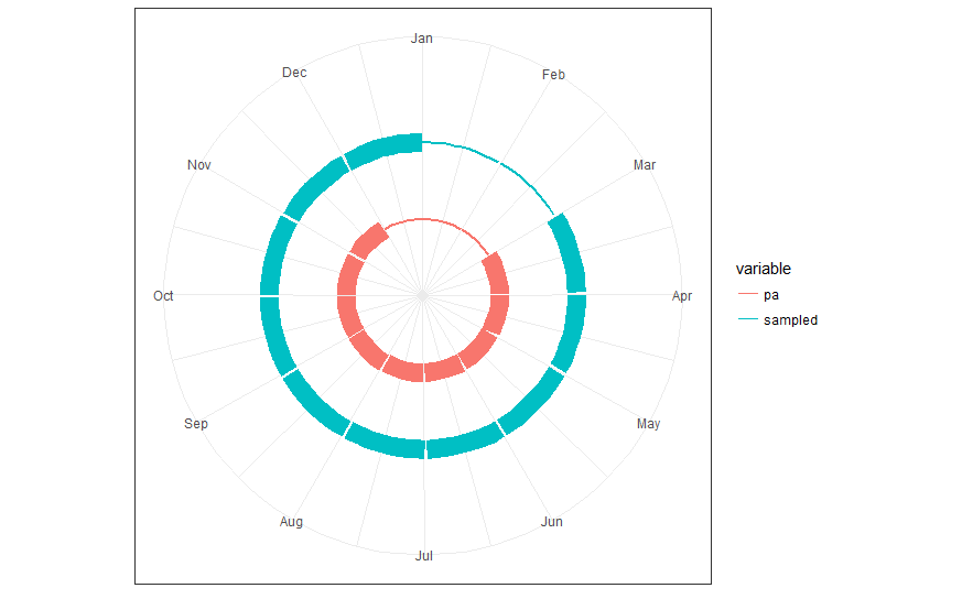
Variant 2: months as period (with start and end date)

ml[, start := as.Date("2016-01-01") + base::months(month - 1L)]
# last day of month = begin of next month - 1 day
ml[, end := as.Date("2016-01-01") + base::months(month) - 1L]
library(ggplot2)
ggplot(ml, aes(x = start, xend = end, y = variable, yend = variable,
               group = variable, colour = variable,
               size = value)) + 
  geom_segment() +
  scale_y_discrete(expand = c(0, 1), breaks = NULL) +
  scale_x_date(date_breaks = "1 month", date_labels = month.abb,
               limits = range(c(ml$start, ml$end))) +
  scale_size(guide = FALSE) +
  coord_polar() +
  theme_bw() + xlab(NULL) + ylab(NULL)

enter image description here

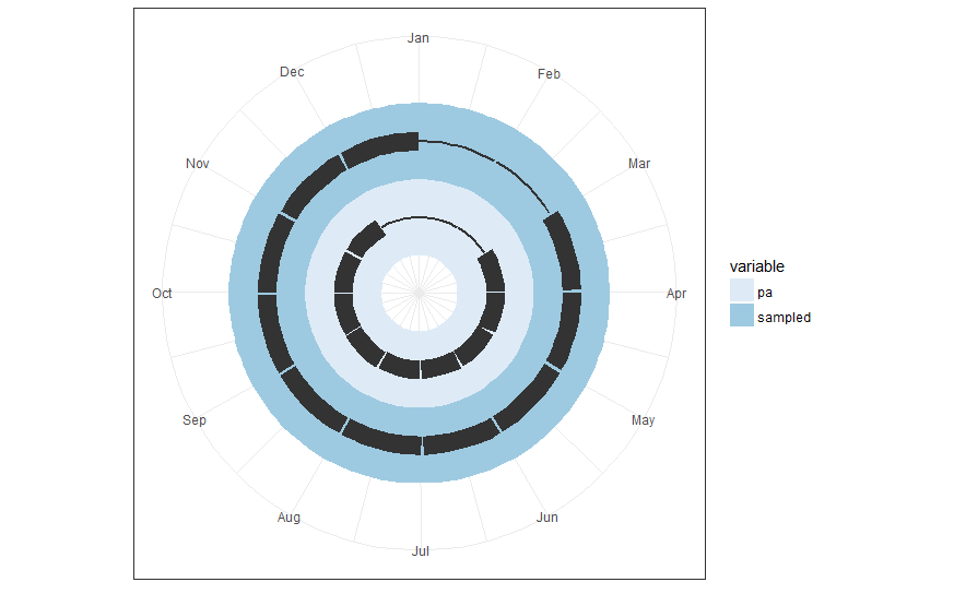
Variant 3: coloured background

In response to a request in the comments, this variant colours the background for each variable individually while the ring segments are kept in black colour. So, if we would add a third variable it would get its own coloured background ring.

ml[, start_year := as.Date("2016-01-01")]
# last day of month = begin of next month - 1 day
ml[, end_year := as.Date("2016-12-31")]
ml[, start := start_year + base::months(month - 1L)]
ml[, end := start_year + base::months(month) - 1L]

library(ggplot2)
bg_height <- 1.0
ggplot(ml) + 
  geom_rect(aes(xmin = start_year, xmax = end_year, 
                ymin = as.integer(variable) - 0.5 * bg_height, 
                ymax = as.integer(variable) + 0.5 * bg_height,
                group = variable, fill = variable)
            ) + 
  geom_segment(aes(x = start, xend = end, y = variable, yend = variable,
                   group = variable, size = value),
               colour = "gray20") +
  scale_y_discrete(expand = c(0, 1), breaks = NULL) +
  scale_x_date(date_breaks = "1 month", date_labels = month.abb,
               limits = range(c(ml$start, ml$end))) +
  scale_size(guide = FALSE) +
  scale_fill_brewer(palette = "Blues") +
  coord_polar() +
  theme_bw() + xlab(NULL) + ylab(NULL)

enter image description here

Jemena answered 12/12, 2016 at 9:51 Comment(3)
Is it possible to add a circular colored background like panel.background = element_rect(fill='grey') and then shape = 1 (I know you can't add shape to element rect but maybe there's a way to do this?)Glycol
You may try to plot geom_rect() with appropriately selected width, height, and colour as first layers to create the white, light blue, and blue rings which form the background in the screenshot.Jemena
I've added a 3rd variant with coloured background rings as requested.Jemena
G
3

I wasn't sure how to relate your data to the plot above, but does the following code help?

df <- data.frame(startdate  = as.Date(c("2016-02-20", "2016-02-20", "2016-02-20")),
             finishdate = as.Date(c("2016-04-30", "2016-04-30", "2016-06-10")),
             y          = c(4,5,8))


library(ggplot2)

ggplot(df) +
  geom_rect(aes(xmin = startdate, 
                xmax = finishdate,
                ymin = y-0.2,
                ymax = y + 0.2)) +
  geom_rect(aes(xmin = startdate - 5, 
                xmax = finishdate + 5,
                ymin = y-0.05,
                ymax = y + 0.05)) +
  xlim(as.Date("2016-01-01"), as.Date("2016-12-31")) +
  ylim(0,10) +
  coord_polar()

enter image description here

Gonfanon answered 12/12, 2016 at 6:43 Comment(0)

© 2022 - 2024 — McMap. All rights reserved.