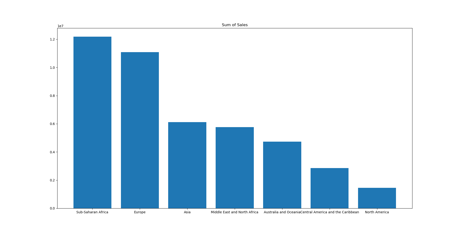
I have a bar chart that looks like how I want it to look, except for the scientific notation on the y-axes.
Some other solutions included using
ax.yaxis.set_major_formatter(tick)
which didn't work. Also, I tried checking whether this was an offset-problem, but it should have shown a '+' sign, which it doesn't in this case.
Whenever I use:
plt.ticklabel_format(style='plain')
I get an error message saying:
Traceback (most recent call last):
  File "C:\Python\lib\site-packages\matplotlib\axes\_base.py", line 2831, in ticklabel_format
    self.xaxis.major.formatter.set_scientific(sb)
AttributeError: 'FixedFormatter' object has no attribute 'set_scientific'

During handling of the above exception, another exception occurred:

Traceback (most recent call last):
  File "C:/Python/Projects/Kaggle 1.py", line 13, in <module>
    plt.ticklabel_format(style='plain')
  File "C:\Python\lib\site-packages\matplotlib\pyplot.py", line 2982, in ticklabel_format
    useMathText=useMathText)
  File "C:\Python\lib\site-packages\matplotlib\axes\_base.py", line 2856, in ticklabel_format
    "This method only works with the ScalarFormatter.")
AttributeError: This method only works with the ScalarFormatter.
I've looked into this ScalarFormatter, but I couldn't get any wiser as to why it doesn;t work. I've tried to explicitly include it in the code, but it doesn't work.
The code I use is:
import pandas as pd
import numpy as np
import matplotlib.pyplot as plt

df = pd.read_csv("100 Sales Records.csv")
df_new = df.groupby(['Region']).sum().sort_values("Total Profit", ascending=False)
regions = ('Sub-Saharan Africa', 'Europe', 'Asia', 'Middle East and North Africa', 'Australia and Oceania', 'Central America and the Caribbean', 'North America')
profit = df_new['Total Profit']
y_pos = np.arange(len(profit))

plt.bar(y_pos, profit)
plt.xticks(y_pos, regions)
plt.ticklabel_format(style='plain')
plt.title('Sum of Sales')

plt.show()
The chart currently looks like this:


plt.ticklabel_format(axis="y", style='plain')– Carl