Tailwind CSS hidden and visible
Asked Answered
S

1

7

Backend dev here learning front. I am trying to hide an element on small and medium screens and visible on the rest of the screens.

But the thing is when I do sm:hidden it hides the element for small screens and above. And when I try to do sm:hidden md:visible the element is not visible on medium screens and above. How should I go about this?

Schaper answered 24/12, 2022 at 10:10 Comment(0)
D
10

As we can read in official docs :

By default, Tailwind uses a mobile-first breakpoint system

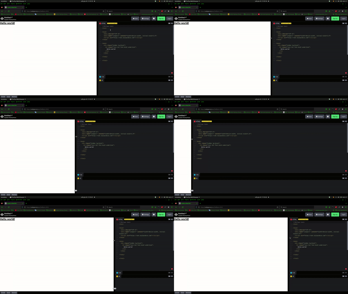
Then In Your case on small breakpoint hidden and visible on Large lg breakpoints and above :

<div class="hidden lg:block">
  <!-- ... -->
</div>

Example:

<!doctype html>
<html>

<head>
  <meta charset="UTF-8">
  <meta name="viewport" content="width=device-width, initial-scale=1.0">
  <script src="https://cdn.tailwindcss.com"></script>
</head>

<body>
  <div class="hidden lg:block">
    <h1 class="text-3xl font-bold underline">
      Hello world!
    </h1>
  </div>

</body>

</html>

enter image description here

Doralia answered 24/12, 2022 at 10:28 Comment(3)
It worked. thank you dude. I cant upvote tho because I just made the accountSchaper
@Schaper But you can accept answer as it solved your problem :-P ! You're Welcome! ;-)Doralia
Since Tailwind v3.2 it can be shorten as max-lg:hidden in that caseAndriette

© 2022 - 2024 — McMap. All rights reserved.