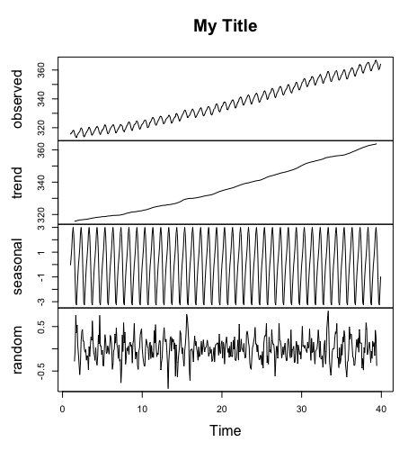
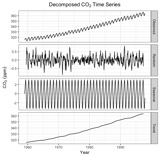
I'm reasonably familiar with the usual ways of modifying a plot by writing your own x axis labels or a main title, but I've been unable to customize the output when plotting the results of a time series decomposition.
For example,
library(TTR)
t <- ts(co2, frequency=12, start=1, deltat=1/12)
td <- decompose(t)
plot(td)
plot(td, main="Title Doesn't Work") # gets you an error message
gives you a nice, basic plot of the observed time series, trend, etc. With my own data (changes in depth below the water surface), however, I'd like to be able to switch the orientation of the y axes (eg ylim=c(40,0) for 'observed', or ylim=c(18,12) for 'trend'), change 'seasonal' to 'tidal', include the units for the x axis ('Time (days)'), and provide a more descriptive title for the figure.
My impression is that the kind of time series analyses I'm doing is pretty basic and, eventually, I may be better off using another package, perhaps with better graphical control, but I'd like to use ts() and decompose() if I can for now (yeah, cake and consumption). Assuming this doesn't get too horrendous.
Is there a way to do this?
Thanks! Pete


