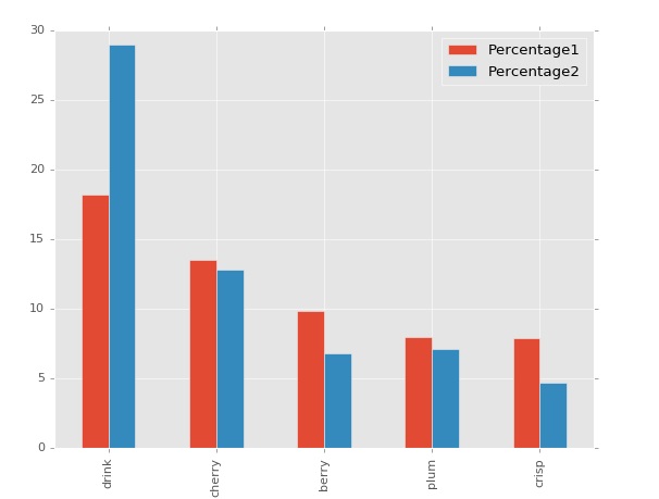
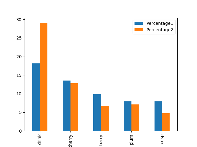
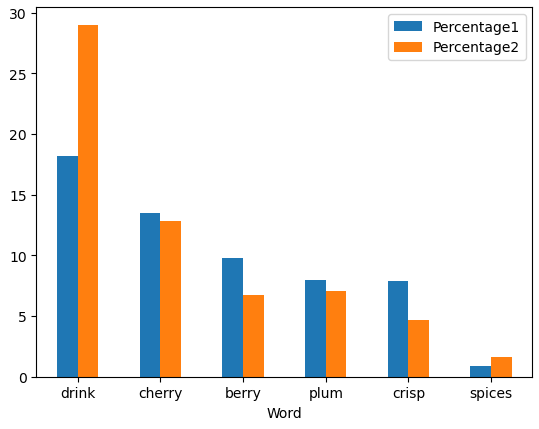
I have a little pandas dataframe that looks like this:
import pandas as pd

data = {'Word': ['drink', 'cherry', 'berry', 'plum', 'crisp', 'spices'],
        'Percentage1': [18.166654, 13.498262, 9.810123, 7.964429, 7.892941, 0.856775],
        'Percentage2': [29.014272, 12.802642, 6.775552, 7.105845, 4.715009, 1.663586]}

df = pd.DataFrame(data)

     Word  Percentage1  Percentage2
0   drink    18.166654    29.014272
1  cherry    13.498262    12.802642
2   berry     9.810123     6.775552
3    plum     7.964429     7.105845
4   crisp     7.892941     4.715009
5  spices     0.856775     1.663586
Words (50) and the two columns with figures corresponding to every one of them signifying the incidence of the word. How do I make a clustered chart to show the comparison of the two figures for each word? I have tried virtually every piece of code that was offered to other people on this site, I just don't understand how to group the two "Percentage" columns.

