Plotly: How to add text labels to a histogram?
Asked Answered
M

3

7

Is there a way how to display the counted value of the histogram aggregate in the Plotly.Express histogram?

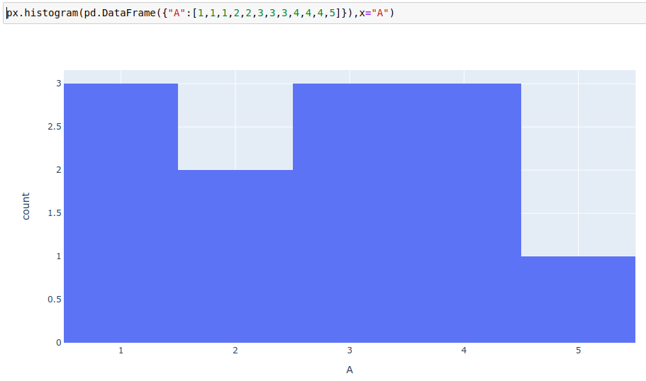
px.histogram(pd.DataFrame({"A":[1,1,1,2,2,3,3,3,4,4,4,5]}),x="A") enter image description here If I would use regular histogram, I can specify text parameter which direct to the column which contain the value to display.
px.bar(pd.DataFrame({"val":[1,2,3,4,5], "height": [3,2,3,3,1]}), x="val", y="height", text="height") enter image description here
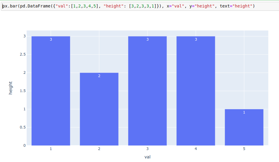
But with histograms, this value is calculated and it's not even part of the fig.to_dict(). Is there a way to add the text labels into histogram?

Using the answers below, I've summarized the finding to an article - https://towardsdatascience.com/histograms-with-plotly-express-complete-guide-d483656c5ad7

Mulholland answered 17/9, 2020 at 19:52 Comment(3)
Does it have to be Plotly express? I don't think there are any parameters in Plotly express that allow you to add text, unless you want to add annotations, but then it seems like using a graph_object would be easier.Elfredaelfrida
@vaasha How did my suggestion work out for you?Ghetto
@Mulholland Thanks for the feedback! Would you consider marking my suggestion as the accepted answer? As you most likely know, if a better solution comes along you can always select a different accepted answerGhetto
G
3

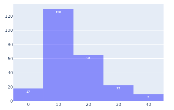
As far as I know, plotly histograms do not have a text attribute. It also turns out that it's complicated if at all possible to retrieve the applied x and y values and just throw them into appropriate annotations. Your best option seems to be to take care of the binning using numpy.histogram and the set up your figure using go.Bar. The code snippet below will produce the following plot:

enter image description here

Complete code:

import numpy as np
import plotly.express as px
import plotly.graph_objects as go

# sample data
df = px.data.tips()

# create bins
bins = [0, 10, 20, 30, 40, 50]
counts, bins = np.histogram(df.total_bill, bins=bins)
#bins2 = 0.5 * (bins1[:-1] + bins2[1:])

fig = go.Figure(go.Bar(x=bins, y=counts))
fig.data[0].text = counts
fig.update_traces(textposition='inside', textfont_size=8)
fig.update_layout(bargap=0)


fig.update_traces(marker_color='blue', marker_line_color='blue',
                  marker_line_width=1, opacity=0.4)

fig.show()
Ghetto answered 18/9, 2020 at 21:32 Comment(0)
A
9

The text_auto parameter set to True will do what you want.

Taking your example code, this is what i get :

fig = px.histogram(pd.DataFrame({"A":[1,1,1,2,2,3,3,3,4,4,4,5]}),x="A", 
text_auto=True)
fig.show()

Being a new member i cannot embed the screenshot yet, but here is a link.

Histogram

A bit late but hope this will help.

Aras answered 18/2, 2022 at 13:46 Comment(2)
This worked when I updated from plotly 5.4 to 5.6. Thanks!Deenadeenya
I had all my bars labeled with the number 1, when I added the text_auto parameter. Not sure why.Campinas
G
3

As far as I know, plotly histograms do not have a text attribute. It also turns out that it's complicated if at all possible to retrieve the applied x and y values and just throw them into appropriate annotations. Your best option seems to be to take care of the binning using numpy.histogram and the set up your figure using go.Bar. The code snippet below will produce the following plot:

enter image description here

Complete code:

import numpy as np
import plotly.express as px
import plotly.graph_objects as go

# sample data
df = px.data.tips()

# create bins
bins = [0, 10, 20, 30, 40, 50]
counts, bins = np.histogram(df.total_bill, bins=bins)
#bins2 = 0.5 * (bins1[:-1] + bins2[1:])

fig = go.Figure(go.Bar(x=bins, y=counts))
fig.data[0].text = counts
fig.update_traces(textposition='inside', textfont_size=8)
fig.update_layout(bargap=0)


fig.update_traces(marker_color='blue', marker_line_color='blue',
                  marker_line_width=1, opacity=0.4)

fig.show()
Ghetto answered 18/9, 2020 at 21:32 Comment(0)
O
1

I had his same problem this morning while trying to plot a histogram of TDD percentages. Using plotly, I wanted to normalize (histnorm: 'percent') so I could see percentages of my monthly TDD values instead of the counts. I found this solution by simply doing a print(tdd_hist)

First, I printed the histogram to the console and saw this output...

Figure({
'data': [{'alignmentgroup': 'True',
          'bingroup': 'x',
          'histnorm': 'percent',
          'hovertemplate': 'Total Demand Distortion TDD %=%{x}<br>count=%{y}<extra></extra>',
          'legendgroup': '',
          'marker': {'color': '#636efa'},
          'name': '',
          'offsetgroup': '',
          'orientation': 'v',
          'showlegend': False,
          'type': 'histogram',
          'x': array([0.67, 0.68, 0.68, ..., 2.41, 2.48, 2.01]),
          'xaxis': 'x',
          'yaxis': 'y'}],
'layout': {'barmode': 'relative',
           'legend': {'tracegroupgap': 0},
           'template': '...',
           'title': {'text': 'Percent Histogram of TDD%'},
           'xaxis': {'anchor': 'y', 'domain': [0.0, 1.0], 'title': {'text': 'Total Demand Distortion TDD %'}},
           'yaxis': {'anchor': 'x', 'domain': [0.0, 1.0], 'title': {'text': 'count'}, 'type': 'log'}}

Now I can clearly see that to change this, I do a

tdd_hist.layout.yaxis.title.text = 'Percent'

And it works!

Oliveira answered 28/9, 2020 at 21:46 Comment(1)
This just changes the title of the yaxis, and has nothing to do with the question askedAlexiaalexin

© 2022 - 2024 — McMap. All rights reserved.