Keeping div aspect ratio and centered regardless of parent's aspect ratio
Asked Answered
M

2

7

I have found this css code that allows me to keep a div's aspect ratio.

.container {
  width: 100%;
  height: 100%;
  background-color: red;
  position: absolute;
 }


.wrapper {
  width: 100%;
  /* whatever width you want */
  display: inline-block;
  position: relative;
  top: 50%;
  transform: translate(0%, -50%);
}
.wrapper:after {
  padding-top: 56.25%;
  /* 16:9 ratio */
  display: block;
  content: '';
}
.main {
  position: absolute;
  top: 0;
  bottom: 0;
  right: 0;
  left: 0;
 /* fill parent */
  background-color: deepskyblue;
  /* let's see it! */
  color: white;
}

See this JSFiddle example: https://jsfiddle.net/1uyo07tg/3/

I would like a css-only solution (without the use of VW or VH) to keep this aspect ratio even when the parent is wider than the aspect ratio in question (in this case, 16:9).

In other words, I would like the blue-colored div to stay at 16:9 ratio even when the parent (.container) is stretched wider than 16:9.

Clarifying - i would like some css-only solution, to have a child div stay always in a fixed ratio, centered vertically and horizontally, no matter the size or aspect ratio of the parent div, and without using vw,vh. I am pretty sure this needs JS code (which I have), but just wanted to see if someone has a css-only neat trick for it.

Bottom line - looking for this functionality in CSS only, no vh or vw.

Hope that makes sense. Any ideas?

Thanks in advance, Sa'ar

Moneyed answered 21/11, 2016 at 11:26 Comment(5)
Why don't you use 2 divs on above and below the blue container and keep them there forever? Because what you are asking conflicts the concept of aspect ratio.Throb
updated the question with clarificationMoneyed
can you share with us the JS solution you have. it will make things more clear.Throb
sure: jsfiddle.net/vmx6281fMoneyed
I have the exact same issue, and I dont think there is a pure CSS solution for this problem.Moonshiner
A
15

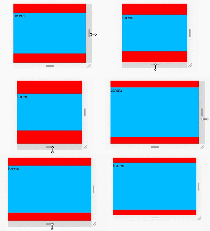
CSS "contain" for elements. Preserve aspect ratio

CSS contain with aspect ratio for elements

  • Use CSS flex with centered content on a parent Element
  • Use the aspect-ratio CSS property.
  • Use an :after element to force the box's aspect-ratio initial state

/* QuickReset */ * { margin: 0; box-sizing: border-box; }

#parent {
  /* This can be just any element with responsive W/H */
  min-height: 100vh;
  background-color: red;
  position: relative;
}

#aspectRatio {
  background-color: #0bf;
  position: absolute;
  margin: auto;
  left: 0;
  right: 0;
  top: 0;
  bottom: 0;
  max-width: 100%;
  max-height: 100%;
  aspect-ratio: 16 / 9;
}
<div id="parent">
  <div id="aspectRatio">Lorem</div>
</div>

Here's another example Fixed header and footers, aspect ratio body

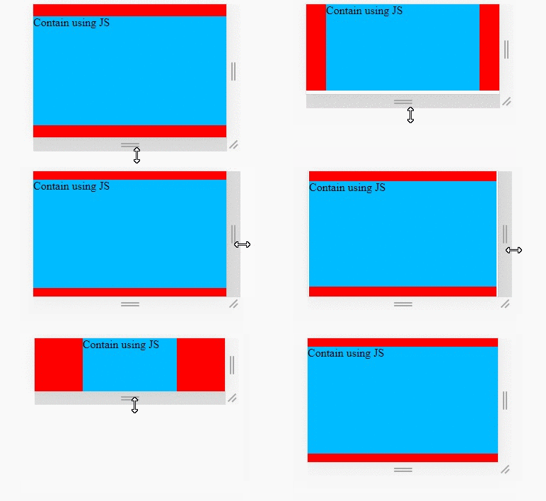
JavaScript solution:

Here I created a JS implementation if you're interested in the intricacies and calculation:

JS contain with aspect ratio for elements

const contain = (EL, rx, ry) => {
  // We need to rely on JS since Firefox is still experimental with aspect-ratio
  // https://mcmap.net/q/1431775/-keeping-div-aspect-ratio-and-centered-regardless-of-parent-39-s-aspect-ratio

  const scale = 1.0; // 1 = max parent size. 0.8 = scale down
  const margin = 0;  // PX gutter around the box

  rx *= scale;
  ry *= scale;
  const parent = EL.parentElement;
  const pw = parent.offsetWidth * scale - margin;
  const ph = parent.offsetHeight * scale - margin;
  // If H should apply instead of W and vice versa
  const isSwap = pw / ph > rx / ry;
  const w = isSwap ? (ph / ry) * rx : pw;
  const h = isSwap ? ph : (pw / rx) * ry;
  EL.style.cssText = `width: ${w}px; height: ${h}px;`;
};


const ELS_aspectRatio = document.querySelectorAll(".ar-box");
const applyContain = () => ELS_aspectRatio.forEach(EL => contain(EL, 16, 9));

window.addEventListener("resize", applyContain);
applyContain();
* { margin: 0; box-sizing: border-box; }

/* DEMO ONLY: This can be any responsive parent with any responsive unit! */
#parent { 
  width: 100vw;
  height: 100vh;
  background-color: red;
  display: flex;
  justify-content: center;
  align-items: center;
}

.ar-box {
  background-color: #0bf;
}
<div id="parent">
  <div class="ar-box">Contain using JS</div>
</div>
Adventist answered 20/3, 2021 at 12:7 Comment(1)
This worked very well for me. Thank you. I wonder if you'd be able to elaborate on how to get the CSS solution done with a sticky footer? #71146299Pavement
H
-1
body,html {
  margin: 0;
  height: 100%;
  width: 100%;
}
.container {
  width: 100%;
  height: 100%;
  background-color: red;
  overflow: hidden;
}     
.wrapper {
  width: 100%;
  max-width: calc(100vh / 0.5625);
  padding-top: 56.25%;
  top: 50%;
  left: 50%;
  transform: translate(-50%, -50%);
  background-color: deepskyblue;
}

.main is even not nessary

Hardnett answered 21/11, 2016 at 12:14 Comment(4)
thanks so much. I forgot to mention in my question: no VH or VW. Is it still possible without it?Moneyed
sorry I can't. Without VH I can't compare the window height with its width, which means it's hard to confirm the BODY can always contain the wrapper box.Hardnett
what about a background-image(16:9 ratio) with background-size:contain and background-position:50%...Hardnett
thanks, but i need the child div to be a container, not just an image. I updated the question with clarificationMoneyed

© 2022 - 2024 — McMap. All rights reserved.