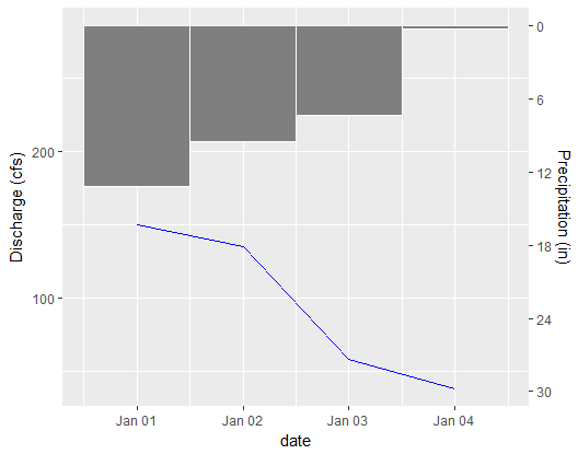
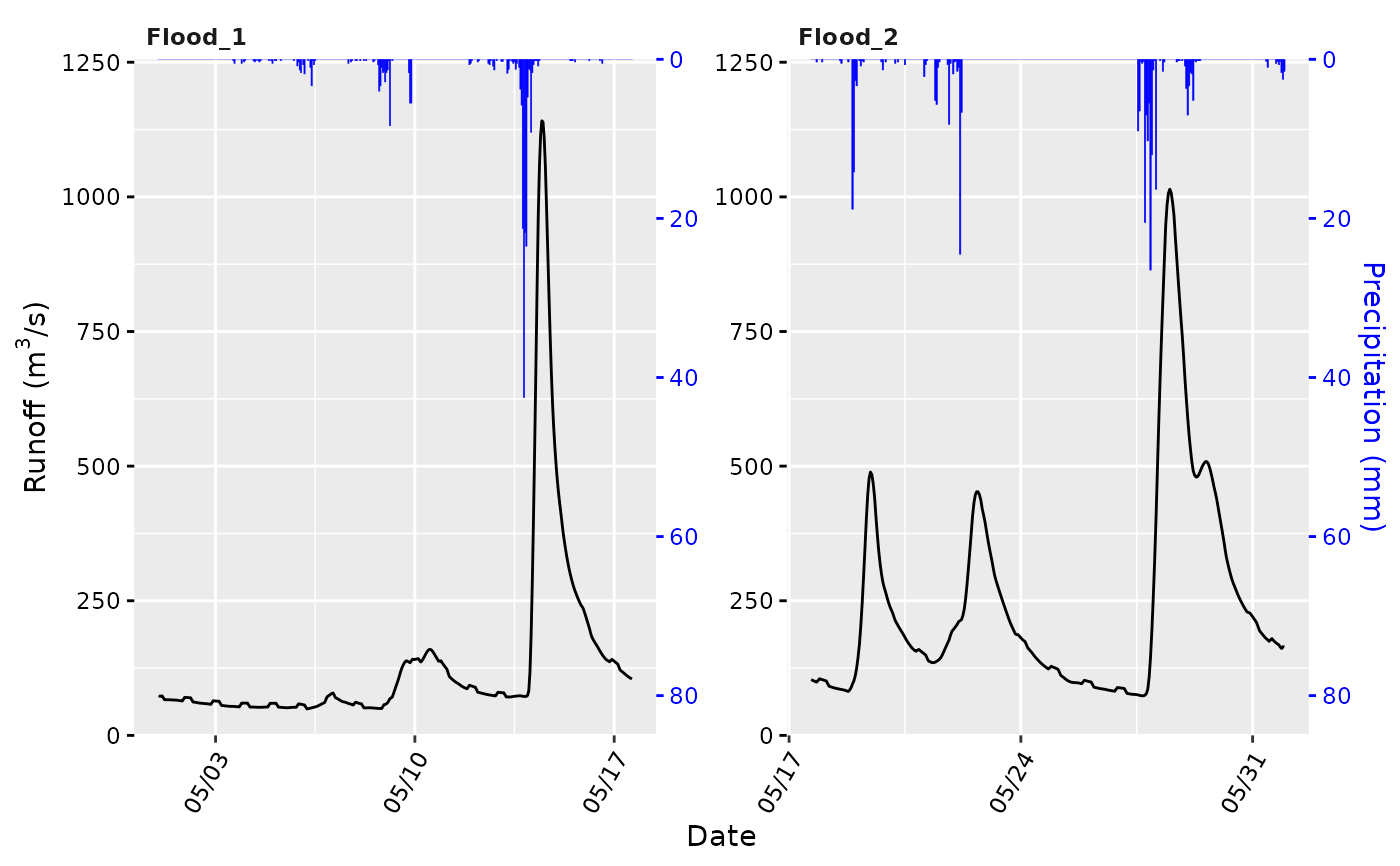
For a hydrologist, the Rainfall Hyetograph and Streamflow Hydrograph is commonly used. It looks like the figure below.

The X-axis represents Date and left Y-axis which is reversed represents rainfall and right Y-axis represents discharge.
I have a rainfall table and a discharge table.
  ####Rain Table####                   ####Discharge Table####
   Date         Value                     Date         Value
2000-01-01       13.2                   2000-01-01      150
2000-01-02       9.5                    2000-01-01      135
2000-01-03       7.3                    2000-01-01      58
2000-01-04       0.2                    2000-01-01      38
Here is my code.
  ggplot(rain,aes(x=DATE,y=value)) +
    geom_bar(stat = 'identity')+
    scale_y_reverse()+
    geom_line(data =discharge,aes(x=DATE,y=value))
But I don't know how to represent these value in two different Y-axis.


sec_axis(), ggplot2 makes you do manual 1:1 transformation work to get the second axis scaled properly. I grok this is a seminal chart in this particular branch of science, but you might want to consider base graphics or overlaying plots instead in the long run. – Papageno2000-01-01for the discharge values? – Papageno