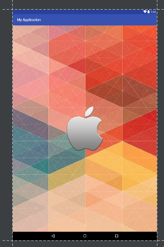
Rendering a splash view in a layout.xml instead of as a theme background (like other answers here recommend) takes longer to load. This is because the app's theme is loaded first, then the Activity is constructed and the layout inflated last. Since the purpose of a splash screen is to display something while the app loads, having a ~0.5s delay in loading the splash screen itself results in a noticeable delay. Loading a splash as a theme windowBackground performs better (renders almost instantly after tapping the launcher icon), but has some restrictions to work around. Your current method of defining multiple logo sizes depending on the screen width is the correct way to handle this situation. Here is an example configuration, which handles differences between pre and post Android v21:
values/themes.xml:
<style name="SplashThemeCommon" parent="Theme.AppCompat.NoActionBar">
    <item name="android:windowContentOverlay">@null</item>
    <item name="android:windowBackground">@drawable/splash_logo_theme</item>
</style>

<style name="SplashTheme" parent="SplashThemeCommon">
    <item name="android:windowFullscreen">true</item>
</style>
values-v21/themes.xml:
<style name="SplashTheme" parent="SplashThemeCommon">
    <item name="android:windowTranslucentStatus">true</item>
    <item name="android:windowTranslucentNavigation">true</item>
</style>
drawable/splash_logo_theme.xml
<?xml version="1.0" encoding="utf-8"?>
<layer-list xmlns:android="http://schemas.android.com/apk/res/android">
    <item>
        <bitmap
            android:gravity="center"
            android:src="@drawable/splash_logo"/>
    </item>
</layer-list>
Next you can include a copy of "splash_logo.png" for different screen configurations. You have a couple reasonable options here. An exhaustive approach might include different logos for each screen size:
- drawable-sw320dp-xxxhdpi/splash_logo.png
- drawable-sw400dp-xxxhdpi/splash_logo.png
- drawable-sw480dp-xxxhdpi/splash_logo.png
- drawable-sw600dp-xxxhdpi/splash_logo.png
- drawable-sw720dp-xxxhdpi/splash_logo.png
- drawable-sw820dp-xxxhdpi/splash_logo.png
The "swXXXdp" means that XXX is the smallest screen dimension (width or height) in dp. 820dp is going to be a huge tablet, 320dp will be an old small device, and most flagship devices today will be in the 400dp category. A 450dp wide device would use the 400dp image.
Why did I define xxxhdpi here? Because if you don't specify, Android will assume it is an mdpi image and try to upscale/resize for higher dpi devices (most flagship phones today are xxhdpi). This upscaling will result in your image being blocky, and larger than the original. By specifying xxxhdpi here, Android will only try to downscale the image ensuring that the image never goes blocky; this is a optimization so we don't also need to define separate images for ldpi, mdpi, hdpi, xhdpi etc.
Having 6 images in the APK is kind of a waste though. We can futher optimize this approach in order to include less images in the app and ensure a smaller APK size. Instead, let's include only the following two images:
- drawable-sw600dp-xxxhdpi/splash_logo.png
- drawable-xxxhdpi/splash_logo.png
Any devices 600dp and larger (tablets) have a larger copy of the image to take advantage of the larger screen real estate, while all other phones use a smaller copy located in the bin with no screen width qualifier. The drawback here is since each bin covers such a large range of screen widths, the logo on a 4" device will take up a larger portion of the screen than on a 6" devices. This is a compromise to cut down the APK size, and most users won't notice so long as the image never gets cut off even on the smallest device.
So what size png's should we include? They need to be a particular size to be displayed in a theme, since unlike in a layout.xml we cannot specify a width/height in the XML (drawable width/height support was only added in API 23). This means if you include a non-optimal png size, it will appear too small or two big; if its too big it will actually get cut off. A good plan to get the right size is:
- Create an layout/test.xml file with just the default LinearLayout and no visible content
- Open it in Android Studio and select the Design tab in the layout editor's bottom left corner
- Change the theme to SplashTheme in the layout editor's top bar
- Change the device to "Pixel XL"
- Place an image under drawable-sw400dp/splash_logo.png
- Open the image in an external image editor such as Photoshop or Gimp, change the size, save, then check the layout in Android Studio (you may need to close and reopen the editor for the change to take effect). Repeat until the image looks the correct size in the layout
- Generate images for the other screen widths proportionately; for example the sw320dp image should be 320/400 or 67% of the 400dp image size, while the 720dp image should be 720/400 or 180% of the 400dp image size. Remember not to upscale your 400dp image for the larger images as you will lose quality. Instead, generate all the images based on your high quality original copy
- Place the generated images in the different drawable directories as specified above
- Select devices of different screen sizes (including tablets) in the layout editor and make sure they logo is large enough, but not cut off, for all screen sizes
How do you know which device screen resolution belongs to which swXXXdp category? This requires a simple calculation. Lets look at the Pixel XL:
- The screen size is 1440x2560
- The smallest dimension is therefore 1440
- The screen dpi is 534
- The screen width in inches is 1440/534=2.69"
- Open the website: http://angrytools.com/android/pixelcalc/
- Enter 2.69 in the inches ("in") box
- One of the green boxes on the left will display the dp, in this case 431
- With a 431 dp wide screen, the Pixel XL will use the drawable-sw400dp/splash_logo.png image if you have all 6 image categories, or the drawable-xxxhdpi/splash_logo.png image if you only have the two image categories


