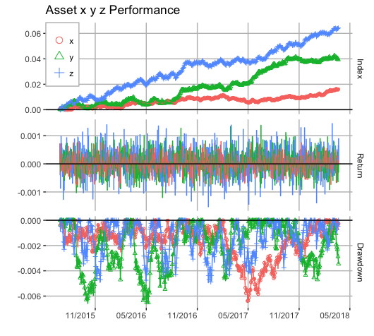
ggplot version of charts.PerformanceSummary
Asked Answered
S

2

7

I would like to make a "ggplot version" of the basic functionality of charts.PerformanceSummary that is available in the PerformanceAnalytics package, as I think that ggplot is generally prettier and theoretically more powerful in term of editing the image. I've got reasonably close but have a few issues that I would like a bit of help on. Namely:

  1. reducing the amount of space that the legend takes up, it gets horrendous/ugly when having more than 10 lines on it...(just the line colour and name is sufficient)
  2. Increasing the size of the Daily_Returns facet to match that of charts.PerformanceSummary in PerformanceAnalytics
  3. Have an option that specifies which asset to show in the daily return series in the Daily_Returns facet, rather than always using the first column, which is than what happens in charts.PerformanceSummary

If there are better ways to do this potentially using gridExtra rather than facets...I'm not adverse to people showing me how that would look better...

The issue here is aesthetics, and potential easy of manipulation I guess, as PerformanceAnalytics already has a good working example, I just want to make it prettier/more professional...

In addition to this for bonus points, I would like to be able to show some performance stats associated with it somewhere on or below or to the side of the graph for each asset...not too sure where would be best to show or display this information.

Furthermore I am not adverse to people suggesting parts that clean up my code if they have suggestions for this.

Here is my reproducible example...

First generate return data:

require(xts)
X.stock.rtns <- xts(rnorm(1000,0.00001,0.0003), Sys.Date()-(1000:1))
Y.stock.rtns <- xts(rnorm(1000,0.00003,0.0004), Sys.Date()-(1000:1))
Z.stock.rtns <- xts(rnorm(1000,0.00005,0.0005), Sys.Date()-(1000:1))
rtn.obj <- merge(X.stock.rtns , Y.stock.rtns, Z.stock.rtns)
colnames(rtn.obj) <- c("x.stock.rtns","y.stock.rtns","z.stock.rtns")

I would like to replicate the image from the result of:

require(PerformanceAnalytics)
charts.PerformanceSummary(rtn.obj, geometric=TRUE)

aim

This is my attempt so far...

gg.charts.PerformanceSummary <- function(rtn.obj, geometric=TRUE, main="",plot=TRUE){

    # load libraries
suppressPackageStartupMessages(require(ggplot2))
suppressPackageStartupMessages(require(scales))
suppressPackageStartupMessages(require(reshape))
suppressPackageStartupMessages(require(PerformanceAnalytics))
    # create function to clean returns if having NAs in data
    clean.rtn.xts <- function(univ.rtn.xts.obj,na.replace=0){
    univ.rtn.xts.obj[is.na(univ.rtn.xts.obj)]<- na.replace
    univ.rtn.xts.obj
}
    # Create cumulative return function
cum.rtn <- function(clean.xts.obj, g=TRUE){
    x <- clean.xts.obj
    if(g==TRUE){y <- cumprod(x+1)-1} else {y <- cumsum(x)}
    y
}
    # Create function to calculate drawdowns
dd.xts <- function(clean.xts.obj, g=TRUE){
    x <- clean.xts.obj
    if(g==TRUE){y <- Drawdowns(x)} else {y <- Drawdowns(x,geometric=FALSE)}
    y
}
    # create a function to create a dataframe to be usable in ggplot to replicate charts.PerformanceSummary
cps.df <- function(xts.obj,geometric){
    x <- clean.rtn.xts(xts.obj)
    series.name <- colnames(xts.obj)[1]
    tmp <- cum.rtn(x,geometric)
    tmp$rtn <- x
    tmp$dd <- dd.xts(x,geometric)
    colnames(tmp) <- c("Cumulative_Return","Daily_Return","Drawdown")
    tmp.df <- as.data.frame(coredata(tmp))
    tmp.df$Date <- as.POSIXct(index(tmp))
    tmp.df.long <- melt(tmp.df,id.var="Date")
    tmp.df.long$asset <- rep(series.name,nrow(tmp.df.long))
    tmp.df.long
}
# A conditional statement altering the plot according to the number of assets
if(ncol(rtn.obj)==1){
            # using the cps.df function
    df <- cps.df(rtn.obj,geometric)
            # adding in a title string if need be
    if(main==""){
        title.string <- paste0(df$asset[1]," Performance")
    } else {
        title.string <- main
    }
            # generating the ggplot output with all the added extras....
    gg.xts <- ggplot(df, aes_string(x="Date",y="value",group="variable"))+
                facet_grid(variable ~ ., scales="free", space="free")+
                geom_line(data=subset(df,variable=="Cumulative_Return"))+
                geom_bar(data=subset(df,variable=="Daily_Return"),stat="identity")+
                geom_line(data=subset(df,variable=="Drawdown"))+
                ylab("")+
                geom_abline(intercept=0,slope=0,alpha=0.3)+
                ggtitle(title.string)+
                theme(axis.text.x = element_text(angle = 45, hjust = 1))+
                scale_x_datetime(breaks = date_breaks("6 months"), labels = date_format("%d/%m/%Y"))

} else {
            # a few extra bits to deal with the added rtn columns
    no.of.assets <- ncol(rtn.obj)
    asset.names <- colnames(rtn.obj)
    df <- do.call(rbind,lapply(1:no.of.assets, function(x){cps.df(rtn.obj[,x],geometric)}))
    df$asset <- ordered(df$asset, levels=asset.names)
    if(main==""){
        title.string <- paste0(df$asset[1]," Performance")
    } else {
        title.string <- main
    }
    if(no.of.assets>5){legend.rows <- 5} else {legend.rows <- no.of.assets}
    gg.xts <- ggplot(df, aes_string(x="Date", y="value",group="asset"))+
      facet_grid(variable~.,scales="free",space="free")+
      geom_line(data=subset(df,variable=="Cumulative_Return"),aes(colour=factor(asset)))+
      geom_bar(data=subset(df,variable=="Daily_Return"),stat="identity",aes(fill=factor(asset),colour=factor(asset)),position="dodge")+
      geom_line(data=subset(df,variable=="Drawdown"),aes(colour=factor(asset)))+
      ylab("")+
      geom_abline(intercept=0,slope=0,alpha=0.3)+
      ggtitle(title.string)+
      theme(legend.title=element_blank(), legend.position=c(0,1), legend.justification=c(0,1),
            axis.text.x = element_text(angle = 45, hjust = 1))+
      guides(col=guide_legend(nrow=legend.rows))+
      scale_x_datetime(breaks = date_breaks("6 months"), labels = date_format("%d/%m/%Y"))

}

assign("gg.xts", gg.xts,envir=.GlobalEnv)
if(plot==TRUE){
    plot(gg.xts)
} else {}

}
# seeing the ggplot equivalent....
gg.charts.PerformanceSummary(rtn.obj, geometric=TRUE)

result

Symbol answered 11/2, 2013 at 17:0 Comment(0)
G
14

I was looking for just that. You got pretty close. Standing on your shoulders, I was able to fix some of the problems.

Edit (9 May 2015): The function Drawdown() may now be called via the triple-colon operator, PerformanceAnalytics:::Drawdown(). The code below was edited to reflect this change. Edit (22 April 2018): show_guide has been deprecated and replaced by show.legend.

require(xts)

X.stock.rtns <- xts(rnorm(1000,0.00001,0.0003), Sys.Date()-(1000:1))
Y.stock.rtns <- xts(rnorm(1000,0.00003,0.0004), Sys.Date()-(1000:1))
Z.stock.rtns <- xts(rnorm(1000,0.00005,0.0005), Sys.Date()-(1000:1))
rtn.obj <- merge(X.stock.rtns , Y.stock.rtns, Z.stock.rtns)
colnames(rtn.obj) <- c("x","y","z")

# advanced charts.PerforanceSummary based on ggplot
gg.charts.PerformanceSummary <- function(rtn.obj, geometric = TRUE, main = "", plot = TRUE)
{

    # load libraries
    suppressPackageStartupMessages(require(ggplot2))
    suppressPackageStartupMessages(require(scales))
    suppressPackageStartupMessages(require(reshape))
    suppressPackageStartupMessages(require(PerformanceAnalytics))

    # create function to clean returns if having NAs in data
    clean.rtn.xts <- function(univ.rtn.xts.obj,na.replace=0){
        univ.rtn.xts.obj[is.na(univ.rtn.xts.obj)]<- na.replace
        univ.rtn.xts.obj  
    }

    # Create cumulative return function
    cum.rtn <- function(clean.xts.obj, g = TRUE)
    {
        x <- clean.xts.obj
        if(g == TRUE){y <- cumprod(x+1)-1} else {y <- cumsum(x)}
        y
    }

    # Create function to calculate drawdowns
    dd.xts <- function(clean.xts.obj, g = TRUE)
    {
        x <- clean.xts.obj
        if(g == TRUE){y <- PerformanceAnalytics:::Drawdowns(x)} else {y <- PerformanceAnalytics:::Drawdowns(x,geometric = FALSE)}
        y
    }

    # create a function to create a dataframe to be usable in ggplot to replicate charts.PerformanceSummary
    cps.df <- function(xts.obj,geometric)
    {
        x <- clean.rtn.xts(xts.obj)
        series.name <- colnames(xts.obj)[1]
        tmp <- cum.rtn(x,geometric)
        tmp$rtn <- x
        tmp$dd <- dd.xts(x,geometric)
        colnames(tmp) <- c("Index","Return","Drawdown") # names with space
        tmp.df <- as.data.frame(coredata(tmp))
        tmp.df$Date <- as.POSIXct(index(tmp))
        tmp.df.long <- melt(tmp.df,id.var="Date")
        tmp.df.long$asset <- rep(series.name,nrow(tmp.df.long))
        tmp.df.long
    }

    # A conditional statement altering the plot according to the number of assets
    if(ncol(rtn.obj)==1)
    {
        # using the cps.df function
        df <- cps.df(rtn.obj,geometric)
        # adding in a title string if need be
        if(main == ""){
            title.string <- paste("Asset Performance")
        } else {
            title.string <- main
        }
    
        gg.xts <- ggplot(df, aes_string( x = "Date", y = "value", group = "variable" )) +
            facet_grid(variable ~ ., scales = "free_y", space = "fixed") +
            geom_line(data = subset(df, variable == "Index")) +
            geom_bar(data = subset(df, variable == "Return"), stat = "identity") +
            geom_line(data = subset(df, variable == "Drawdown")) +
            geom_hline(yintercept = 0, size = 0.5, colour = "black") +
            ggtitle(title.string) +
            theme(axis.text.x = element_text(angle = 0, hjust = 1)) +
            scale_x_datetime(breaks = date_breaks("6 months"), labels = date_format("%m/%Y")) +
            ylab("") +
            xlab("")
    
    } 
    else 
    {
        # a few extra bits to deal with the added rtn columns
        no.of.assets <- ncol(rtn.obj)
        asset.names <- colnames(rtn.obj)
        df <- do.call(rbind,lapply(1:no.of.assets, function(x){cps.df(rtn.obj[,x],geometric)}))
        df$asset <- ordered(df$asset, levels=asset.names)
        if(main == ""){
            title.string <- paste("Asset",asset.names[1],asset.names[2],asset.names[3],"Performance")
        } else {
            title.string <- main
        }
    
        if(no.of.assets>5){legend.rows <- 5} else {legend.rows <- no.of.assets}
    
        gg.xts <- ggplot(df, aes_string(x = "Date", y = "value" )) +
        
            # panel layout
            facet_grid(variable~., scales = "free_y", space = "fixed", shrink = TRUE, drop = TRUE, margin = 
                           , labeller = label_value) + # label_value is default
        
            # display points for Index and Drawdown, but not for Return
            geom_point(data = subset(df, variable == c("Index","Drawdown"))
                       , aes(colour = factor(asset), shape = factor(asset)), size = 1.2, show.legend = TRUE) + 
        
            # manually select shape of geom_point
            scale_shape_manual(values = c(1,2,3)) + 
        
            # line colours for the Index
            geom_line(data = subset(df, variable == "Index"), aes(colour = factor(asset)), show.legend = FALSE) +
        
            # bar colours for the Return
            geom_bar(data = subset(df,variable == "Return"), stat = "identity"
                     , aes(fill = factor(asset), colour = factor(asset)), position = "dodge", show.legend = FALSE) +
        
            # line colours for the Drawdown
            geom_line(data = subset(df, variable == "Drawdown"), aes(colour = factor(asset)), show.legend = FALSE) +
        
            # horizontal line to indicate zero values
            geom_hline(yintercept = 0, size = 0.5, colour = "black") +
        
            # horizontal ticks
            scale_x_datetime(breaks = date_breaks("6 months"), labels = date_format("%m/%Y")) +
        
            # main y-axis title
            ylab("") +
        
            # main x-axis title
            xlab("") +
        
            # main chart title
            ggtitle(title.string)
    
        # legend 
    
        gglegend <- guide_legend(override.aes = list(size = 3))
    
        gg.xts <- gg.xts + guides(colour = gglegend, size = "none") +
        
            # gglegend <- guide_legend(override.aes = list(size = 3), direction = "horizontal") # direction overwritten by legend.box?
            # gg.xts <- gg.xts + guides(colour = gglegend, size = "none", shape = gglegend) + # Warning: "Duplicated override.aes is ignored"
        
            theme( legend.title = element_blank()
                   , legend.position = c(0,1)
                   , legend.justification = c(0,1)
                   , legend.background = element_rect(colour = 'grey')
                   , legend.key = element_rect(fill = "white", colour = "white")
                   , axis.text.x = element_text(angle = 0, hjust = 1)
                   , strip.background = element_rect(fill = "white")
                   , panel.background = element_rect(fill = "white", colour = "white")
                   , panel.grid.major = element_line(colour = "grey", size = 0.5) 
                   , panel.grid.minor = element_line(colour = NA, size = 0.0)
            )
    
    }

    assign("gg.xts", gg.xts,envir=.GlobalEnv)
    if(plot == TRUE){
        plot(gg.xts)
    } else {}

}

# display chart
gg.charts.PerformanceSummary(rtn.obj, geometric = TRUE)

Control over the size of the panels is inside facet_grid: facet_grid(variable ~ ., scales = "free_y", space = "fixed"). What these options do is explained in the manual, quote:

scales: Are scales shared across all facets (the default, "fixed"), or do they vary across rows ("free_x"), columns ("free_y"), or both rows and columns ("free")

space: If "fixed", the default, all panels have the same size. If "free_y" their height will be proportional to the length of the y scale; if "free_x" their width will be proportional to the length of the x scale; or if "free" both height and width will vary. This setting has no effect unless the appropriate scales also vary.

Update: labels

Customized labels can be obtained with the following function:

# create a function to store fancy axis labels 

    my_labeller <- function(var, value){ # from the R Cookbook
        value <- as.character(value)
        if (var=="variable") 
        {
              value[value=="Index"] <- "Cumulative Returns"
              value[value=="Return"] <- "Daily Returns"
              value[value=="Drawdown"] <- "Drawdown"
        }
        return(value)
    }

and setting the labeller option to "labeller = my_labeller"

Update: background

The appearance of the background, grid lines, colours, etc. may be controlled from within the theme() function: The code above has been updated to reflect these changes.

enter image description here

Gujral answered 30/3, 2013 at 7:24 Comment(6)
@PatrickT, thank you for all your work. I have one issue, I am trying to figure out how to remove gaps from plots. I already tried the geometric=FALSE to no avail. See screenshot i.imgur.com/i2sXxZl.png -- I want to eliminate the overnight gap from the plot. There is no such gap in the data, see pastebin: tny.cz/589efad7.Esperanzaespial
@user1530260, I'm no expert: I would imagine that there is a package that has functions to deal with this, like xts or zoo perhaps? or PerformanceAnalytics? But you can also do it "by hand". First step, remove all the NAs. Second step, ignore the date/time and plot according to real trading time. Third step, tweak the labels to have the date/time of the plotted data. Or a quick fix would be to plot unconnected lines, you would still have gaps but the lines would not be connected... Maybe you can start a question too, I'd like to see an answer.Gujral
@PatrickT, thanks. I have tried along those lines already but come up empty. There are no gaps in my data series, it seems to be something to do with being equidistant type spacing which I cannot figure out so far, but will keep trying. When you say "ignore date/time and plot according to real trading time", this is what I want -- to plot along the x axis of what my actual series represents, but it is inserting gaps on its own. I will keep searching.Esperanzaespial
I'm seeing your second comments years later. I imagine that what is going on is that as long as you are supplying date objects, the plotter will introduce "natural time" spacing. So my guess is that you might get what you want by wrapping dates around as.numeric or as.character or as.factor or a combination thereof. But I'm sure the finance packages have functions built in for this purpose.Gujral
Apparently now Drawdowns() function has been hidden and only accessible by using triple colon, i.e. calling it via PerformanceAnalytics:::Drawdowns(). Maybe you want to update it or modify for using the lastest PerformanceAnalytics function for drawdowns. Also is it possible to specify the colour of lines for a single asset perf summary plot?Zincograph
@Frash, thanks I have edited the code above to reflect this change. I'm not clear about your question. Also I have not used xts and PerformanceAnalytics for a while. Generally speaking, with ggplot2, for a single series, you should be able to specify colours inside geom_line() or geom_point() with geom_line(color = "red"). You can also modify colours as an afterthought inside scale_colour_manual, say, scale_colour_manual(name = "variable", values = c("red"))Gujral
M
1

For the size of the legend, see ?theme. Most aspects of the legend can be adjusted through there... What you want to adjust is legend.key.size I guess, as well as legend.background to remove the box around each legend...

The size of each panel in faceting is a bit more complicated. I have a hack that lets you specify the relative size of each panel when calling facet_grid, but it requires installing from source etc... A better solution would be to convert your plot to a gtable object and modify that... assuming your plot is called p:

require(gtable)
require(grid)

pTable <- ggplot_gtable(ggplot_build(p))
pTable$heights[[4]] <- unit(2, 'null')

grid.newpage()
grid.draw(pTable)

This will make the height of the top panel double the size of each of the other panels... The reason it is pTable$heights[[4]] and not pTable$heights[[1]] is that the faceting panels are not the top grobs in the plot.

I will refrain from being more specific than this, as you will be best served by exploring the properties of gtable yourself (and because I don't have time)

best

Thomas

Messiah answered 15/2, 2013 at 10:17 Comment(0)

© 2022 - 2024 — McMap. All rights reserved.