How to force Office UI Fabric ChoiceGroup to align horizontal
Asked Answered
P

5

7

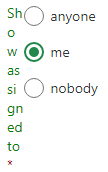
I am trying to build a SPFx webpart containing a ChoiceGroup. When I set the css style to ms-sm12 the choices are aligned vertical:

Show assigned to:
o anyone
* me
o nobody

I like them to align horizontal in one row:

Show assigned to: o anyone * me o nobody

When I set the style to ms-sm6, it aligns them "mixed": The Slider and Toggle are set to ms-sm3

Show assigned to: o anyone
* me
o nobody

Mixed

With ms-sm4 it looks like:

ms-sm4

With ms-sm3, ms-sm2, ms-sm1 it looks like (the title getting more and more squashed and all options in one column:

enter image description here

How can I force / encourage the options to be rendered horizontal?

Pharisaism answered 1/8, 2017 at 20:46 Comment(0)
S
6

Follow the steps given below :

1) Create New .scss file

ex: fabric.scss and paste this class in it.

  .inlineflex .ms-ChoiceField{
      display: inline-block;
   }

2) In your component give refernece like:

  import  './fabric.scss';

3) Add component and apply class.

  <ChoiceGroup 
                className="inlineflex"
                label='Pick one icon'
                options={ [
                {
                    key: 'day',                        
                    text: 'Day'
                },
                {
                    key: 'week',                        
                    text: 'Week'
                },
                {
                    key: 'month',                        
                    text: 'Month'                       
                }
                ] }
             /> 
Shrieval answered 2/8, 2017 at 11:57 Comment(3)
Thanks that worked, I just had to prefix .ms-ChoiceField with :global. My css looks now like .inlineflex { :global .ms-ChoiceField { display: inline-block; } }Pharisaism
I am facing the same issue but this solution is not working for me.Catchy
@DennisKuhn provided the answer I needed in his comment.Magisterial
L
5

Another option that doesn't require adding a CSS is to apply the style directly to the control:

  1. set the flexContainer style to display:flex.
  2. you will notice a space might be needed at the end of the options, I added a non-breaking space as \u00A0

    <ChoiceGroup selectedKey={valueType}
    styles={{ flexContainer: { display: "flex" } }} options={[
    { key: 'specific', text: 'selected\u00A0\u00A0' },
    { key: 'relative', text: 'relative' }]} />
    

done!

Leo answered 2/4, 2019 at 18:28 Comment(2)
I use this and only the choices are inline. the label is on a line on top. how can I force the label to be in the same line.Mcgann
Repeating the comment above for emphasis. The label is still on another line.Magisterial
A
2
  1. add styles property to ChoiceGroup styles={{ flexContainer: { display: "flex" } }}
  2. add styles property to options styles: { choiceFieldWrapper: { display: 'inline-block', margin: '0 0 0 10px' }}

done!

Assiniboine answered 19/2, 2020 at 14:49 Comment(2)
sorry, but how to style the options margin on the options attr?Nankeen
IChoiceGroupOption interface have property styles, so you could set it like styles={{ choiceFieldWrapper: { display: 'inline-block', margin: '0 0 0 10px' } }} (depends on the use case) for each option. Just use F12 for TS to check which objects has styles inside.Assiniboine
E
1
const options: IChoiceGroupOption[] = [
      { key: 'conforme', text: 'Conforme'},
      { key: 'noConforme', text: 'No conforme', styles:{field: { marginLeft: "15px"}}}
    ];
<ChoiceGroup styles={{ flexContainer: { display: "flex" } }}  options={options}  />
Emiliaemiliaromagna answered 26/2, 2020 at 13:21 Comment(2)
please consider writing a few sentences about your code so others can learn from it. Only code answers are considered as low quality.Wilhoit
While this code snippet may be the solution, including an explanation really helps to improve the quality of your post. Remember that you are answering the question for readers in the future, and those people might not know the reasons for your code suggestion.Agone
N
1

Adding flex display with a gap of 10px work for me perfectly.

<ChoiceGroup 
    defaultSelectedKey="A" 
    options={[
        {key: "A", text: "A"},
        {key: "B", text: "B"},
        {key: "C", text: ""}
    ]} 
    styles={{ flexContainer: { display: "flex", gap: 10}}}
/>
Novitiate answered 31/12, 2023 at 1:27 Comment(0)

© 2022 - 2024 — McMap. All rights reserved.