Preventing items in a css grid from stretching to fill space
Asked Answered
B

5

7

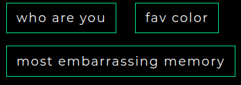
I have a list of 3 buttons I'm trying to display in a grid.

The text of the buttons is dynamic, it could be one word or a full sentence.

I'd like each button's width to be determined thru its content. Make it wide if its a long sentence, keep it small if its 1 word. Example:

example buttons

On larger screens, I want them to show up in 1 row like the above. On smaller screens I want it to move stuff to the next line if there isn't enough width to show them all in 1 row:

responsive example

I've been really struggling with getting this to work, because whenever I set grid on the container, the buttons are stretched horizontally to fill up all the space. Or, they're moved to 1 button per row, and still stretched horizontally all the way.

I've tried setting min-width on everything, I've tried auto-fill / auto-fit and all the different justify and align properties and nothing gives me the result I want.

The solution that's working for me now is to just not use any grids and just set a margin top & right on the buttons themselves, and they're aligning themselves the way I want. But I feel like it should be doable through grids.

Is that possible or is the better solution to not use grids for this?

Boisleduc answered 26/6, 2020 at 4:36 Comment(2)
limit the width of your main/outer div and also you can use flex-wrap.Betoken
did u figure out how to do it? (its been a while since i coded and i dont want the items expanding to fill the whole width of the desktop as the viewport changes from mobile to desktop)Unopened
P
10

try this on button's CSS class

.btn{width:fit-content;}

Poikilothermic answered 27/9, 2022 at 18:15 Comment(0)
I
5

I found myself struggling with this problem today. I had a button at the end of the grid that was stretching to fill the grid cell, but I didn't want that (it looked really weird).

After I didn't find the answer here, I looked elsewhere and found the answer. So, here it is...

On each item in the grid, you can use align-self:start; and it won't stretch to fill the container. Something like this:

.container > *{
    align-self:start;
}

Source: https://yoksel.github.io/grid-cheatsheet/#section-align-self

Isolated answered 6/7, 2022 at 21:26 Comment(0)
C
1

Is this not what you want? The elements will not cover the whole space if you do not specify them to do that.

.container {
  display: flex;
  flex-direction: row;
  resize: both;
  width: 300px;
  border: 1px solid blue;
  overflow: auto;
  flex-wrap: wrap;
}

.container > * {
  padding: 5px;
  border: 1px solid green;
  margin: 5px;
  white-space: nowrap;
}
<div class="container">
  <div>First medium</div>
  <div>Second</div>
  <div>Third very large</div>
</div>
Chianti answered 26/6, 2020 at 5:36 Comment(1)
Right, it'll work with flex, but I was trying to make it work with css grids. I guess that isn't possible? :PBoisleduc
U
0

#grid {
  resize: horizontal;
  overflow: auto;
  display: grid;
  
  /* if only you could replace 150px with fit-content... */
  grid-template-columns: repeat(auto-fit, minmax(150px, auto));
  
max-width: 80%;
border: black solid 2px;
box-sizing: border-box;
}

.items {
  white-space: nowrap;
  max-width: fit-content;
  min-width: fit-content;
background: pink;
border: red solid 2px;
box-sizing: border-box;
}
<div id='grid'>
  <div class='items'>Elephants are cool.</div>
  <div class='items'>Snails are small.</div>
  <div class='items'>Lions</div>
  <div class='items'>Leopards are spotted and spotted in the wild.</div>
</div>

The demo is very close to what you want, but I cannot figure out how to make the track size responsive to each item.

Unopened answered 9/7, 2023 at 2:28 Comment(0)
D
-1

You could try something like this.

.basic-grid {
  display: grid;
  gap: 1rem;
  grid-template-columns: repeat(auto-fit, minmax(240px, 1fr))
}
<section class="basic-grid auto-fit">
  <div class="card">1</div>
  <div class="card">2</div>
  <div class="card">3</div>
  <div class="card">4</div>
</section>

I recommend watching this video to learn a bit more about grids. https://www.youtube.com/watch?v=705XCEruZFs

Dialysis answered 26/6, 2020 at 6:33 Comment(1)
The problem is the buttons (columns) are stretching all the way horizontally, even in the code you gave.Boisleduc

© 2022 - 2024 — McMap. All rights reserved.