Adding padding to the beginning and end of a UIStackView
Asked Answered
L

2

7

I've been switching over to UIStackView recently and trying to do all my layout with it and it's so much easier than using Auto Layout... with one exception.

I have a layout using nested UIStackViews with a vertical stack view and inside it is a horizontal stack view.

Like this...

|    Label    |
|    Label    |
|Button Button|
|    Label    |

This is fine except I now want to have a space between the buttons and the edges of the screen. I can set a space between the buttons but not at the edges.

Is there a way to do this?

What I would like is this...

|   B     B   |

The buttons both have a background colour with rounded corners. I'd like a gap between the edge of the screen and the background.

If that makes sense.

I just can't find anything that would allow me to do this.

Lied answered 12/1, 2016 at 9:35 Comment(12)
how about setting insets on the buttonsAeronautics
@Aeronautics that moves the contents but doesn't change the background. I have updated my post to explain about the background. ThanksLied
@Aeronautics well, it seems that "spacer views" aren't going anywhere for now. The only way I got it to do what I wanted was to add zero width views to each end of the stack view. LOLLied
How about adding a padding of few pixels on left and right of vertical stackView?Loophole
@Loophole exactly... that's what I'm asking. How do you do that? Have you tried?Lied
yes i tried it.. Take a vertical stack view and put your controls as u mentioned above and add left and right constraint on vertical stack view with constant of 10 and inside your vertical stack view add horizontal stack view and put those two buttons in that . Output is this imgur.com/RE8mvX1Loophole
@Loophole ah, I see what you mean now. But there is content in the vertical stack that needs to go to the edge of the screen. It's just the buttons that don't.Lied
Then you should break your vertical stack into further more . or take out the buttons stack view out of vertical stackview.Loophole
@Loophole I'll try breaking it up a bit. Taking the button stack view out of the vertical one would mean they are no longer stacked.Lied
Let us continue this discussion in chat.Loophole
I see you went to chat. Was there an answer? @LiedHangover
@Hangover yes! You can use the layoutMargins on the stock view to add padding to the inside of it.Lied
H
16

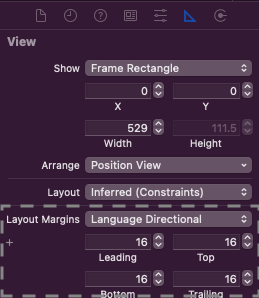
StackView doesn't have padding attribute as of iOS 14 / Xcode 12. But we could set the layout margin.

  • through Interface Builder:

enter image description here


OR

  • through code, could configure the stack view to lay out its arranged subviews relative to its layout margins:

stackView.isLayoutMarginsRelativeArrangement = true

For iOS > 10

stackView.directionalLayoutMargins = NSDirectionalEdgeInsets(top: 16, leading: 16, bottom: 16, trailing: 16)

For iOS <= 10

stackView.layoutMargins = UIEdgeInsets(top: 16, left: 16, bottom: 16, right: 16)


P.S drawback of this approach, when the StackView has no subviews, it would persist its layout margins. Therefore to remove the paddings we should set a layout margin with zero edge insets through code.

Helgeson answered 10/1, 2021 at 23:5 Comment(0)
I
0

I realize this is a super old question, but you can do it like this:

  • add 0px wide UIViews to both sides of the horizontal stack view
  • set their background color to clearColor
  • set the horizontal stack view's Distribution to Equal Spacing.

[Update: I just saw you mentioned this in the comments]

Intransigent answered 20/7, 2018 at 14:57 Comment(0)

© 2022 - 2024 — McMap. All rights reserved.