display a histogram with very non-uniform bin widths
Asked Answered
C

3

7

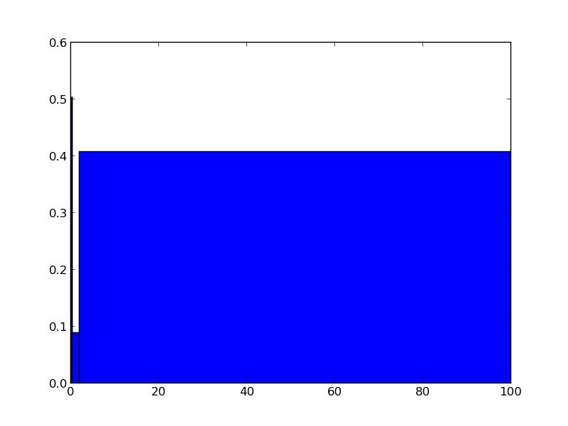
Here is the histogram enter image description here

To generate this plot, I did:

bins = np.array([0.03, 0.3, 2, 100])
plt.hist(m, bins = bins, weights=np.zeros_like(m) + 1. / m.size)

However, as you noticed, I want to plot the histogram of the relative frequency of each data point with only 3 bins that have different sizes:

bin1 = 0.03 -> 0.3

bin2 = 0.3 -> 2

bin3 = 2 -> 100

The histogram looks ugly since the size of the last bin is extremely large relative to the other bins. How can I fix the histogram? I want to change the width of the bins but I do not want to change the range of each bin.

Calices answered 3/11, 2015 at 11:6 Comment(4)
but then it's not a histogram anymore, is it?Marcenemarcescent
@cel, no, it can be a bar graph.Calices
Well, have you tried plotting a bar graph? You get the number of counts in each bin from np.histogram, so the implementation should be straight forward.Marcenemarcescent
@Marcenemarcescent - yes I tried it. I still didn't figure out a way to change the numbers on the xaxis .Calices
B
16

As @cel pointed out, this is no longer a histogram, but you can do what you are asking using plt.bar and np.histogram. You then just need to set the xticklabels to a string describing the bin edges. For example:

import numpy as np
import matplotlib.pyplot as plt

bins = [0.03,0.3,2,100] # your bins
data = [0.04,0.07,0.1,0.2,0.2,0.8,1,1.5,4,5,7,8,43,45,54,56,99] # random data

hist, bin_edges = np.histogram(data,bins) # make the histogram

fig,ax = plt.subplots()

# Plot the histogram heights against integers on the x axis
ax.bar(range(len(hist)),hist,width=1) 

# Set the ticks to the middle of the bars
ax.set_xticks([0.5+i for i,j in enumerate(hist)])

# Set the xticklabels to a string that tells us what the bin edges were
ax.set_xticklabels(['{} - {}'.format(bins[i],bins[i+1]) for i,j in enumerate(hist)])

plt.show()

enter image description here

EDIT

If you update to matplotlib v1.5.0, you will find that bar now takes a kwarg tick_label, which can make this plotting even easier (see here):

hist, bin_edges = np.histogram(data,bins)

ax.bar(range(len(hist)),hist,width=1,align='center',tick_label=
        ['{} - {}'.format(bins[i],bins[i+1]) for i,j in enumerate(hist)])
Bellona answered 3/11, 2015 at 11:59 Comment(3)
when I do this I get two plots instead of one and the text isn't centered edit: the updated version works better, I still get two plotsOira
Dear, there is no need for adding 0.5 for setting xticks anymore. Maybe due to change in matplotlib.Koerlin
@Koerlin yes, you'll notice in the edit to my answer above that's accounted for alreadyBellona
S
2

If your actual values of the bins are not important but you want to have a histogram of values of completely different orders of magnitude, you can use a logarithmic scaling along the x axis. This here gives you bars with equal widths

import numpy as np
import matplotlib.pyplot as plt

data = [0.04,0.07,0.1,0.2,0.2,0.8,1,1.5,4,5,7,8,43,45,54,56,99]

plt.hist(data,bins=10**np.linspace(-2,2,5)) 
plt.xscale('log')

plt.show()

When you have to use your bin values you can do

import numpy as np
import matplotlib.pyplot as plt

data = [0.04,0.07,0.1,0.2,0.2,0.8,1,1.5,4,5,7,8,43,45,54,56,99]
bins = [0.03,0.3,2,100] 

plt.hist(data,bins=bins) 
plt.xscale('log')

plt.show()

However, in this case the widths are not perfectly equal but still readable. If the widths must be equal and you have to use your bins I recommend @tom's solution.

Selle answered 3/11, 2015 at 12:57 Comment(0)
Z
0

As was pointed out, this is better thought of as a bar plot with the labels indicating ranges, rather than a histogram.

We can use pandas.cut() (pandas docs) to create the necessary table, and then plot it. This is preferable to tinkering with the parameters of the plotting functions themselves.

foo = [1, 2, 3, 4, 5, 6, 7, 8, 9, 10]
bar = (0, 3, 10)
cuts = pd.cut(foo, bins=bar).value_counts().reset_index()

sns.barplot(cuts, x='index', y='count')
  • the reset_index() is done to provide column names to sns.barplot
  • you can do a sort_index() after value_counts() if you need to sort the labels in order
Zurheide answered 9/7 at 10:22 Comment(0)

© 2022 - 2024 — McMap. All rights reserved.