3 layer donut chart in R
Asked Answered
P

2

7

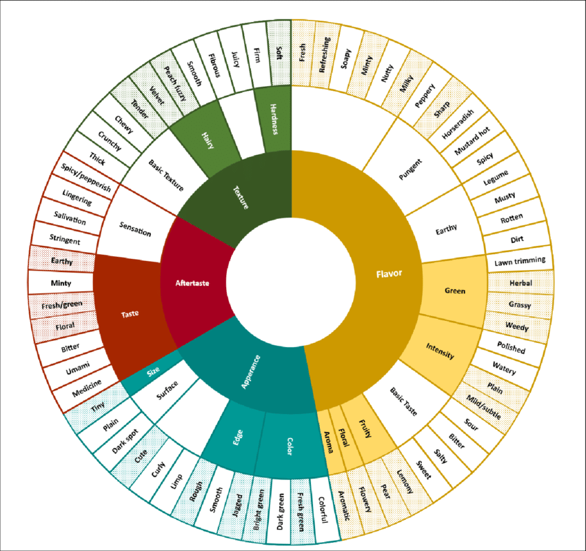
I am trying to recreate this image in R, however I am unable to work out how to have 3 layers to a donut chart - everything I find (for instance, webr::PieDonut) only allows 2. Using ggplot I am also unable to re-create it.

enter image description here

A MRE is:

library(ggplot2)
library(webr)
library(dplyr)

lexicon <- data.frame("Level1" = c(rep("Flavour", 11), rep("Appearance", 4)),
                  "Level2" = c(rep("Misc", 6), rep("Pungent", 5), rep("Colour", 4)),
                  "Level3" = c("Fresh", "Refreshing", "Soapy", "Minty", "Nutty", "Milky", "Peppery", "Sharp", "Horseradish", "Mustard hot", "Spicy", "Colourful"," Fresh Green", "Dark Green", "Bright Green")
)

PieDonut(lexicon, aes(Level1, Level2), title = "Salad Lexicon", showRatioDonut =FALSE, showRatioPie = FALSE)

ggplot(lexicon, aes(Level2, Level3, fill = Level1)) +
  geom_col() +
  scale_fill_viridis_d() +
  coord_polar("y")

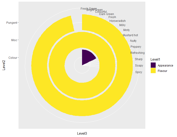
While the PieDonut works for 2 levels (not shown), it doesn't allow the final level to be included. The ggplot approach also does not work, as seen in the figure below.

enter image description here

How can I get this style of chart in R? Either with ggplot or base plotting.

Putative answered 12/8, 2022 at 12:8 Comment(0)
T
12

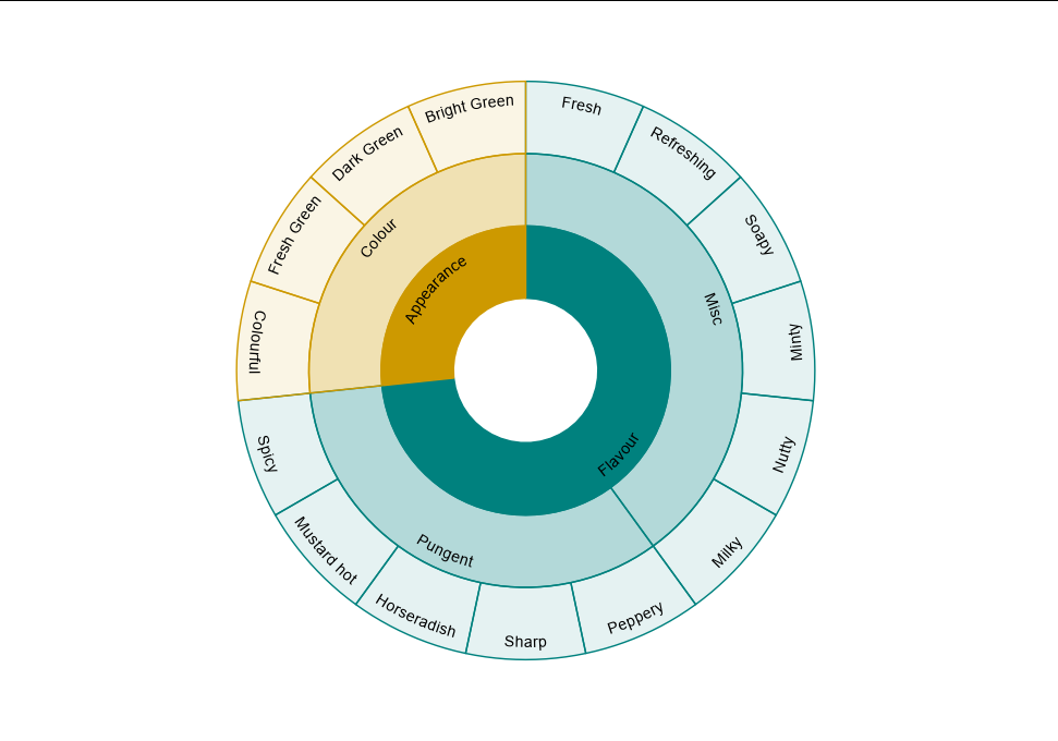
I think a nice alternative is to use geom_rect here after some data manipulation. Using the fill, color, and alpha scales can help improve the differentiation of categories. I would also use geom_textpath here, though I might go for circumferential labels if there is room to do so:

lexicon %>%
  mutate(top_level = Level1) %>%
  pivot_longer(1:3) %>%
  group_by(name, value) %>%
  mutate(width = n()) %>%
  unique() %>%
  arrange(name) %>%
  group_by(name) %>%
  mutate(ymid = as.numeric(sub("\\D+", "", name)),
         ymax = ymid + 0.5, ymin = ymid - 0.5,
         xmin = c(0, head(cumsum(width), -1)),
         xmax = cumsum(width),
         xmid = (xmax + xmin) / 2) %>%
  ggplot(aes(xmid, ymid, fill = top_level)) +
  geom_rect(aes(xmin = xmin, xmax = xmax, ymin = ymin, ymax = ymax,
                alpha = name, color = top_level)) +
  geomtextpath::geom_textpath(aes(y = ymid + 0.25, label = value, 
                                  group = value)) +
  scale_alpha_manual(values = c(1, 0.3, 0.1)) +
  scale_fill_manual(values = c("#cd9900", "#00817e")) +
  scale_colour_manual(values = c("#cd9900", "#00817e")) +
  scale_y_continuous(limits = c(-0.5, 3.6)) +
  coord_polar() +
  theme_void() +
  theme(legend.position = "none")

enter image description here

Teredo answered 12/8, 2022 at 13:30 Comment(6)
Really nice Allan. Tried with circumferential labels too but failed with geom_col. Will keep the trick with geom_rect in mind.Agnusago
Thank you for this. This looks really good. Would you mind telling me how to have the text radial rather than circumferential? I have tried a few things but they don't seem to work, and I am unfamiliar with ggplot, let alone these functions.Putative
@Putative use angle = 90 inside geom_textpathTeredo
@AllanCameron. Upon further inspection, when using duplicated values (for instance 'Earthy' is both a flavour category and aftertaste-> taste in the original plot. This seems to break this approach - do you know how to avoid this (without changing the values)? I have tried a few approaches, such as trying to use an UID for the combination but that doesn't seem to workPutative
The graph looks impressing, BUT I get the following error: Error in namespaceExport(ns, exports) : undefined exports: GeomLabelabline, GeomLabelcontour, GeomLabelcurve, GeomLabeldensity... What kind of library could be throwing this?Corinnecorinth
@Corinnecorinth try library(geomtextpath) and re-run your codeTeredo
A
8

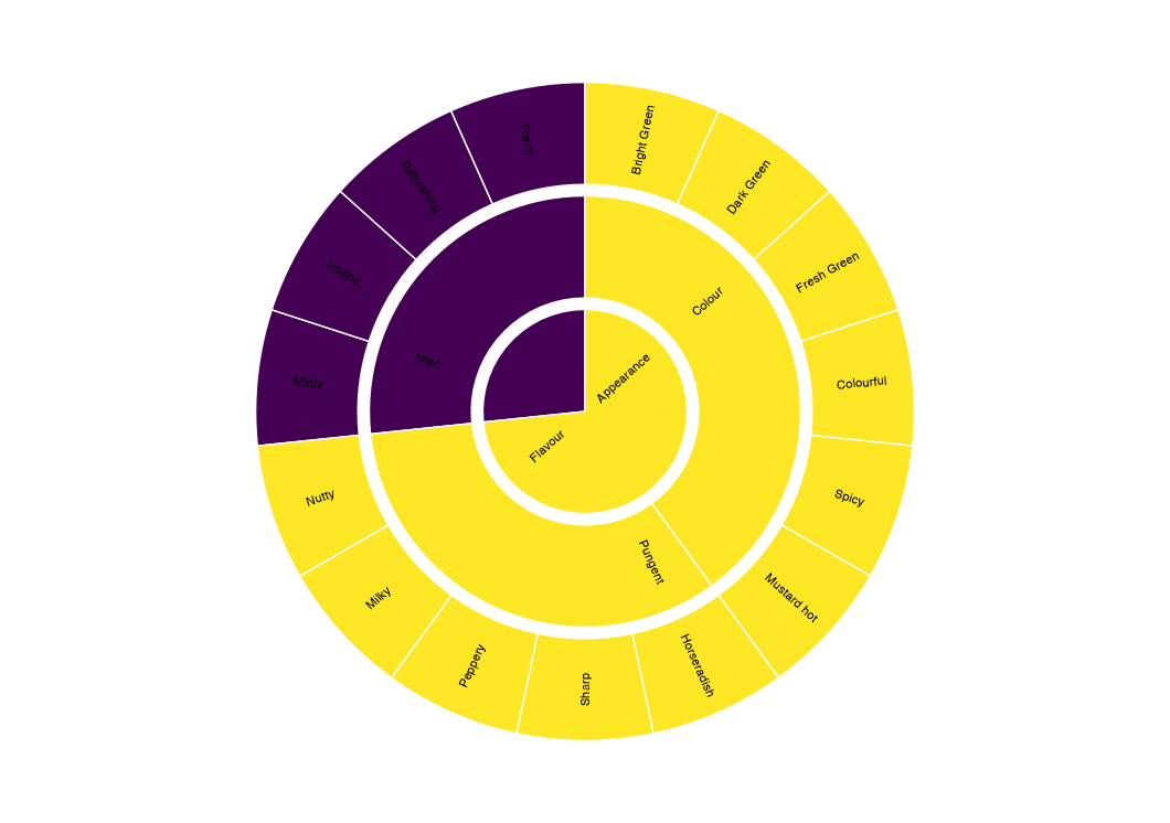
One option would be to reeshape your data to long and do some manual aggregating before passing to ggplot. Additionally I use geomtextpath::geom_textpath to add the labels:

library(ggplot2)
library(dplyr)
library(geomtextpath)

lexicon <- data.frame("Level1" = c(rep("Flavour", 11), rep("Appearance", 4)),
                      "Level2" = c(rep("Misc", 6), rep("Pungent", 5), rep("Colour", 4)),
                      "Level3" = c("Fresh", "Refreshing", "Soapy", "Minty", "Nutty", "Milky", "Peppery", "Sharp", "Horseradish", "Mustard hot", "Spicy", "Colourful"," Fresh Green", "Dark Green", "Bright Green")
)

lexicon_long <- lexicon |>
  mutate(fill = Level1) |>
  tidyr::pivot_longer(-fill, names_to = "level", values_to = "label") |>
  mutate(label = forcats::fct_inorder(label)) |> 
  count(fill, level, label) |>
  group_by(level) |>
  mutate(pct = n / sum(n))

ggplot(lexicon_long, aes(level, pct, fill = fill)) +
  geom_col(color = "white") +
  geom_textpath(aes(label = label, group = label),
                position = position_stack(vjust = .5),
                upright = TRUE, hjust = .5, size = 3
  ) +
  scale_fill_viridis_d() +
  coord_polar("y") +
  theme_void() +
  guides(fill = "none")

enter image description here

Agnusago answered 12/8, 2022 at 12:43 Comment(3)
Nice to see a geomtextpath solution :)Teredo
This seems to have broken the structure of the data. In each ring the values are all alphabetical, rather than relating to the relevant layers.Putative
My bad. If you want a specific order you have to use a factor. I just have made an edit and use fct_inorder after reshaping so that the order of your categories is or should be preserved.Agnusago

© 2022 - 2024 — McMap. All rights reserved.