Pagination and Card Components with Ant Design (antd)?
Asked Answered
B

3

7

Is it possible to combine the Pagination component from antd with Card components to get a page similar to Pinterest with pagination?

Basic Pagination code from https://ant.design/components/pagination/:

import { Pagination } from 'antd';

ReactDOM.render(<Pagination defaultCurrent={1} total={50} />, mountNode);

Basic Card code from https://ant.design/components/card/:

import { Card } from 'antd';

ReactDOM.render(
  <Card
    title="Card title"
    extra={<a href="#">More</a>}
    style={{ width: 300 }}
  >
    <p>Card content</p>
    <p>Card content</p>
    <p>Card content</p>
  </Card>,
  mountNode
);

How can these be combined to cycle through many cards similar to the example in the image? For example, some number of page with 9 cards.

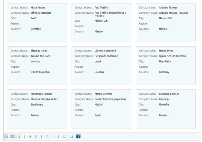
pagination example

Breeder answered 19/12, 2018 at 1:58 Comment(2)
What is the required result here? A grid of cards with pagination?Indurate
Added an example imageBreeder
M
19

This can be done by setting minimum and maximum value and showing results accordingly.

const numEachPage = 4   // Use a constant here to keep track of number of cards per page

constructor(props) {
    super(props);
    this.state = {
      minValue: 0,
      maxValue: 1
    };
  }

And then show data based on these values using Array.slice() as given below:

render() {
    let data = [
      { title: "Card title1", value: "Card content1" },
      { title: "Card title2", value: "Card content2" },
      { title: "Card title3", value: "Card content3" },
      { title: "Card title4", value: "Card content4" },
      { title: "Card title5", value: "Card content5" }
    ];
    return (
      <div>
        {data &&
          data.length > 0 &&
          data.slice(this.state.minValue, this.state.maxValue).map(val => (
            <Card
              title={val.title}
              extra={<a href="#">More</a>}
              style={{ width: 300 }}
            >
              <p>{val.value}</p>
            </Card>
          ))}
        <Pagination
          defaultCurrent={1}
          defaultPageSize={numEachPage} //default size of page
          onChange={this.handleChange}
          total={3} //total number of card data available
        />
      </div>
    );
  }

Then you can write you logic in handleChange method.

handleChange = value => {
    this.setState({
      minValue: (value - 1) * numEachPage,
      maxValue: value * numEachPage
    });
  };

I have created a working demo.

Medamedal answered 19/12, 2018 at 6:35 Comment(0)
P
8

Here is a working code that I have used in my projects:

<List
  grid={{
   gutter: 16,
   xs: 1,
   sm: 2,
   md: 3,
   lg: 4,
   xl: 5,
   xxl: 6
  }}

  pagination={{
    showSizeChanger: true,
    pageSizeOptions: ["10", "50", "100", "1000"],
    position: "both"
  }}

  dataSource={dataSource}
  renderItem={data => (
    <List.Item>
      <Card
        bordered={false}
        key={key}
        title={"CARD TITLE"}
        cover={
          <img
            alt={"ALT"}
            src={url}
          />
        }
      >
       {"BODY"}
      </Card>
  </List.Item>
/>
Philipson answered 2/1, 2020 at 10:3 Comment(0)
L
2

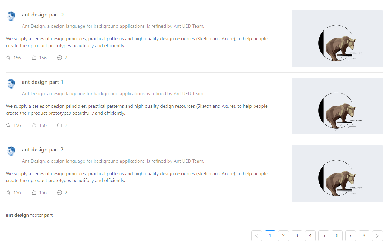
What you actually want here is a List component with the pagination prop and the renderItem render prop. Ant Design has a demo of this in its docs:

enter image description here

Their code is below; all you'd have to do is pass in your data to the dataSource prop and have renderItem return a Card!

import { List, Avatar, Icon } from 'antd';

const listData = [];
for (let i = 0; i < 23; i++) {
  listData.push({
    href: 'http://ant.design',
    title: `ant design part ${i}`,
    avatar: 'https://zos.alipayobjects.com/rmsportal/ODTLcjxAfvqbxHnVXCYX.png',
    description:
      'Ant Design, a design language for background applications, is refined by Ant UED Team.',
    content:
      'We supply a series of design principles, practical patterns and high quality design resources (Sketch and Axure), to help people create their product prototypes beautifully and efficiently.',
  });
}

const IconText = ({ type, text }) => (
  <span>
    <Icon type={type} style={{ marginRight: 8 }} />
    {text}
  </span>
);

ReactDOM.render(
  <List
    itemLayout="vertical"
    size="large"
    pagination={{
      onChange: page => {
        console.log(page);
      },
      pageSize: 3,
    }}
    dataSource={listData}
    footer={
      <div>
        <b>ant design</b> footer part
      </div>
    }
    renderItem={item => (
      <List.Item
        key={item.title}
        actions={[
          <IconText type="star-o" text="156" key="list-vertical-star-o" />,
          <IconText type="like-o" text="156" key="list-vertical-like-o" />,
          <IconText type="message" text="2" key="list-vertical-message" />,
        ]}
        extra={
          <img
            width={272}
            alt="logo"
            src="https://gw.alipayobjects.com/zos/rmsportal/mqaQswcyDLcXyDKnZfES.png"
          />
        }
      >
        <List.Item.Meta
          avatar={<Avatar src={item.avatar} />}
          title={<a href={item.href}>{item.title}</a>}
          description={item.description}
        />
        {item.content}
      </List.Item>
    )}
  />,
  mountNode,
);
Look answered 6/11, 2019 at 23:10 Comment(0)

© 2022 - 2024 — McMap. All rights reserved.