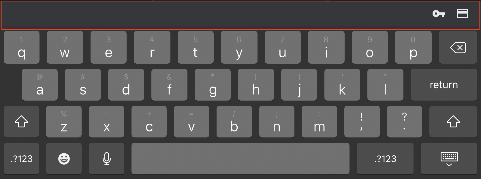
On iOS 13 Chrome, when focusing on a text input, a wide gray bar will show on top of the keyboard with only a couple buttons for password and credit card autocompletion even though the input has attributes type set to "text" and autocomplete set to "off".
Besides being unneeded, this bar doesn't seem to decrease browser's perceived window height, so elements on the bottom of the page are getting cut off.
Edit: it is important to add the bar always shows up glued to the keyboard, even if the focused element is a <textarea> instead. This is not an issue specific to my website. For instance, this bar will show on google.com if I focused on the search input.
Is there a way of disabling/hiding that bar?

